The Greenstraw
Deliverables:
- Logo Identity
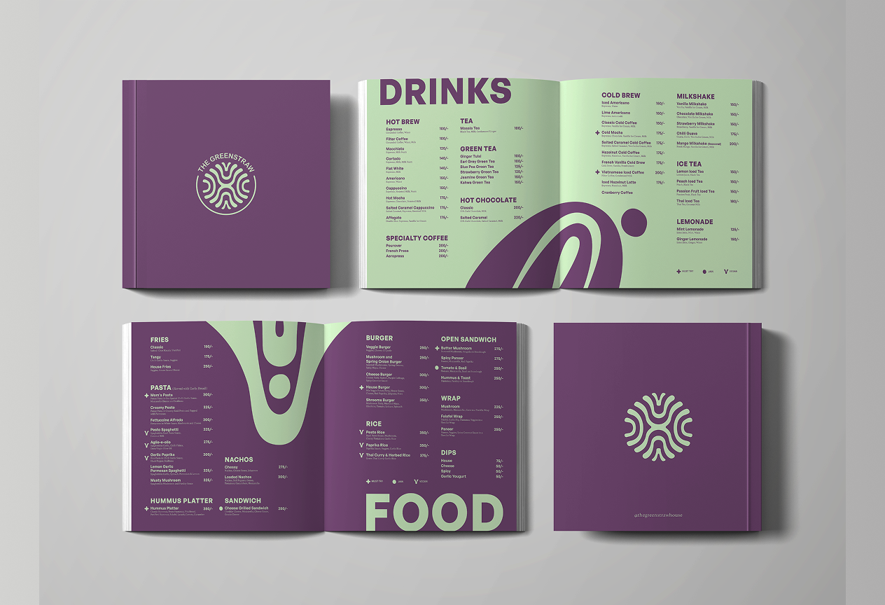
- Menu Design
- Merch Design
- Environmental Graphics
The Greenstraw is an F&B brand that positions itself as more than a cafe
Alongside food, it engages ideas of sustainable living, consultation, and shared working, creating a space where learning and community can coexist. This project involved us thinking about community as a system. We worked closely with Pooja Mathur, co-founder and project head, to reimagine the brand’s visual language in a way that reflects both its intent and its evolving ecosystem.
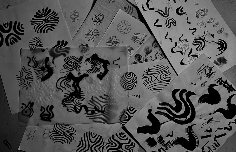
Our entry point into the project was their relationship with food and security. Since their practice extends into various tangents, we were instantly reminded of the image of a rhizome- an underground plant system with a lateral growth pattern.
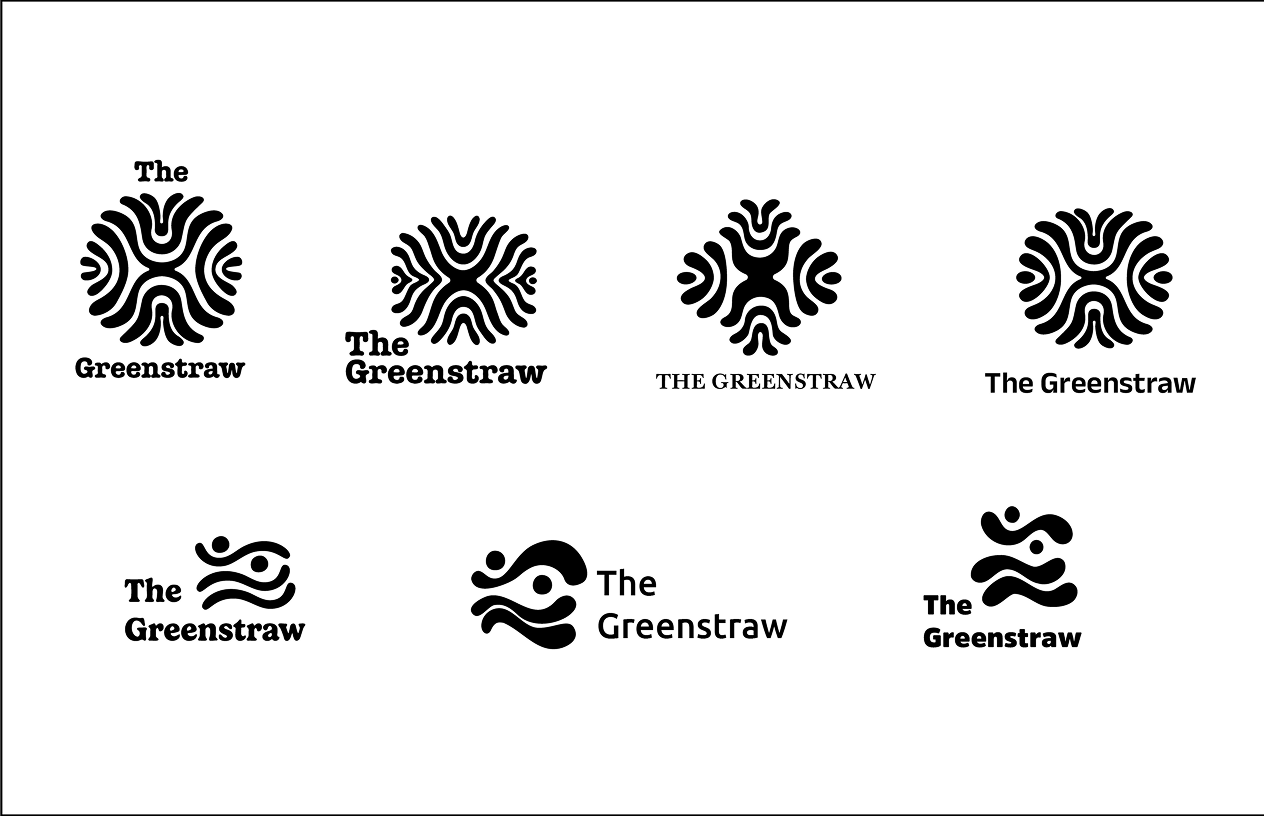
The rhizome regenerates through entangled networks - a metaphor for how a community persists through distributed emotional and symbolic connections. To us, the structure of a rhizome spoke coherence. To translate this into form, we began with a series of fun material explorations using fluid mediums like Fevicol, allowing shapes to emerge organically.


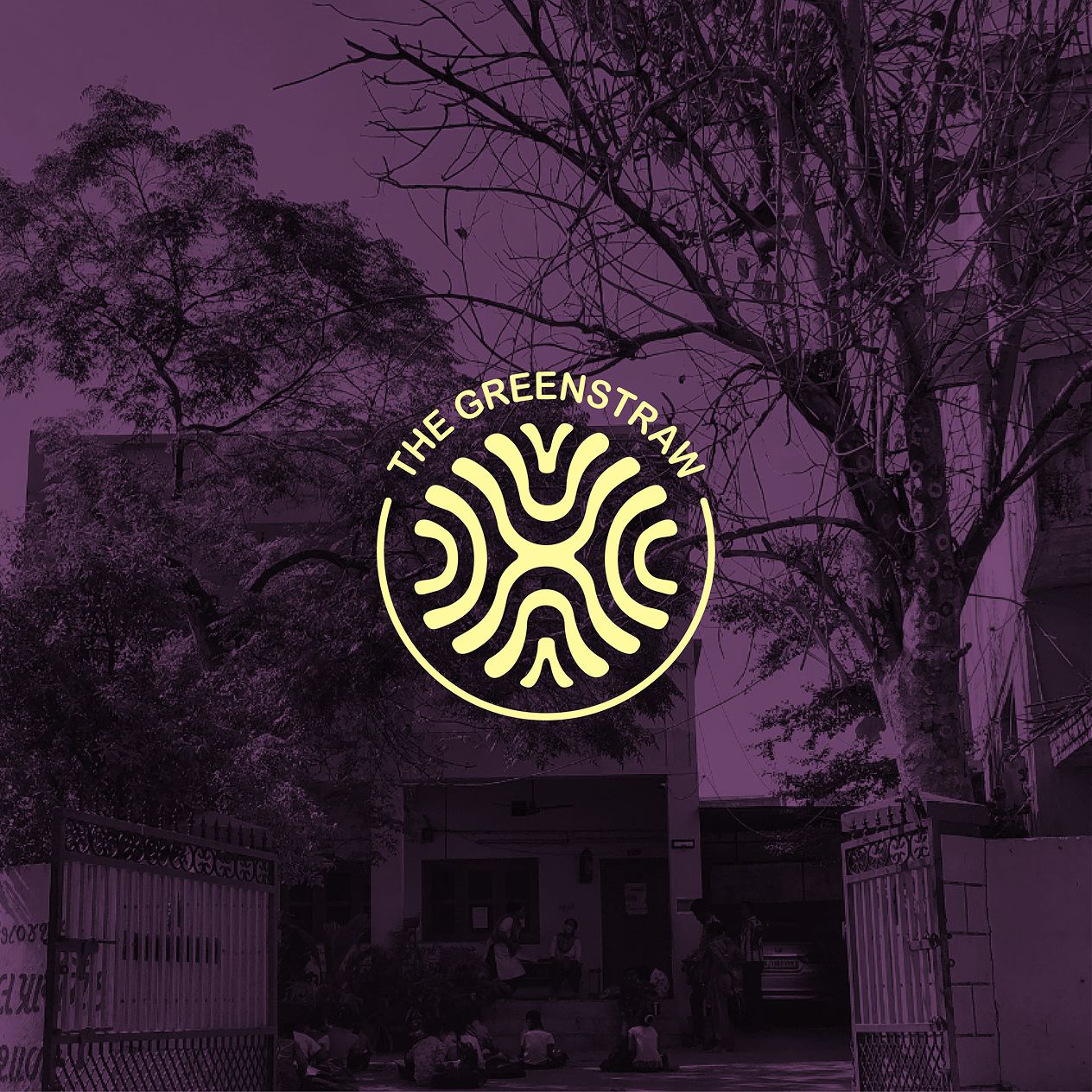
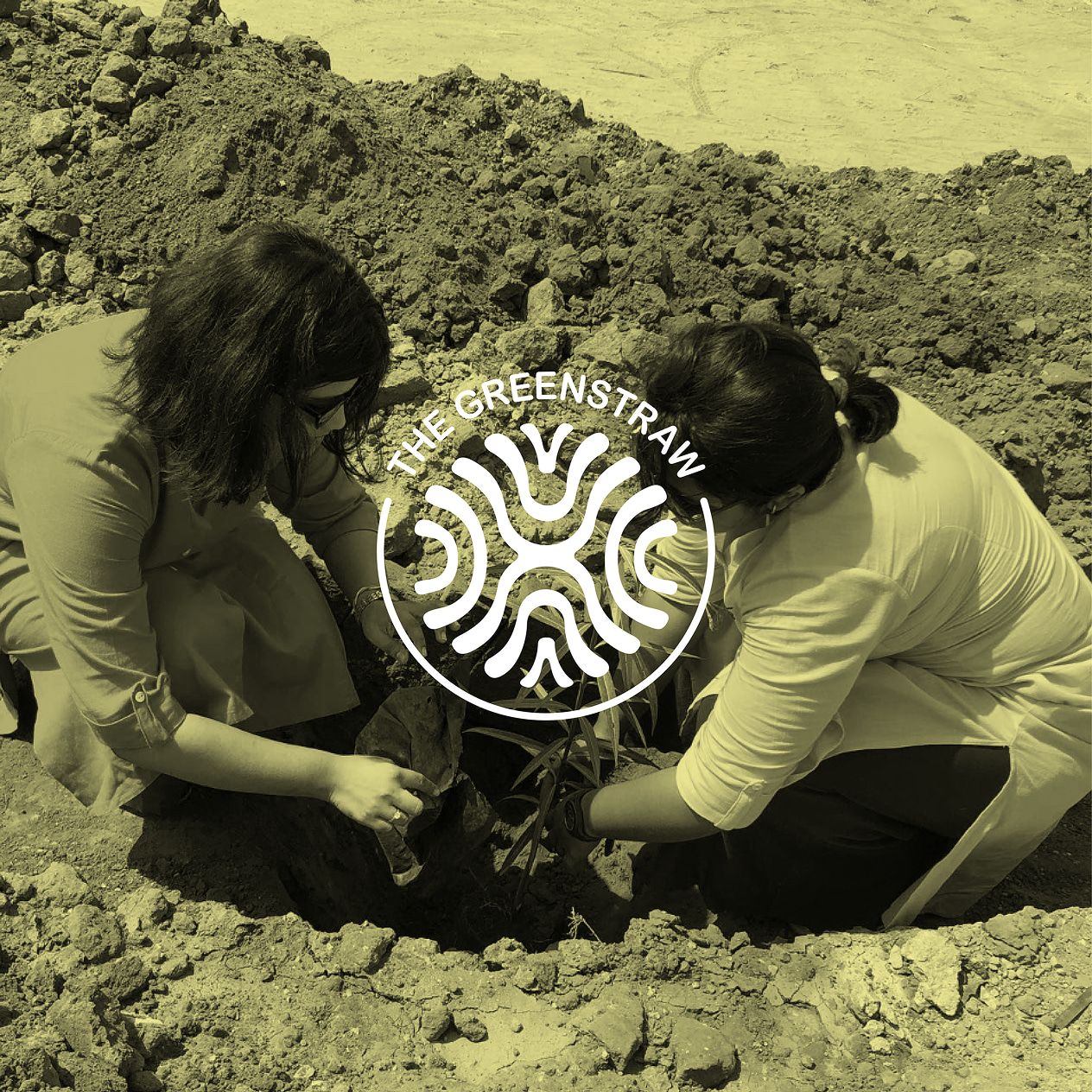
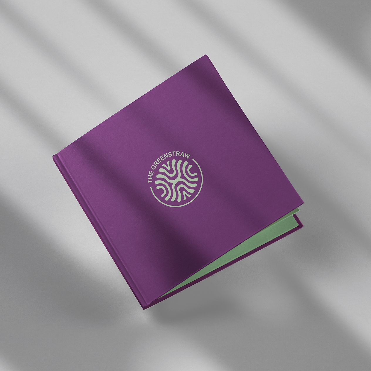
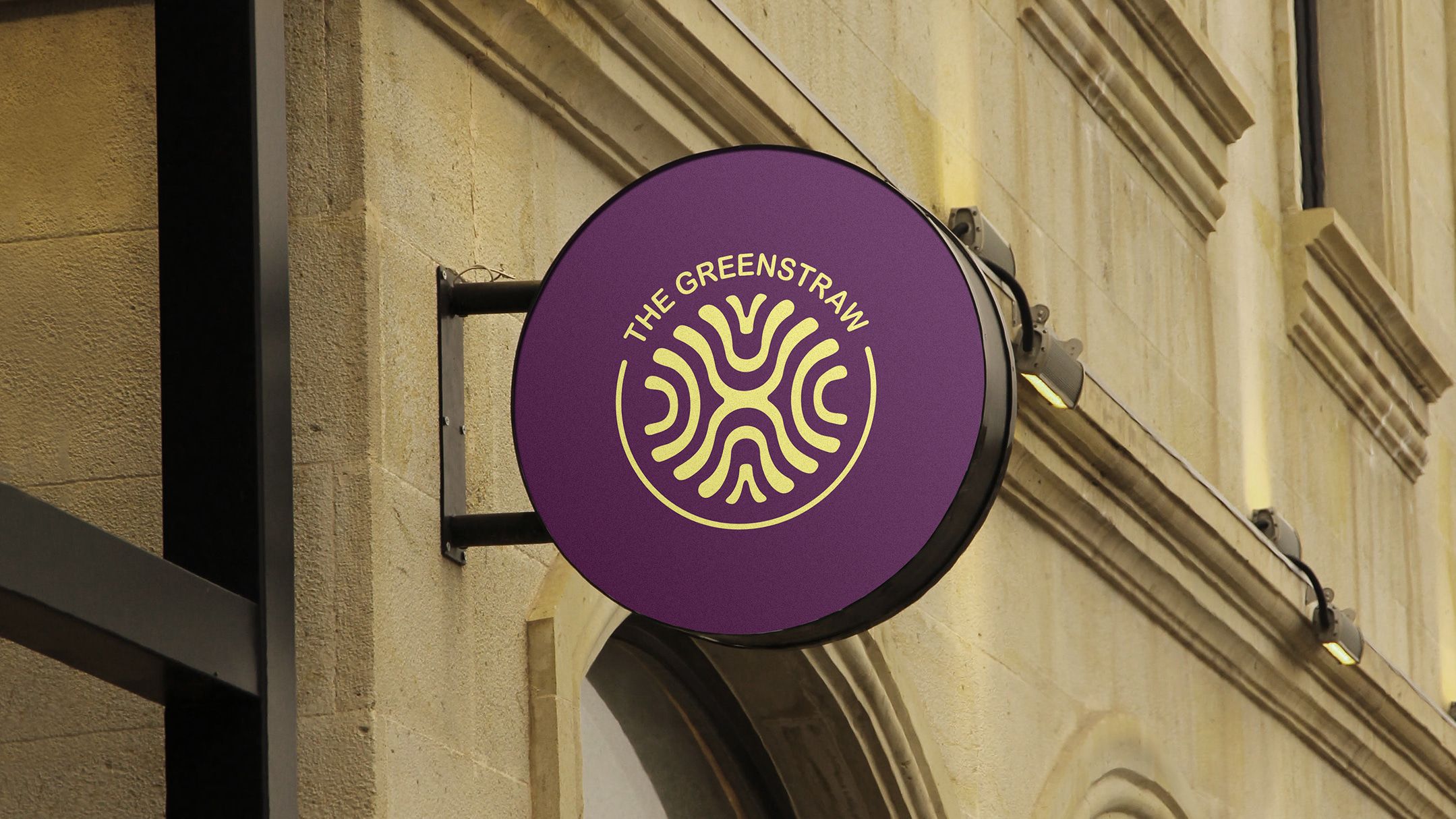
These forms were then studied and repeated to create a symmetric visual language that reflects the growth lines of a rhizome while being held in a circular frame
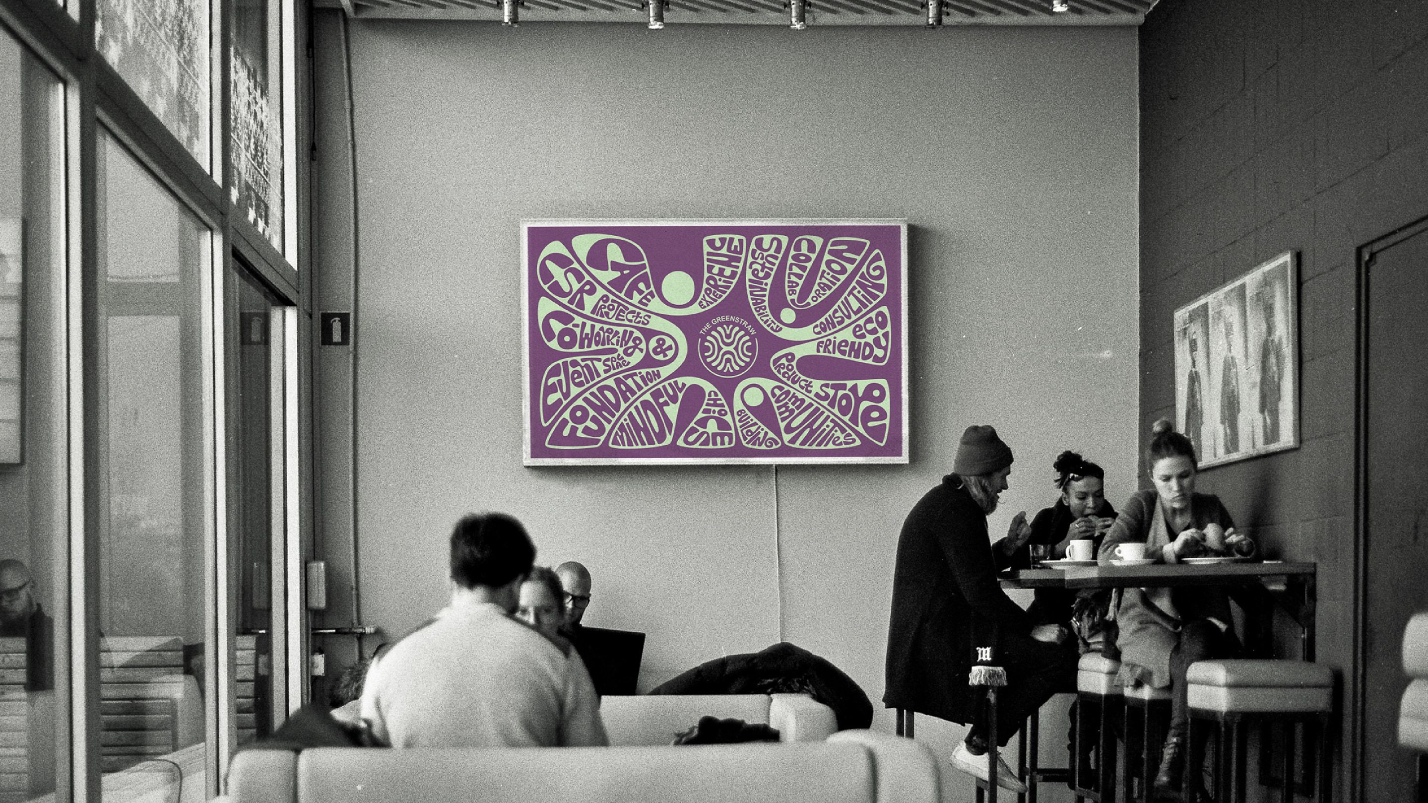
Extending from the logo, the language opens into larger compositions where type is embedded within the system, becoming part of the visual rhythm.
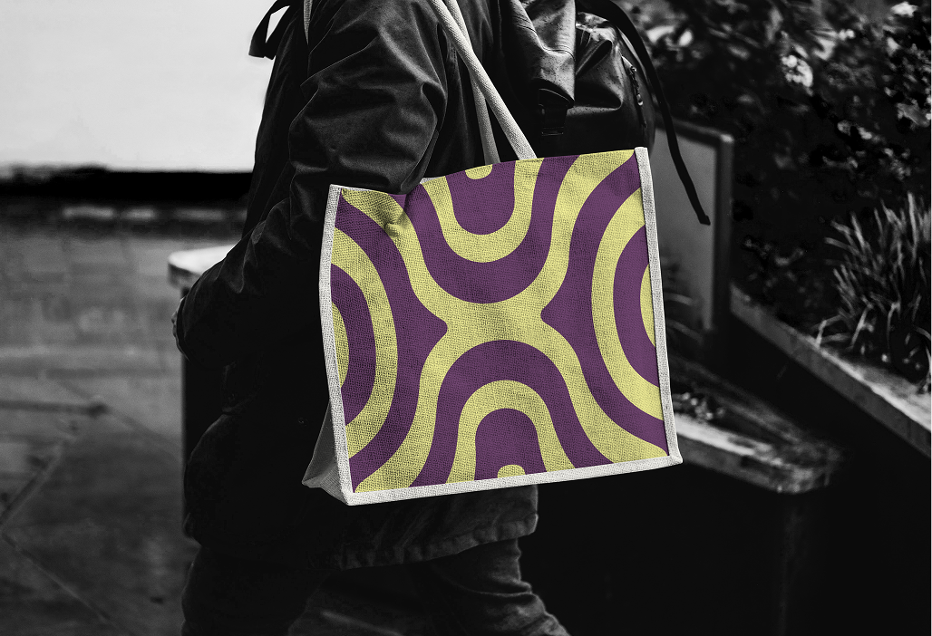

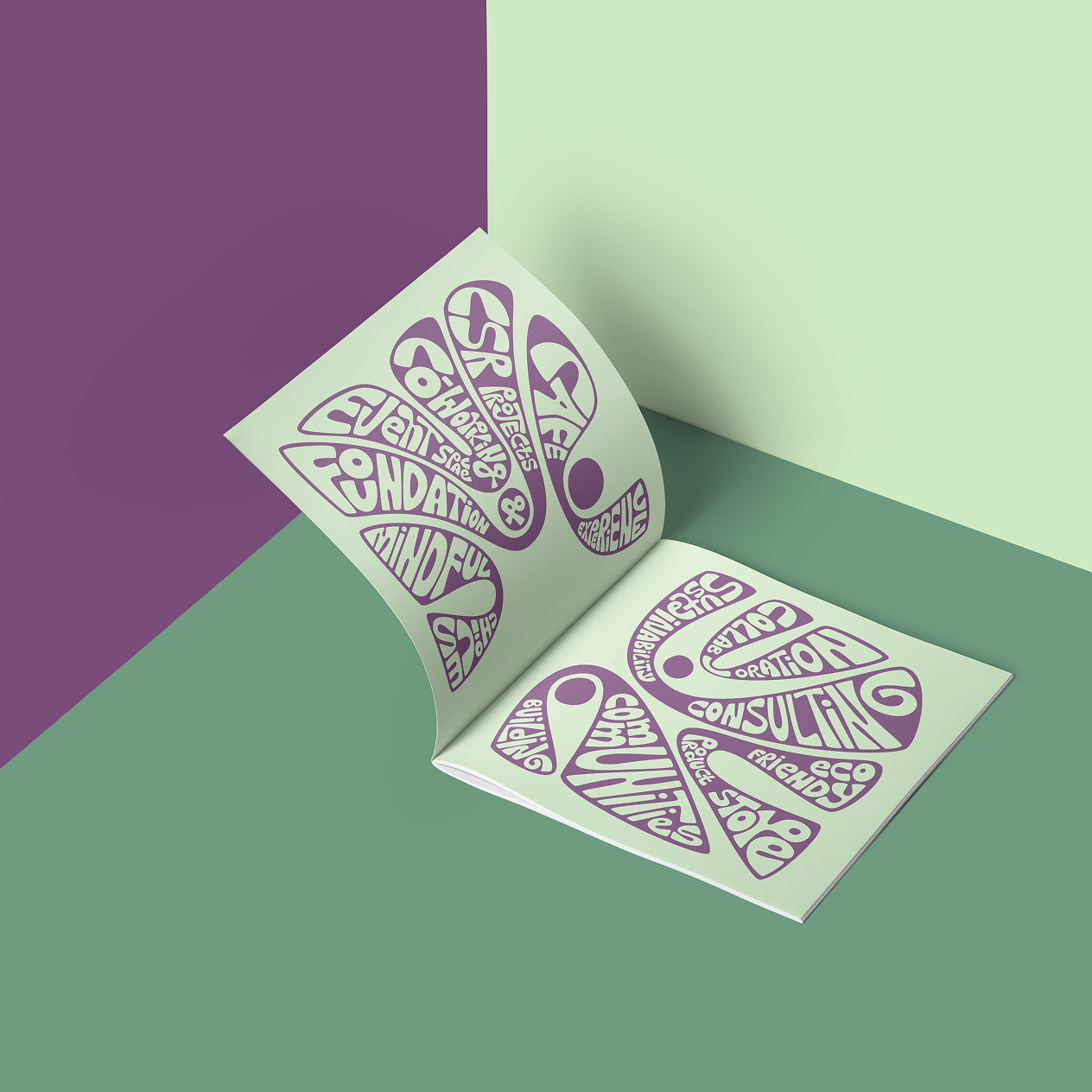
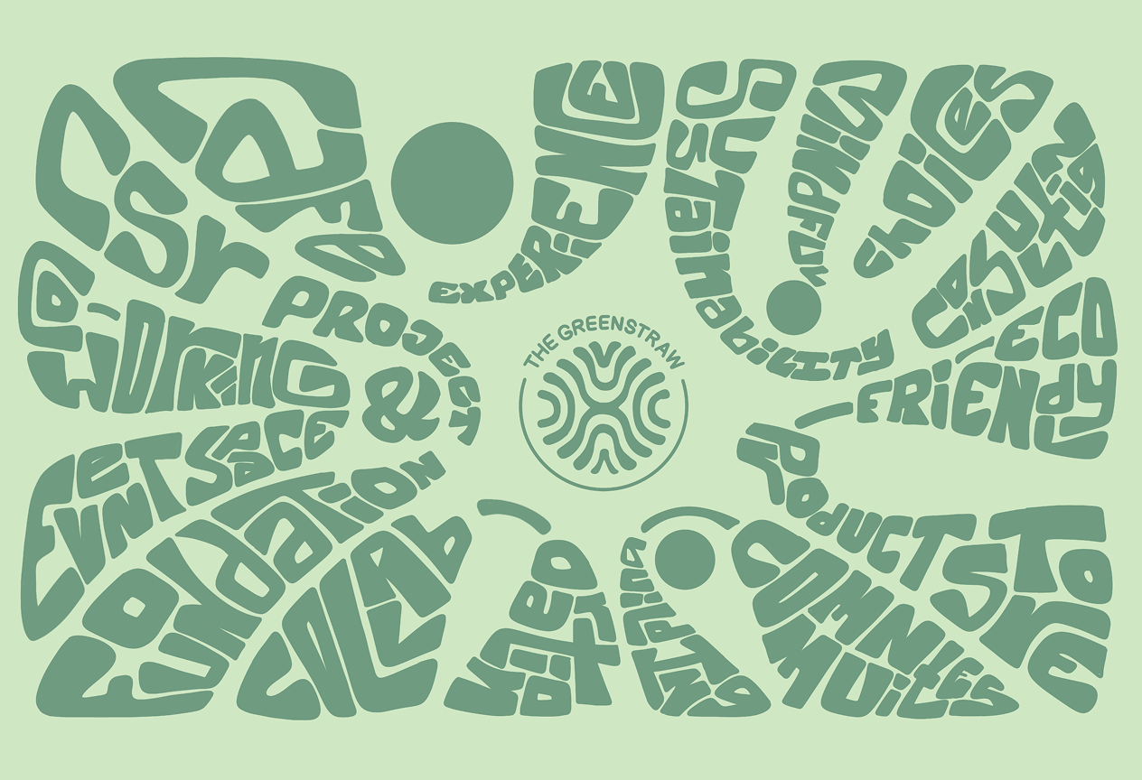
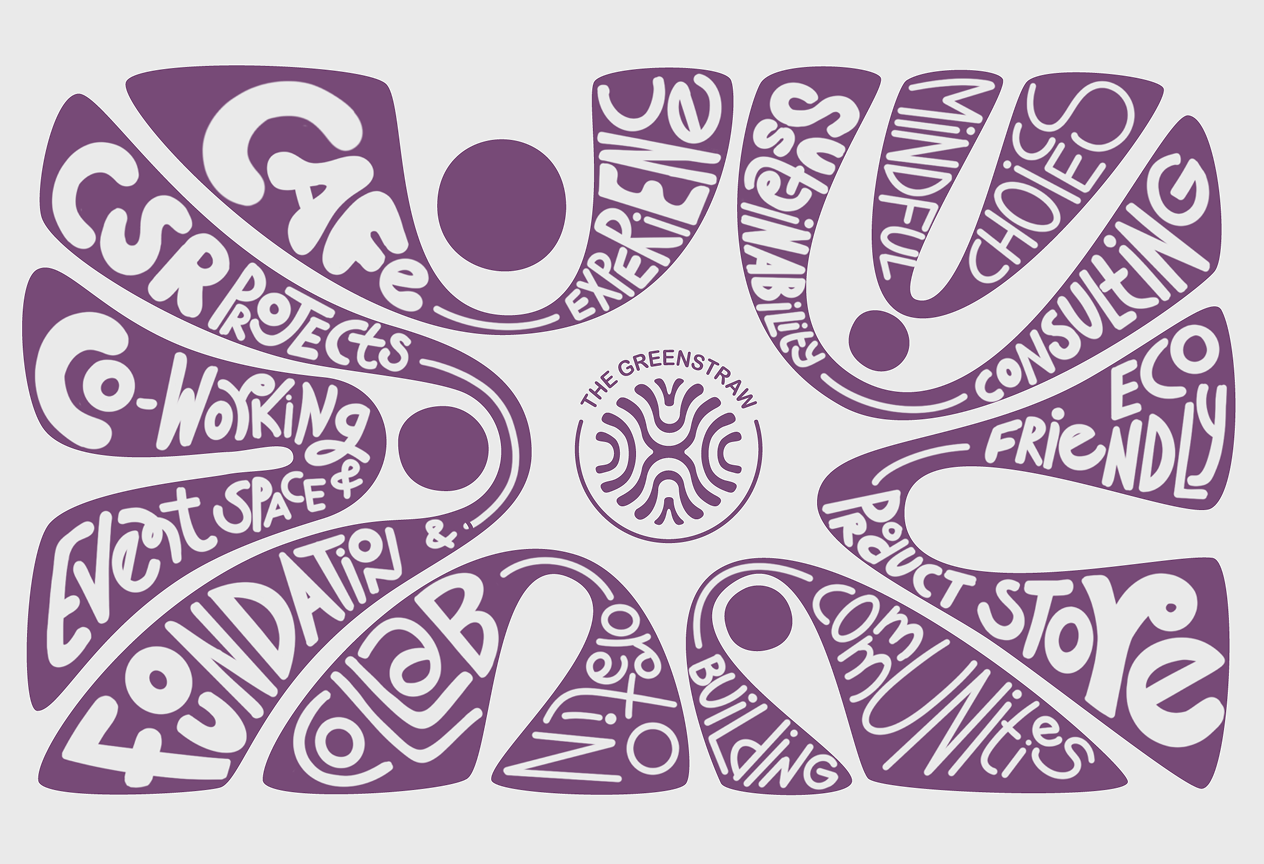
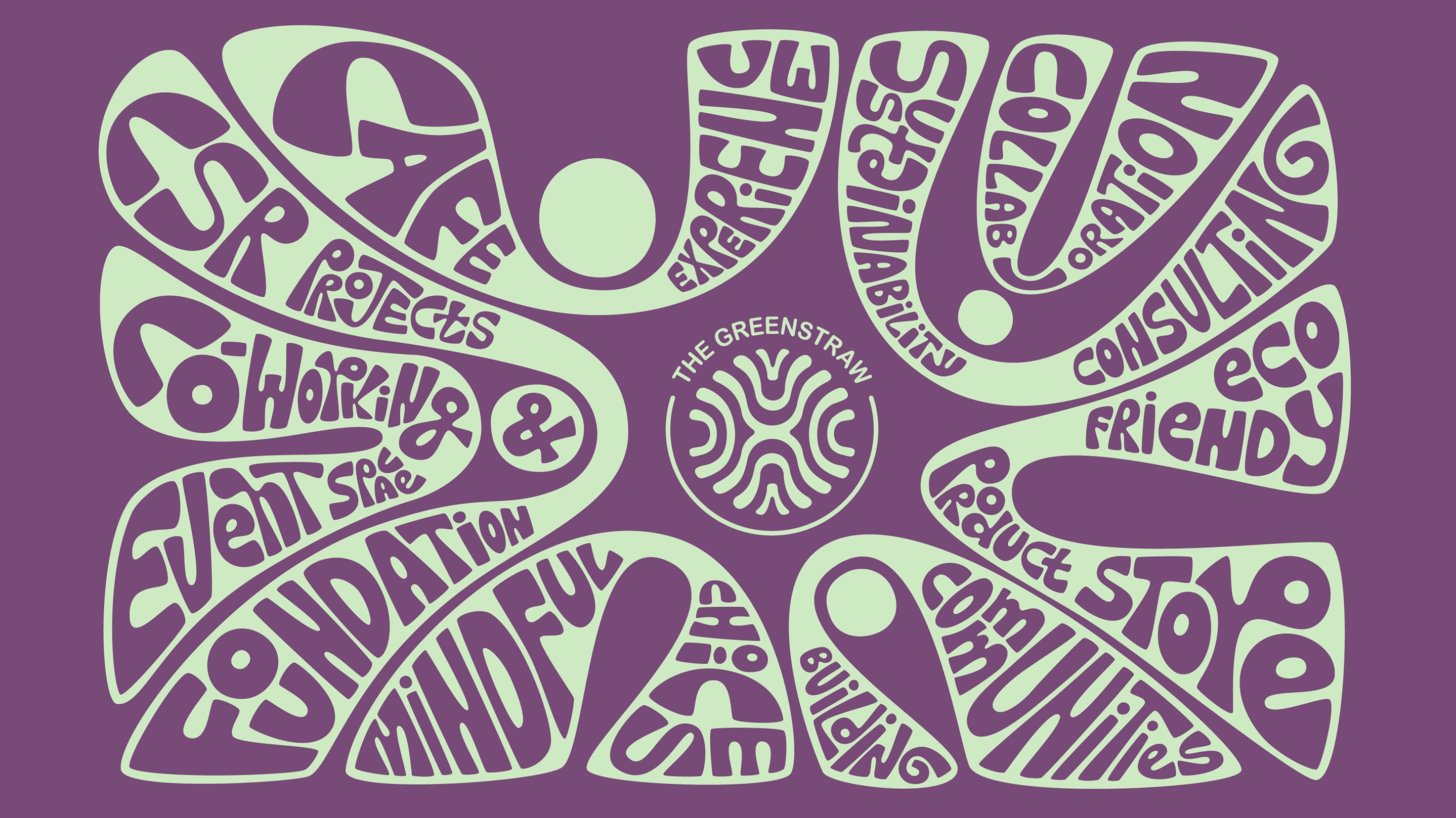
Key ideas like care, consumption, co-living and sustainability are arranged with flowing shapes that guide the eyes across the surface
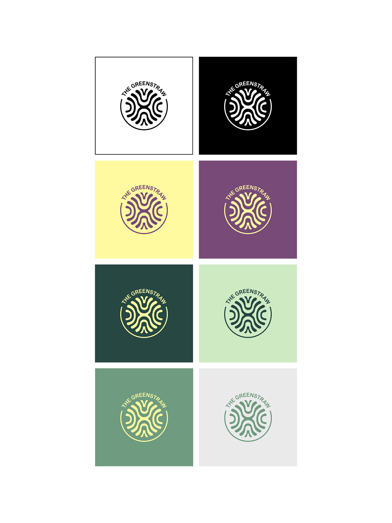
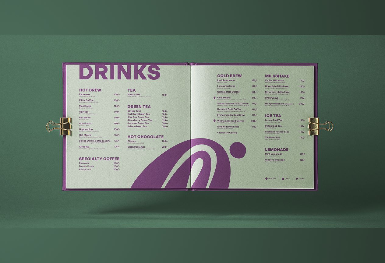
The palette works with a contrast between a deep, muted purple and a soft, organic green. We realized these accents of a lighter tone highlight the forms, allowing the system to remain legible. This project allowed us to create an identity that remains open-ended and grows alongside the community it is built for.

Sanjeeta Bhattachariya
2025