Coffeeverse Experience Center
Deliverables:
- Wall graphics
- Infographic Design
- Zine Design
Coffeeverse is a coffee roasting and brewing company, sourcing beans from the finest estates
We are bold, knowledgeable, and modern, blending education with lifestyle. Coffeeverse is not an attempt to make specialty coffee “cooler” or “hip”, it is only a representation of the coffee community and their lifestyle choices.
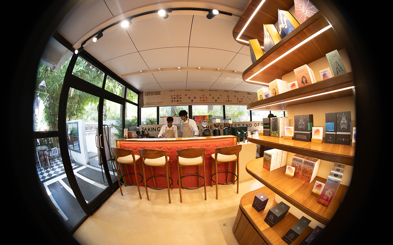
For us Coffee isn’t just a product—it’s a culture, a craft, and a statement. We worked with interior designer Dhruv Thakkar to design their tight-space specialty coffee experience center. Located within the Roastery Cultur Cafe, this is a small space that also houses their industry standard Giesen roaster.
This project started with comprehensively looking at sensory sciences around coffee. Creating a unique set of concerns that guided all material, visual and interior design decisions. Working closely with Dhruv we created a brief that would simplify and enhance the experience of drinking at an omakase coffee bar. A clear idea of sensory perception can be brought when there are lesser variables creating subjectivity and bias.
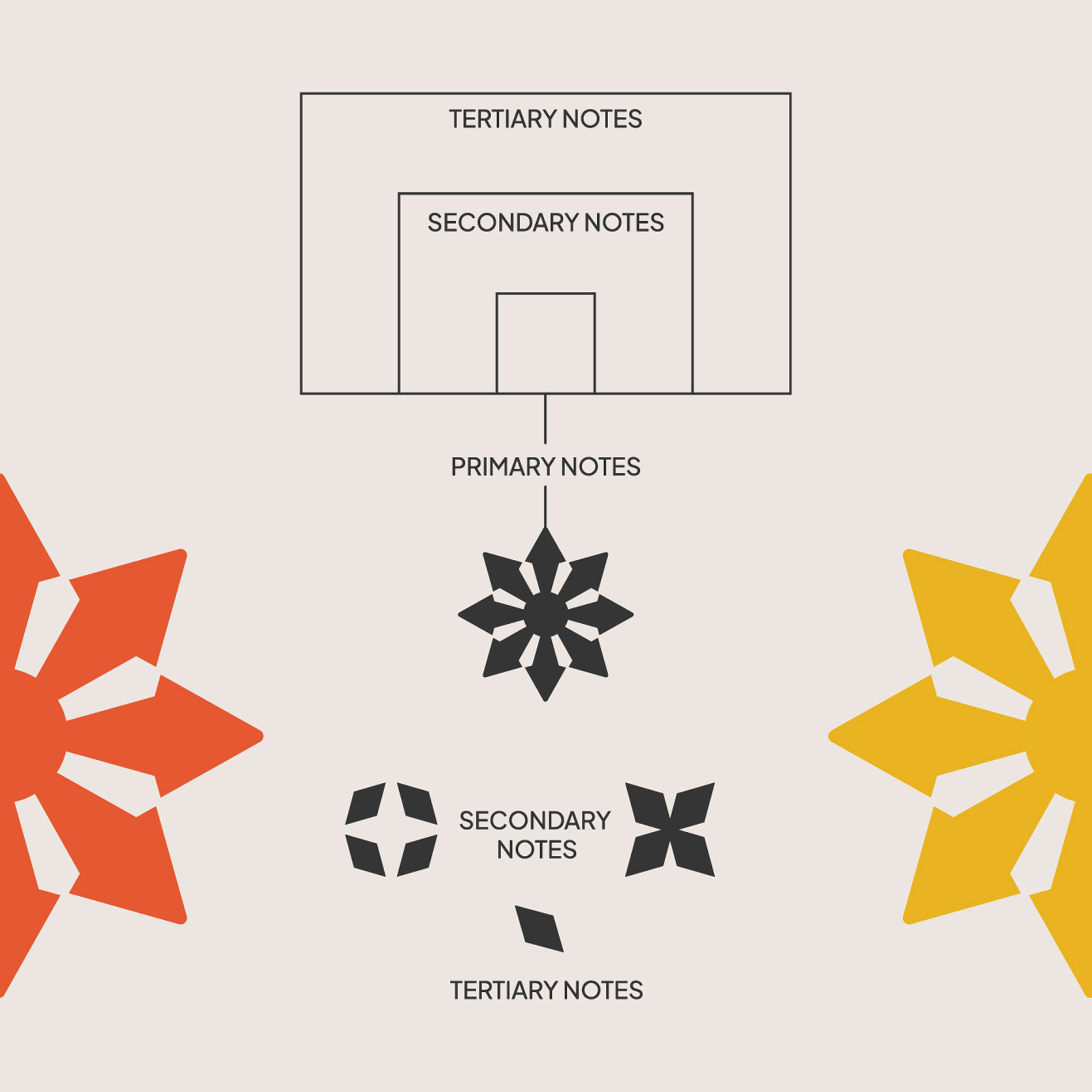
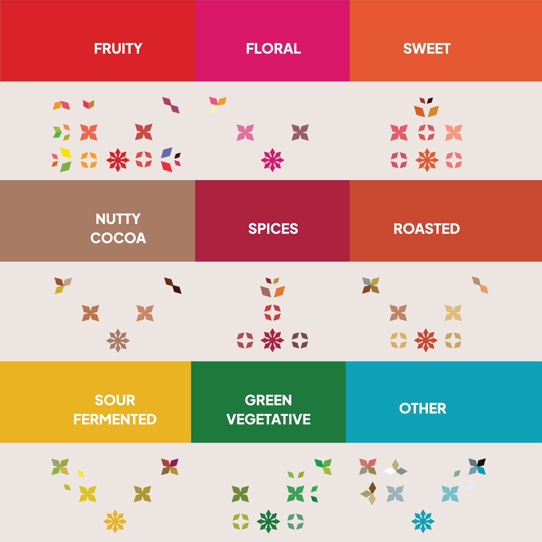
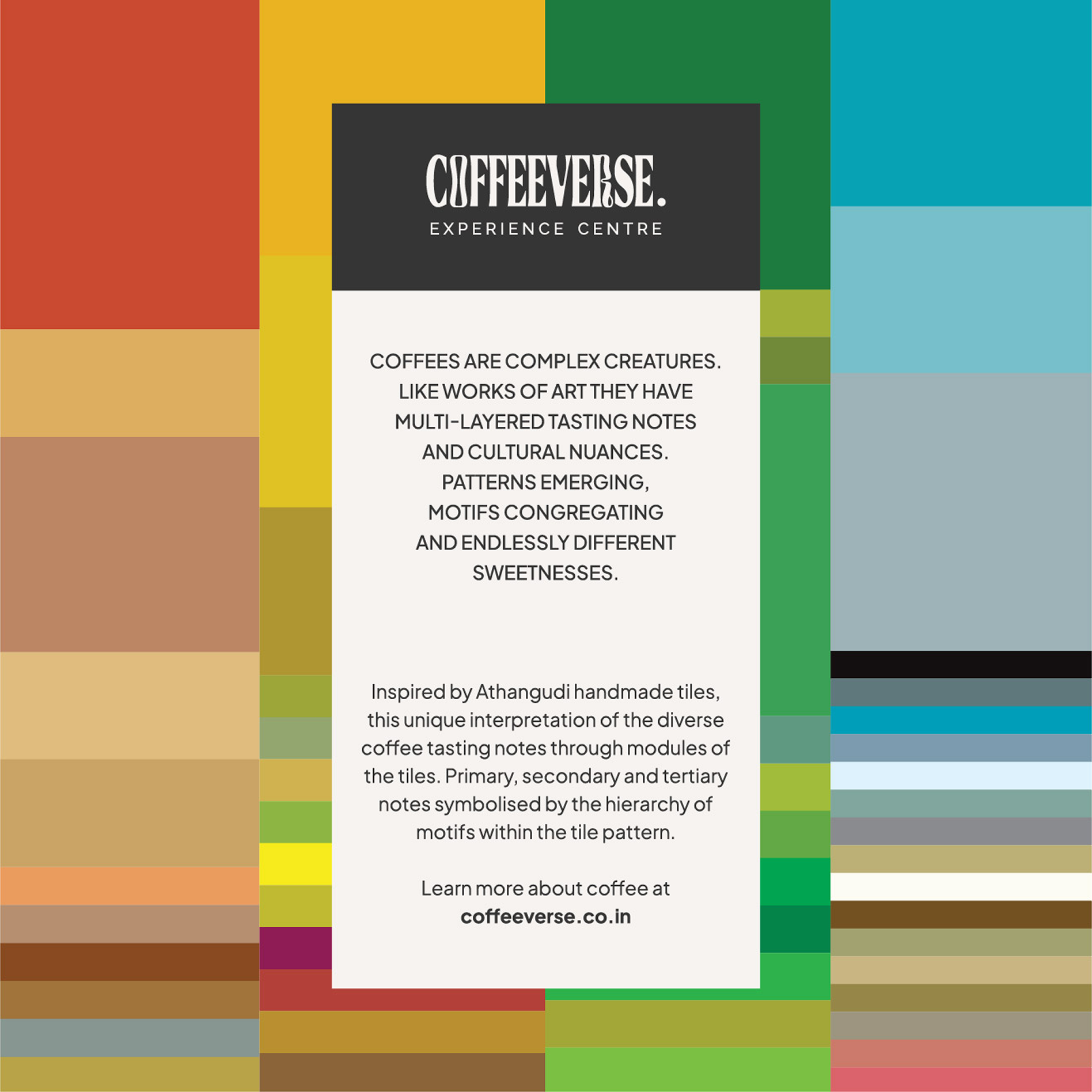
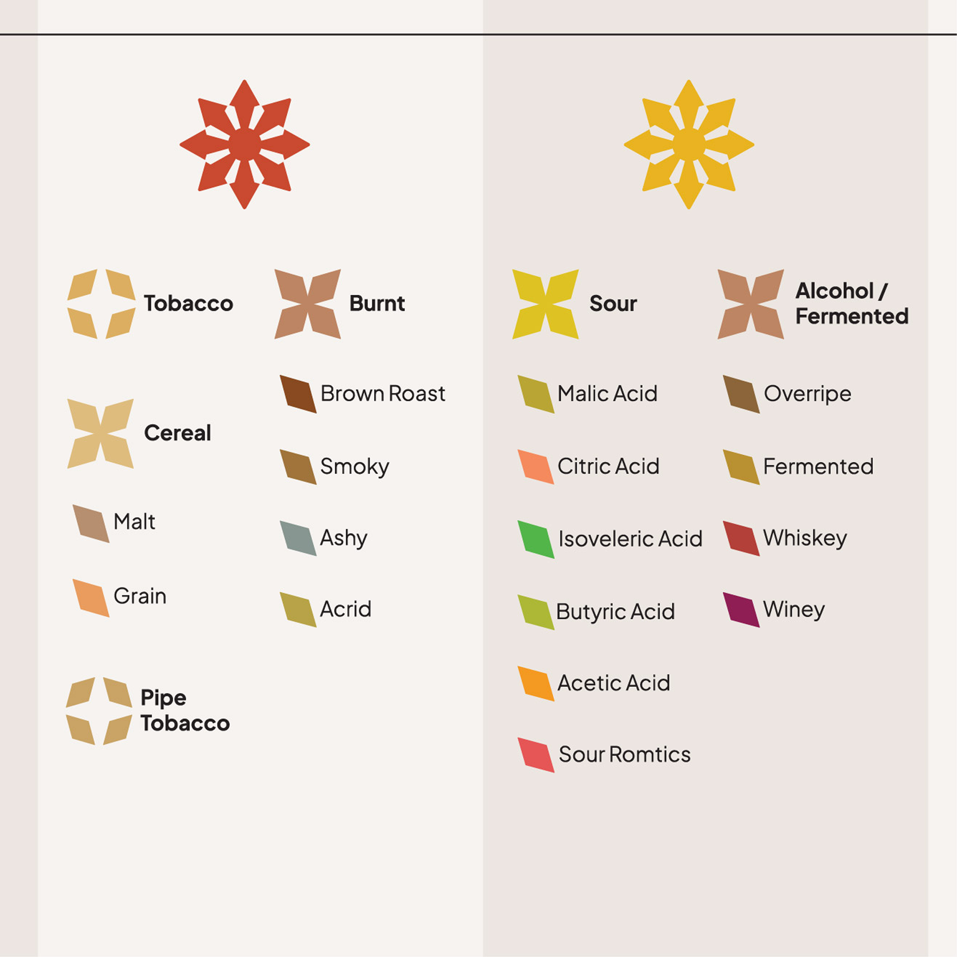
Within the Coffee Sensory and Cupping Handbook by the SCA (Specialty Coffee Association), you will find the definition of tasting bias.
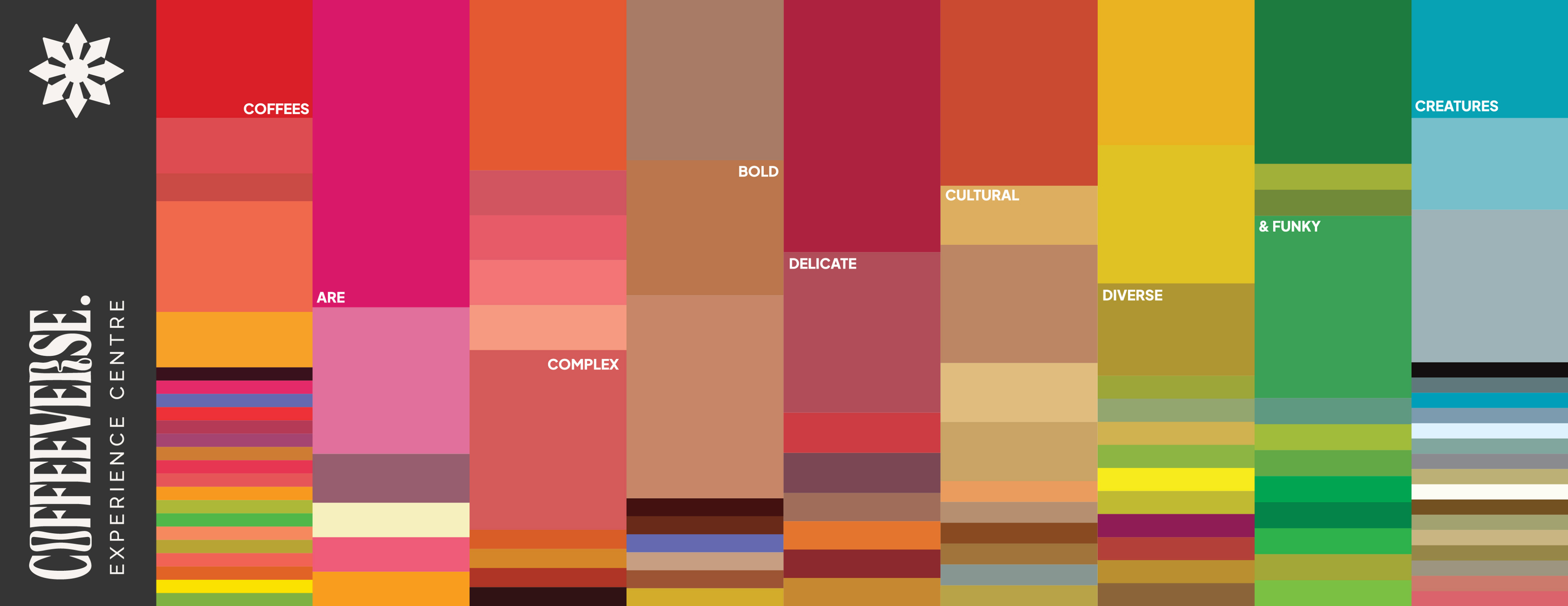
At times cultural, at times personal and also dependent on the colors on the cup and in the space. We wanted to reduce the amount of visual stimulants in the space and let colors only be definitive of the colors within the tasting wheel. We want the customers to have a vocabulary of colors around them to associate with, but we do not want to create an environment which stimulates the viewer in one particular way.
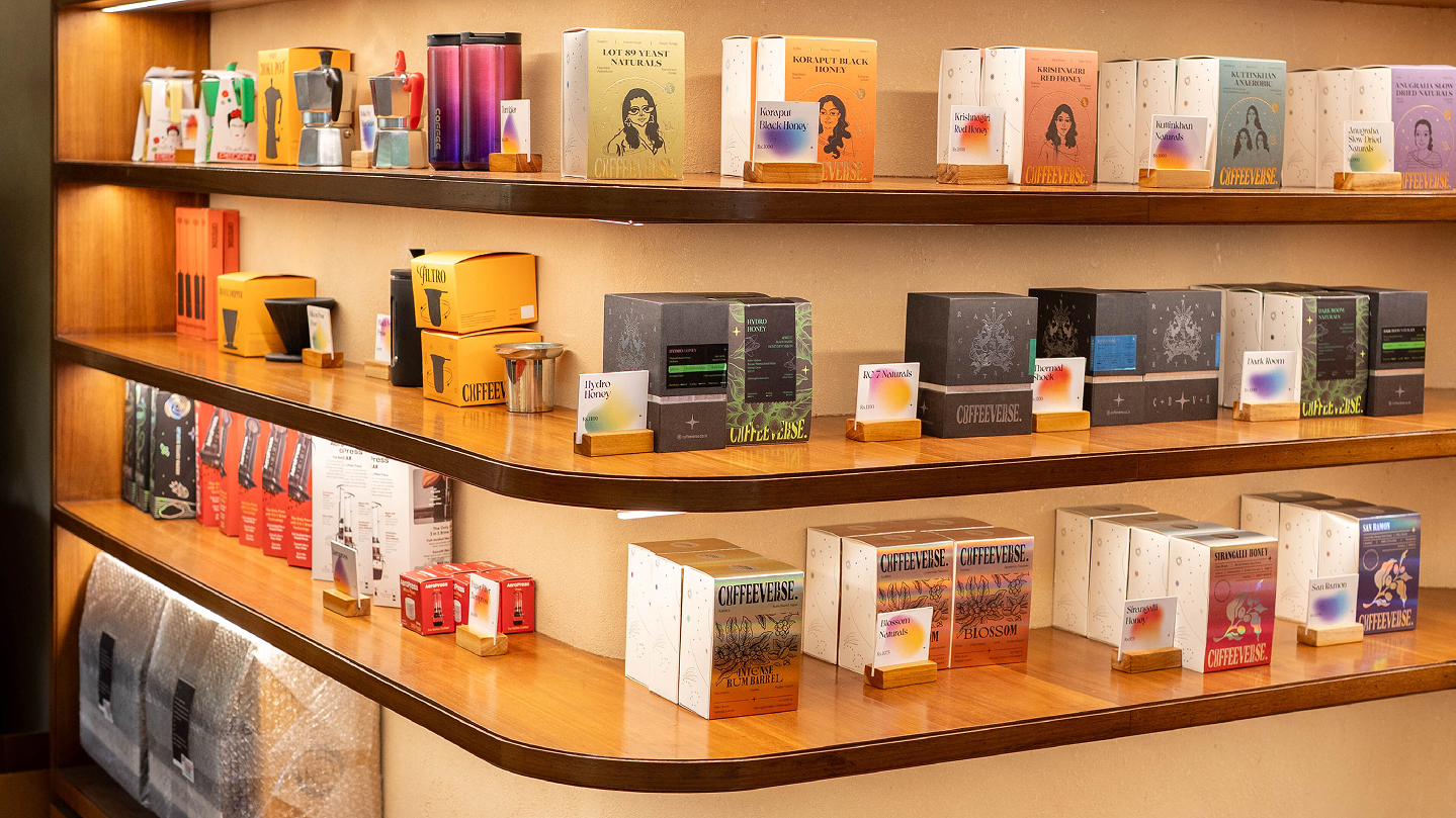
The emphasis on uniformity of warm and muted colors, largely reflecting natural materials and surfaces. Possibilities of lighting variations that can make the space dark and cozy versus well-lit and clinical. A simple, intuitive layout that saves space and allows for the omakase experience.
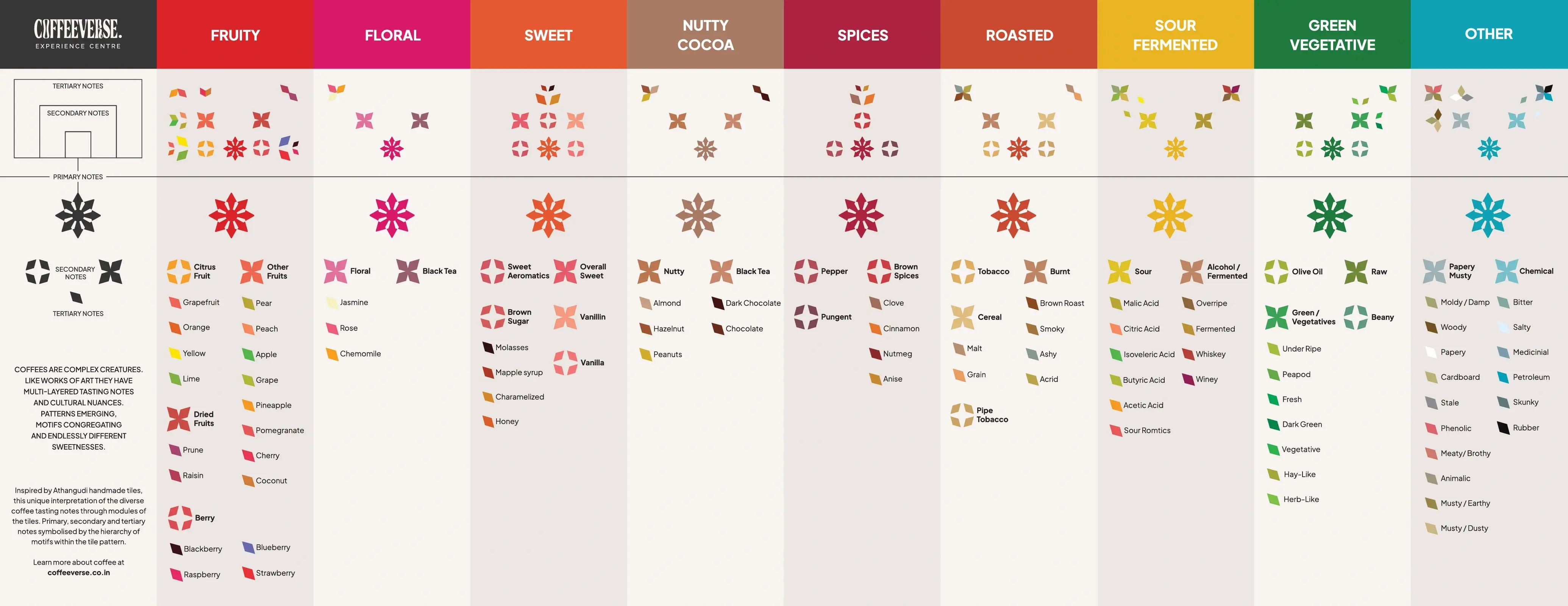
The presence of the colour wheel in the form of environmental graphics, abstract enough to let the colour associations remain passive, the bar provides hand held coffee colour cards for direct associations. We worked with visual stylings from the craft of Athanguri Tiles to develop unique floral motifs that can break down tasting notes into ornamentations.
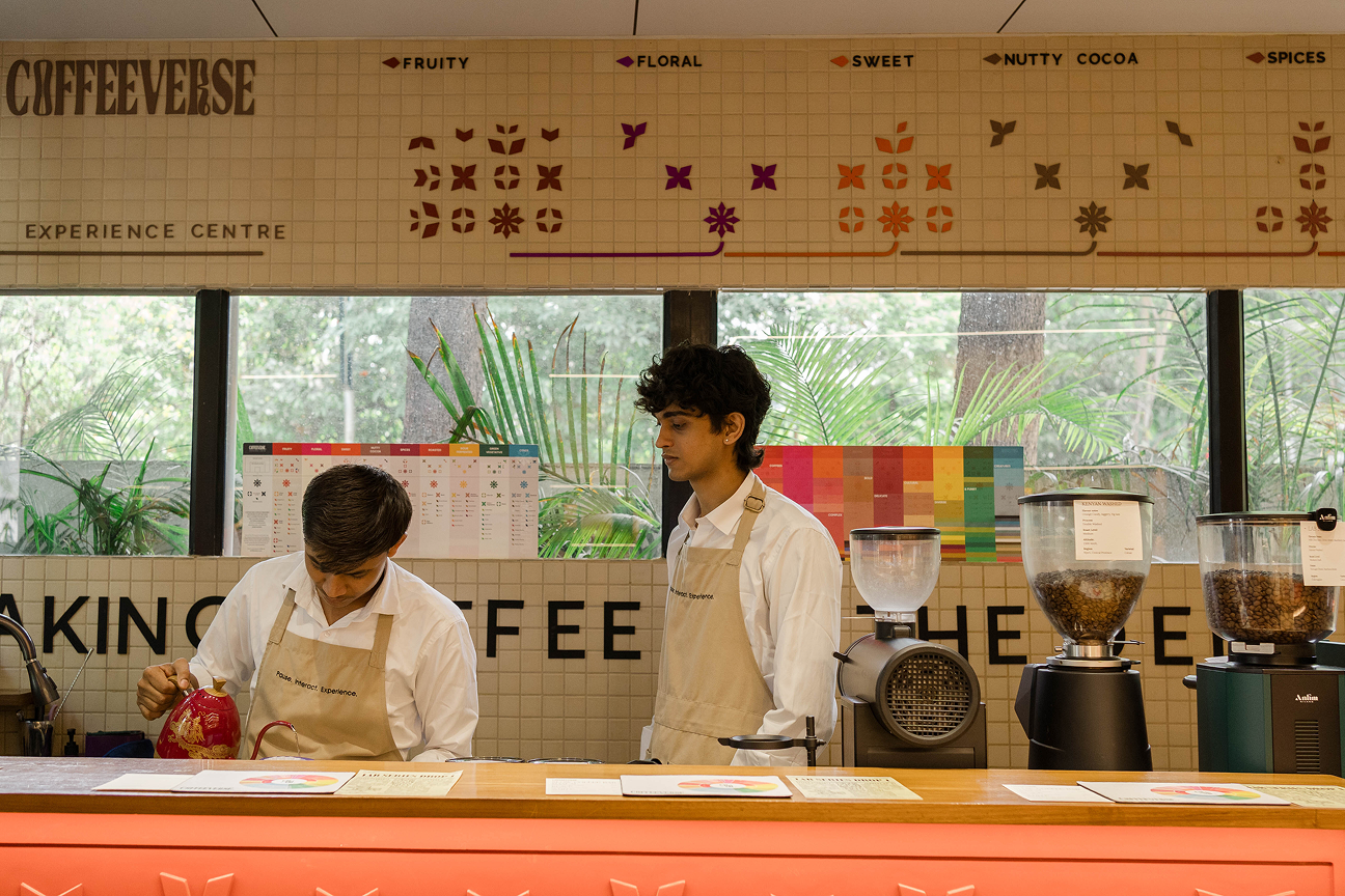
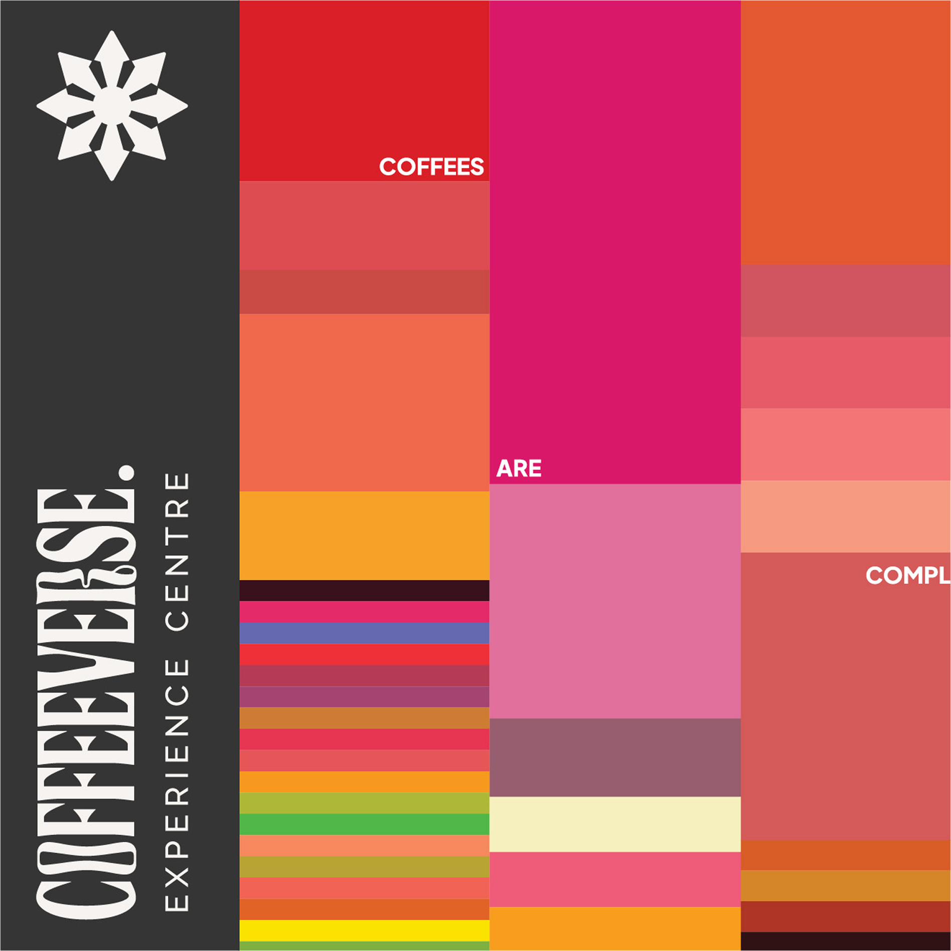
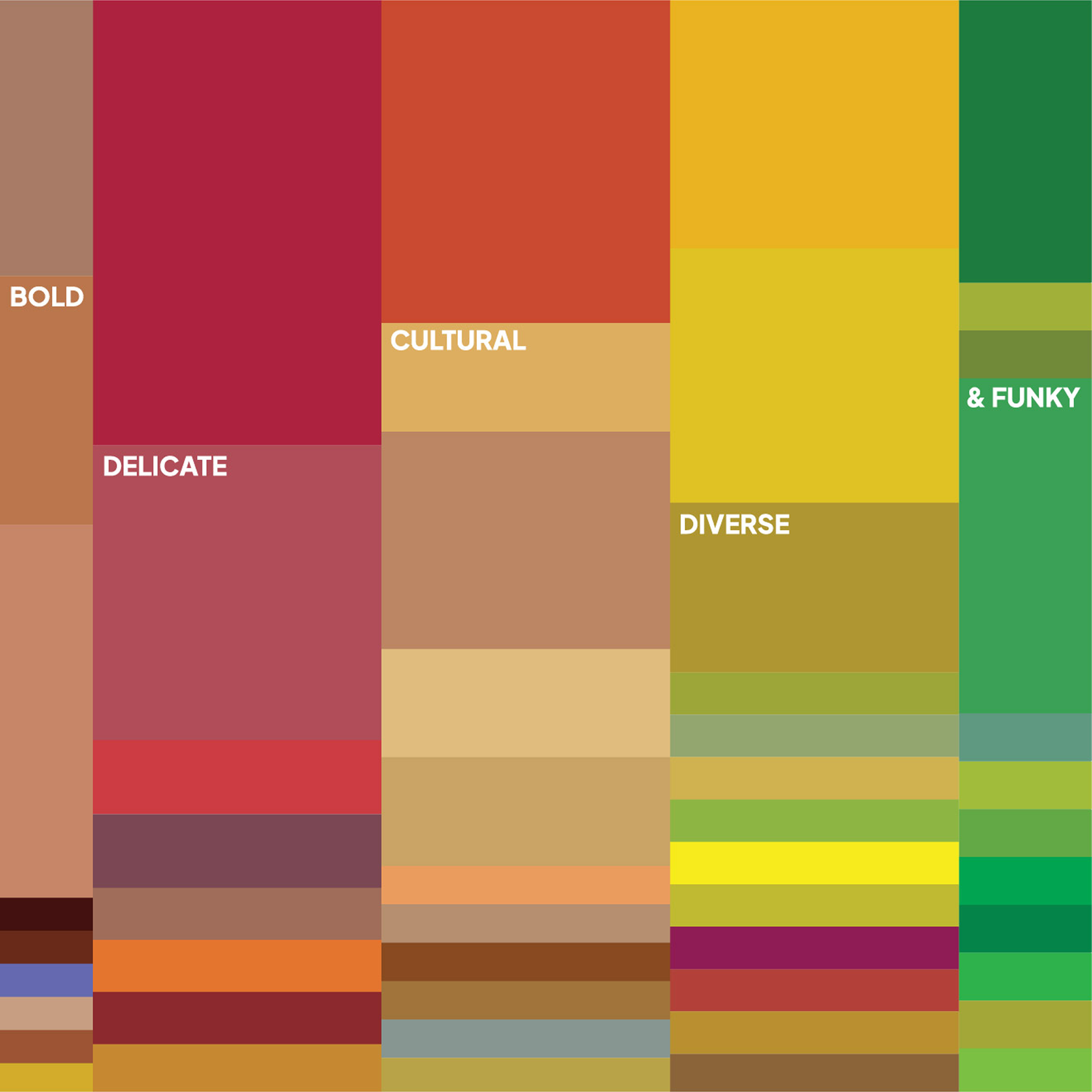

Within the space, tasting notes become ornamentations and aesthetics, on the table the motifs break down into legible flavors. Such subtle visual interventions appear across the space. The interior design is merely a facility of understanding specialty coffee.
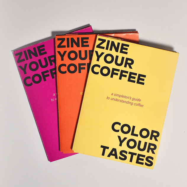
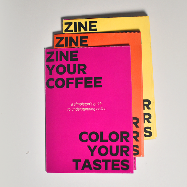
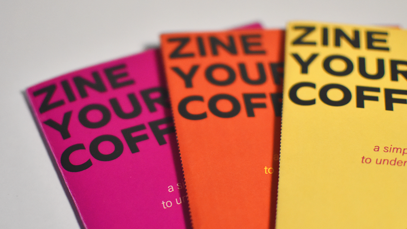
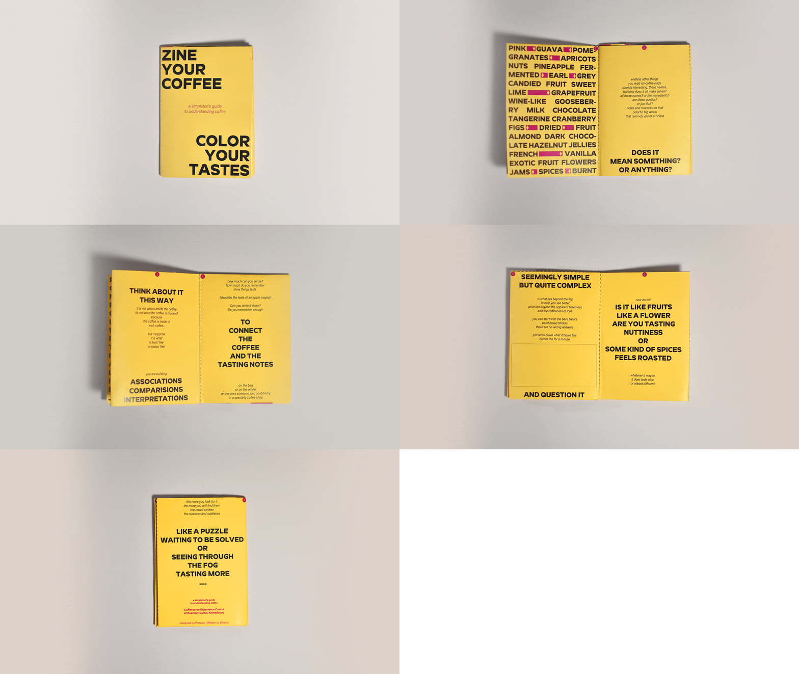
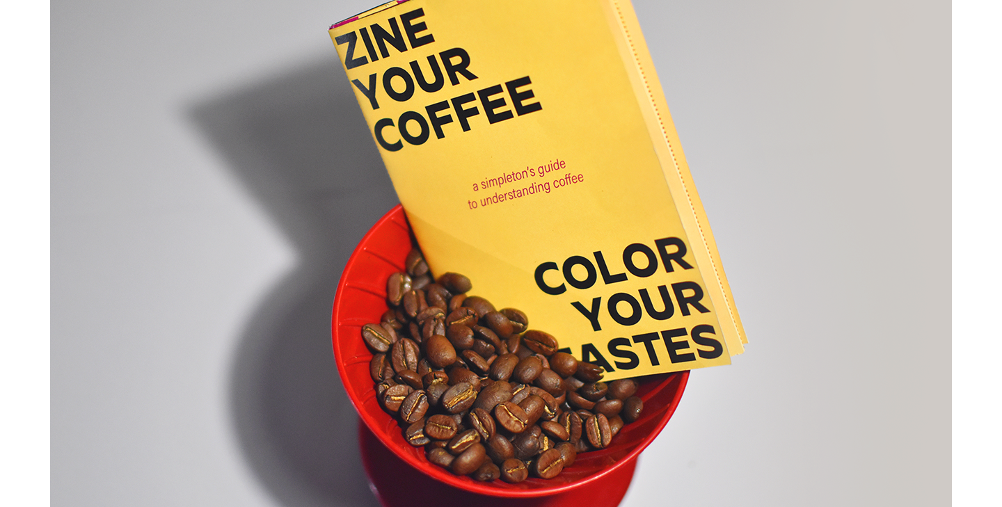
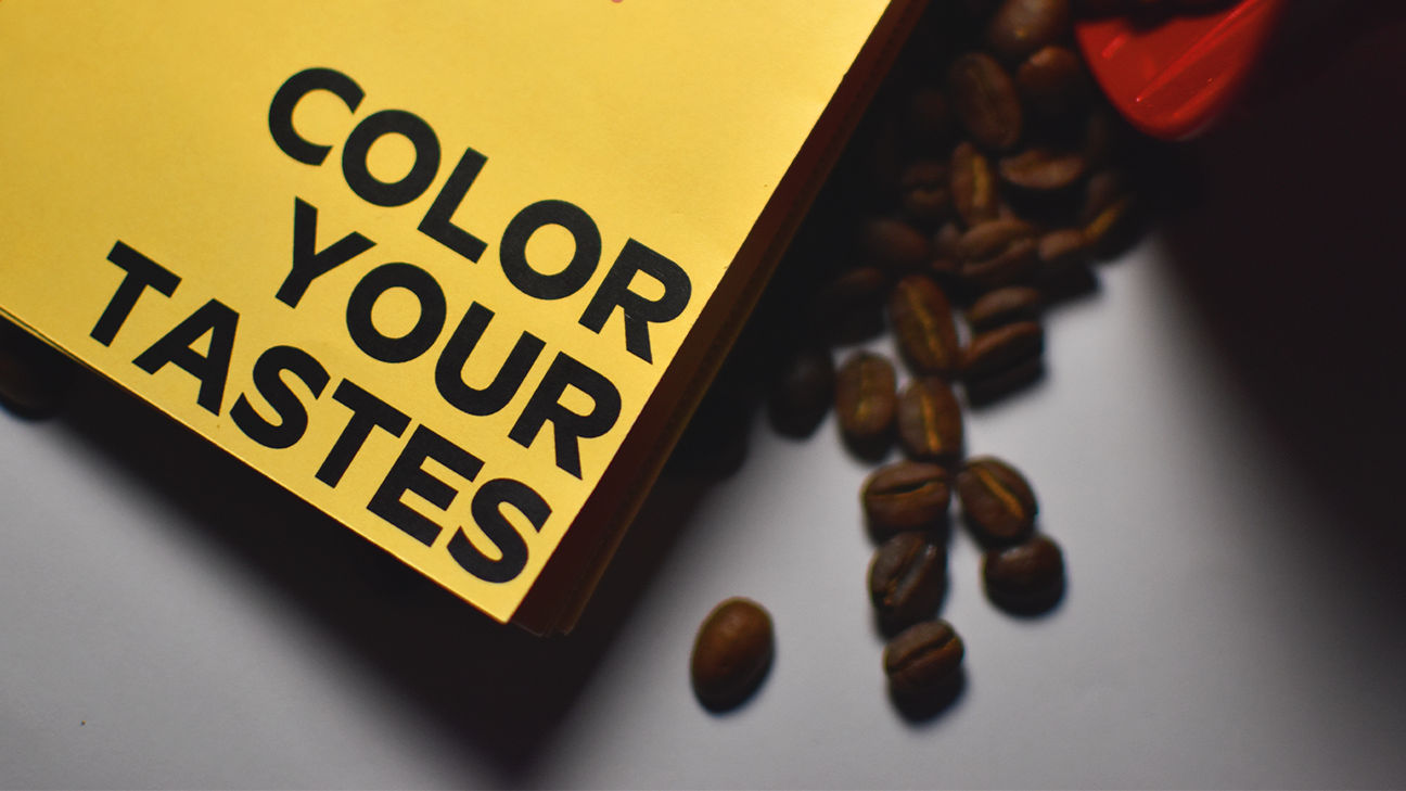
There was more to be done to bridge the gap between experts who understand flavor perception and people who are new to the sensory aspect of specialty coffee. We also designed a zine ‘Zine your Coffee, Color your Taste’. It explains through simple associations, how flavor perception in coffee works, educating the reader on the complexity of the coffee species.
Leap Frog
2024