Bigly
Deliverables:
- Logo Identity
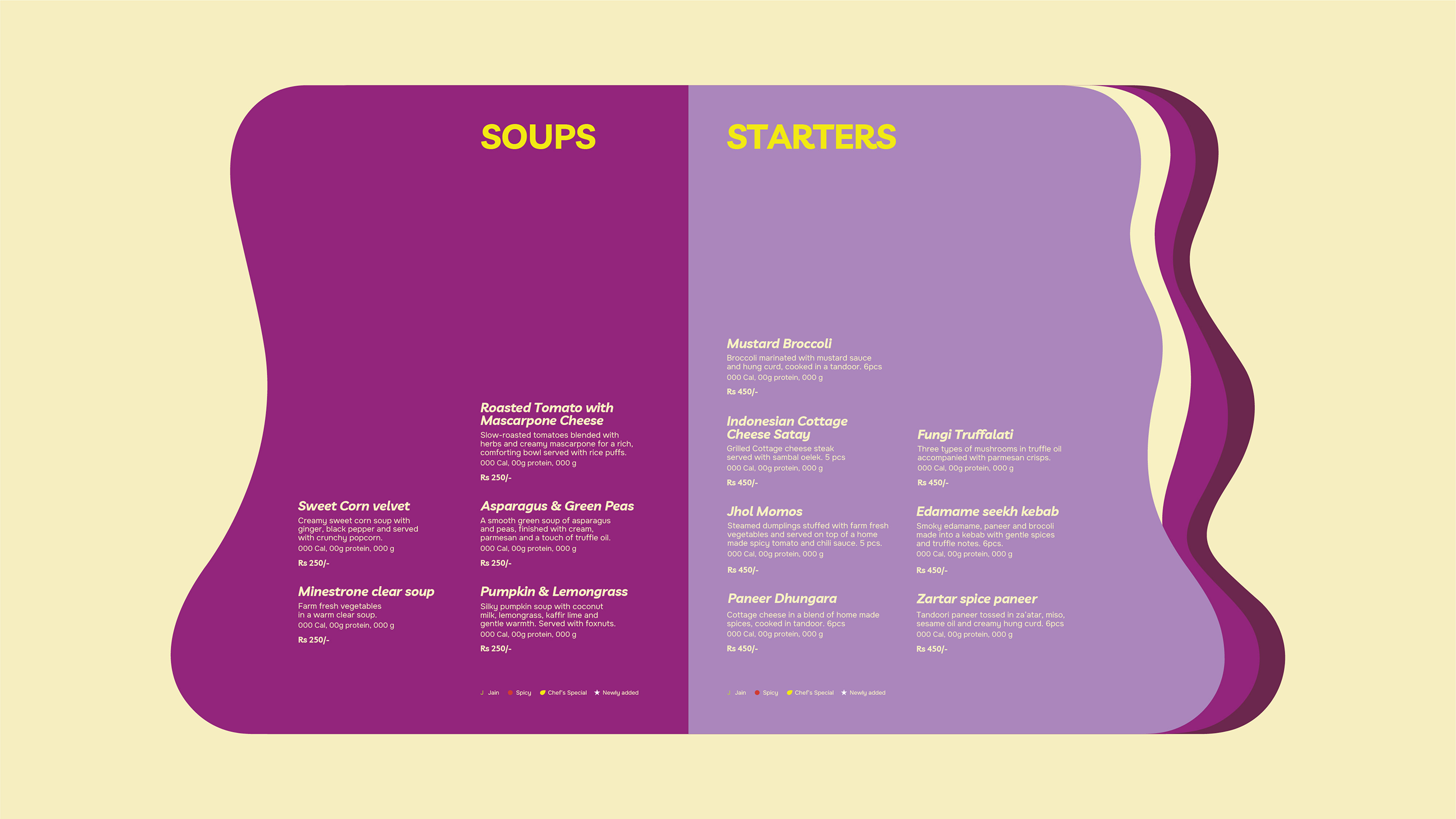
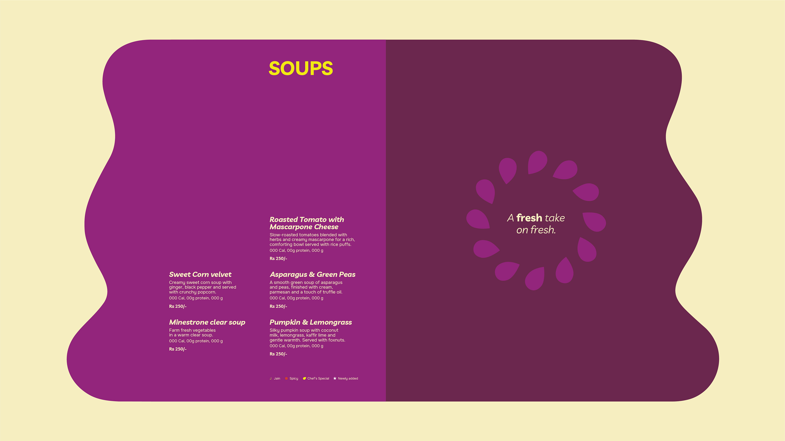
- Menu
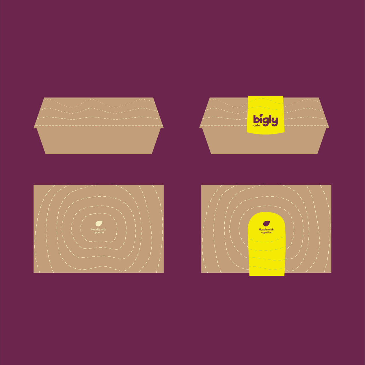
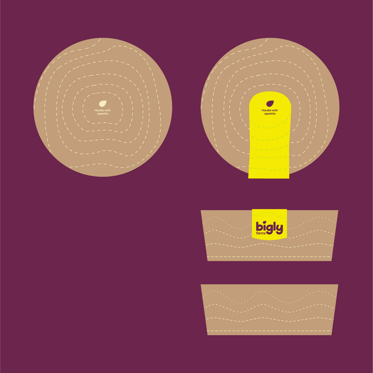
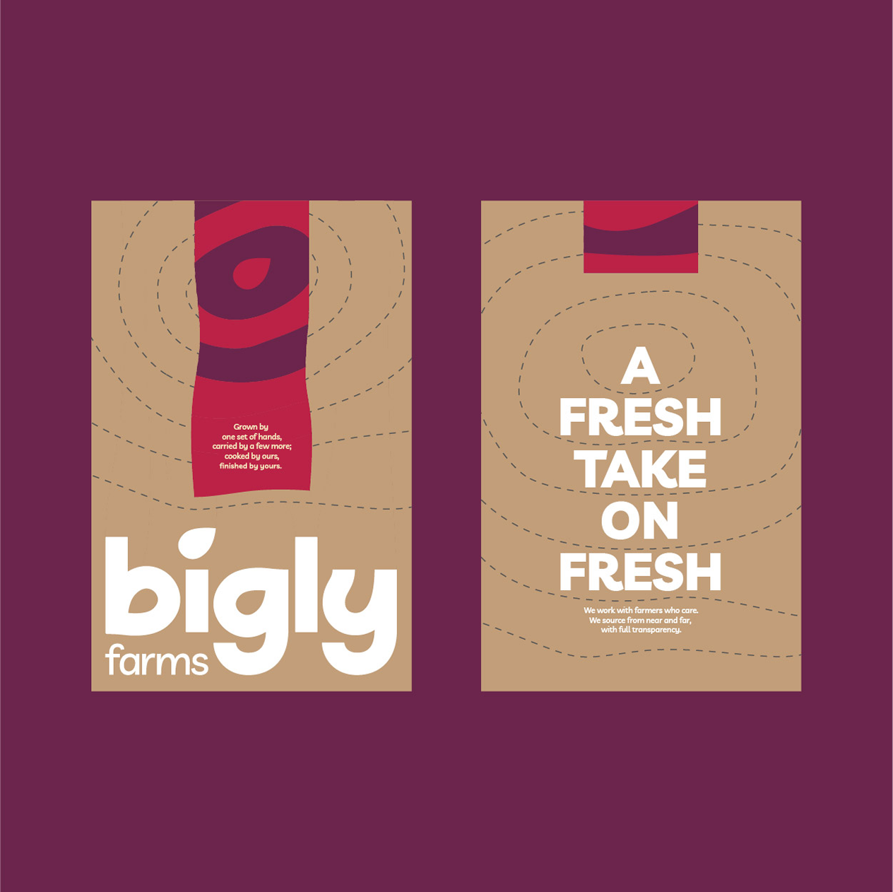
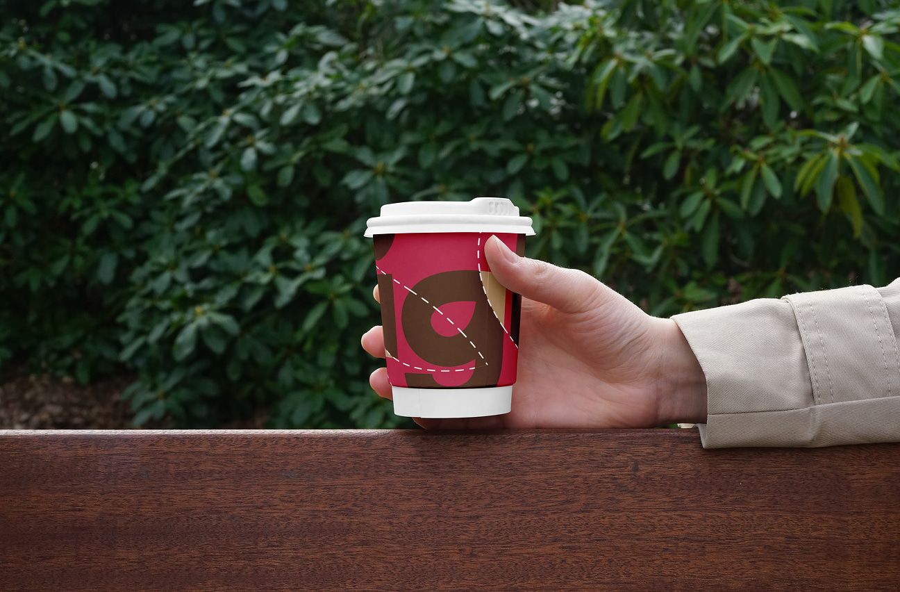
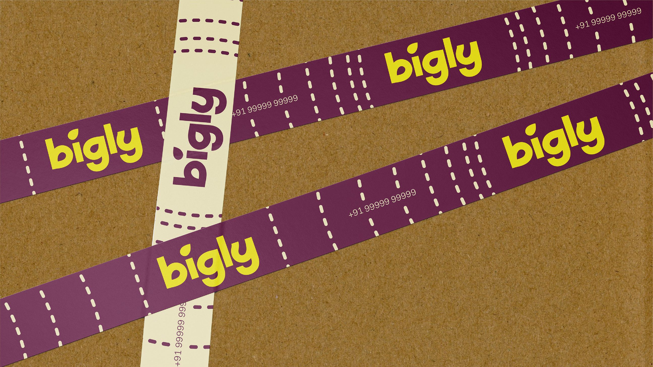
- Packaging Design
- Uniform design

As both a B2B and B2C brand producing their own food, Bigly operates in a space often defined by functional narratives; preservative-free, guilt-free and process-driven
In 2025, we worked with Bigly on a complete rebranding, repositioning them within the growing market of healthy foods. Our approach was to shift this perception. Alongside its nutritional value, we wanted the idea of taste to be at the foreground. Something sensory, stimulating and instant. This project became an exercise in understanding food as a system that begins with cultivation and ends in a culinary experience.



Conversations with the founders repeatedly brought us back to the idea of the seed

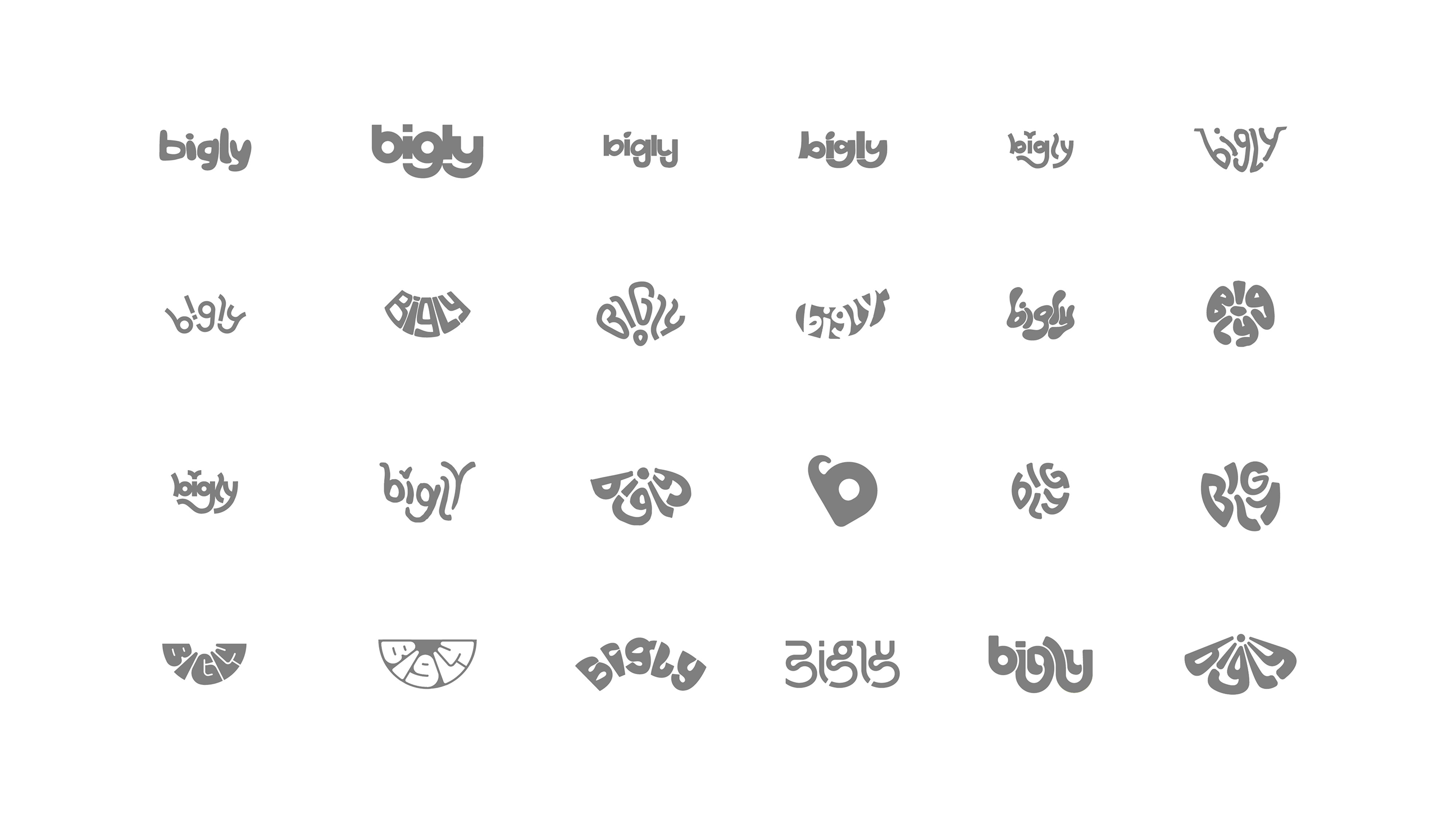
The logotype emerged through a type-led exploration, where we worked through iterations to balance seemingly opposing qualities of ‘premium’ and ‘playful’.
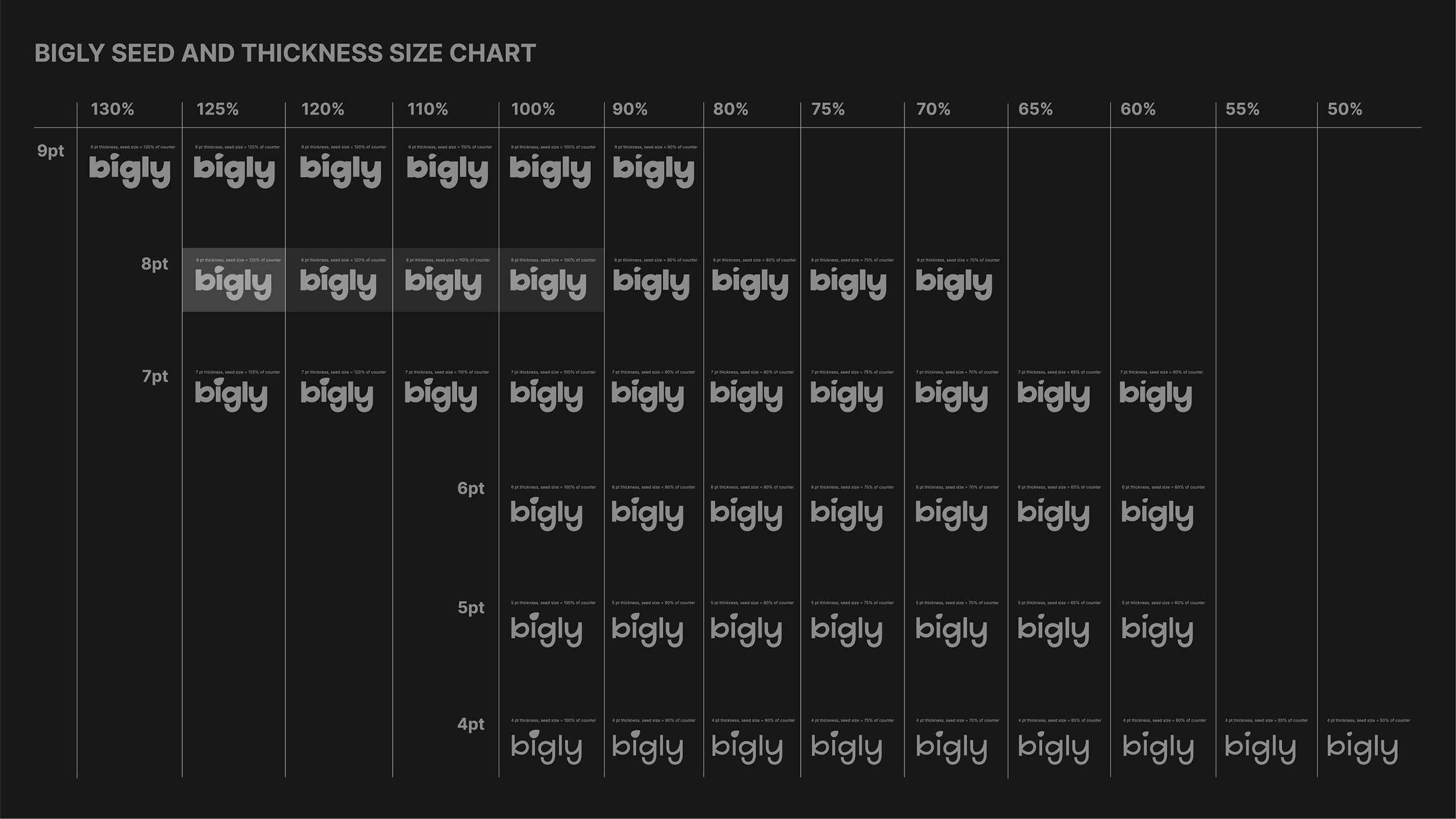
To make this process easier for the clients, we adopted a diagrammatic approach in our presentations, mapping even the smallest shifts in form.
We paid close attention to Bigly’s existing touchpoints, particularly their digital presence.
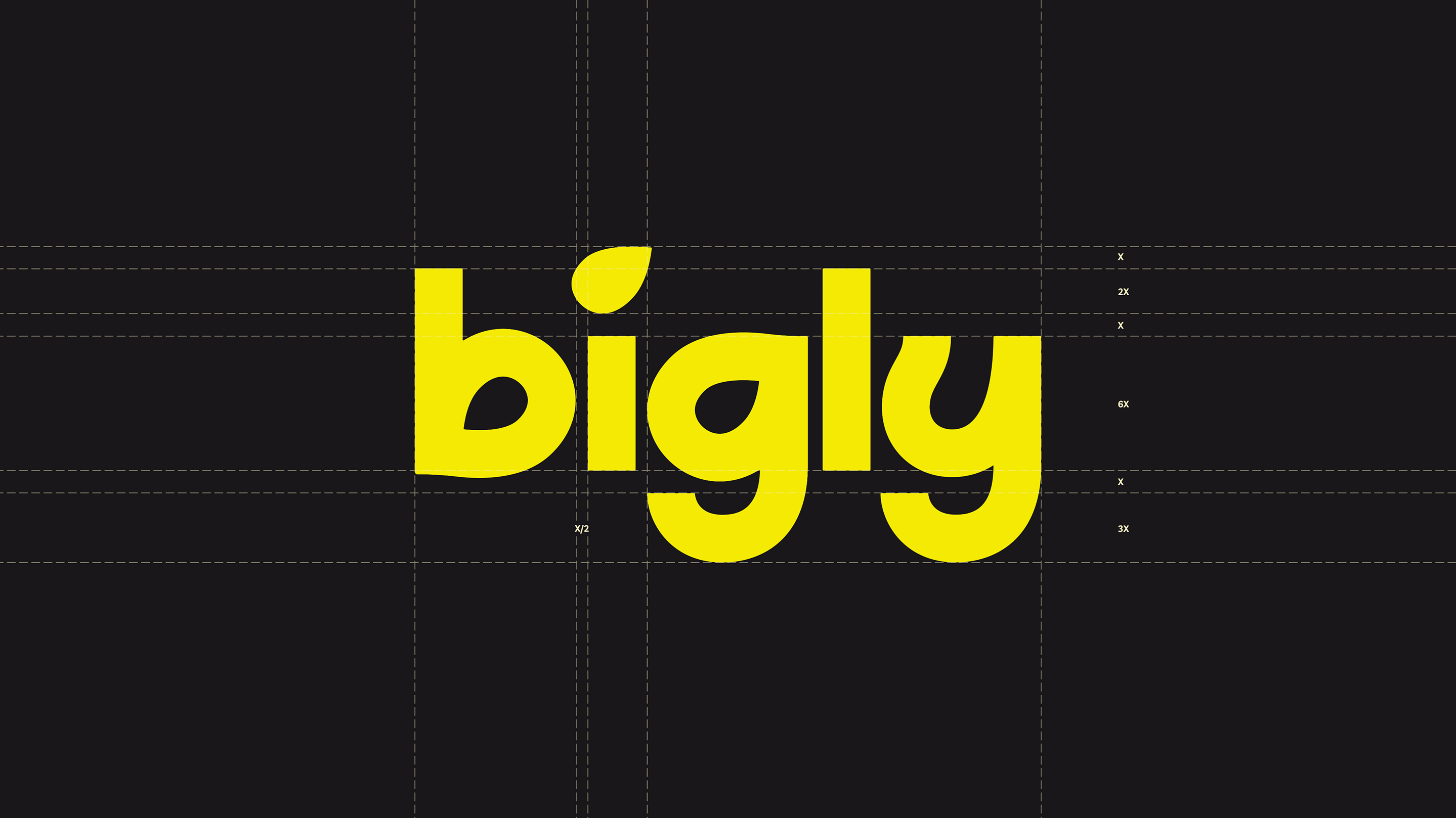
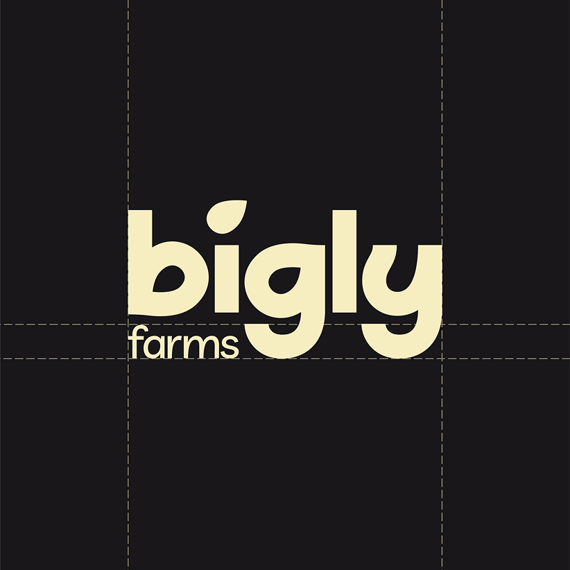
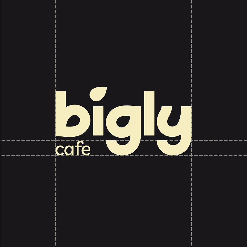
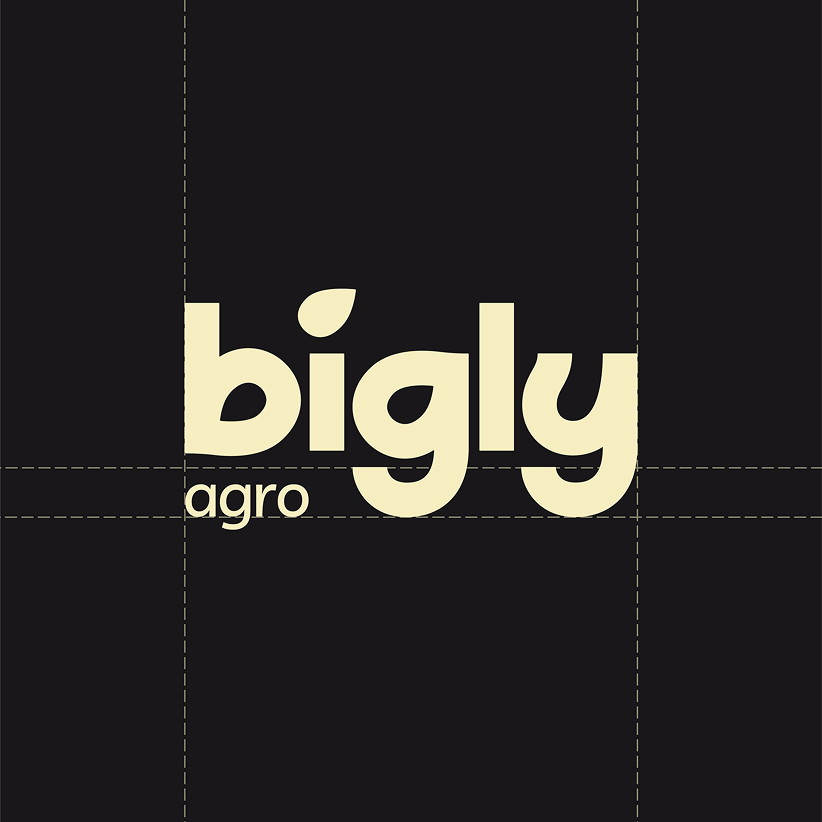
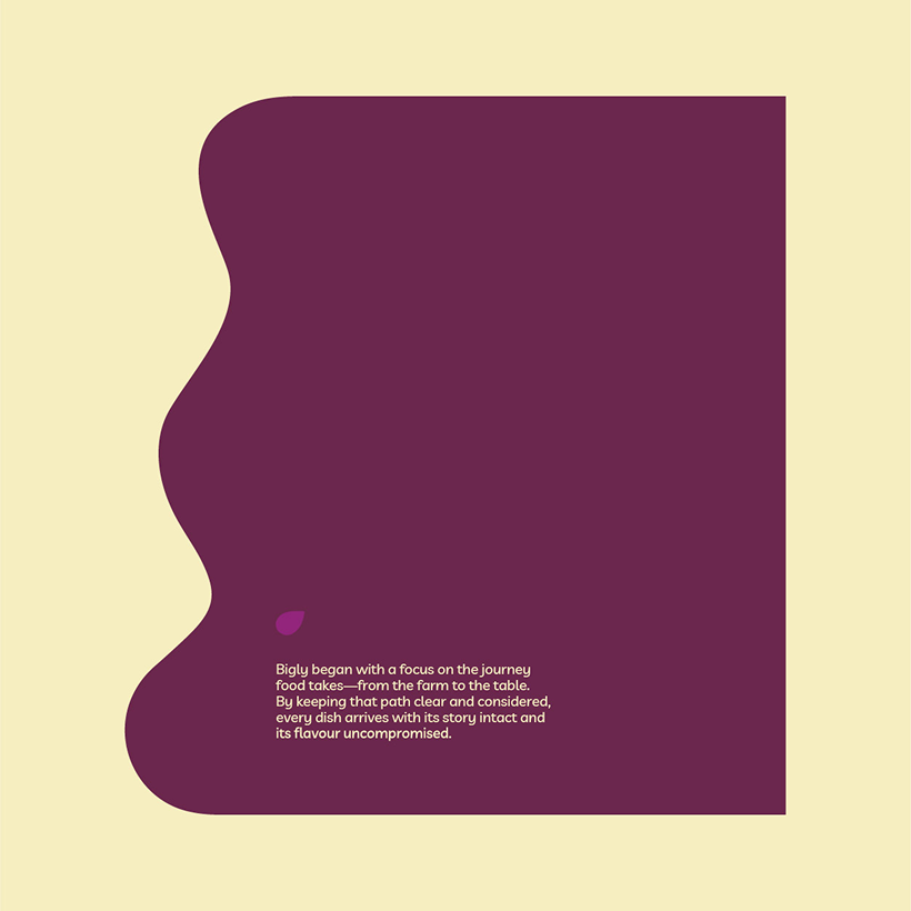
For Bigly, the seed is the source from which an entire ecosystem emerges. If the farmer is at the centre of the story, then the seed is where it begins. This became the conceptual anchor for the identity



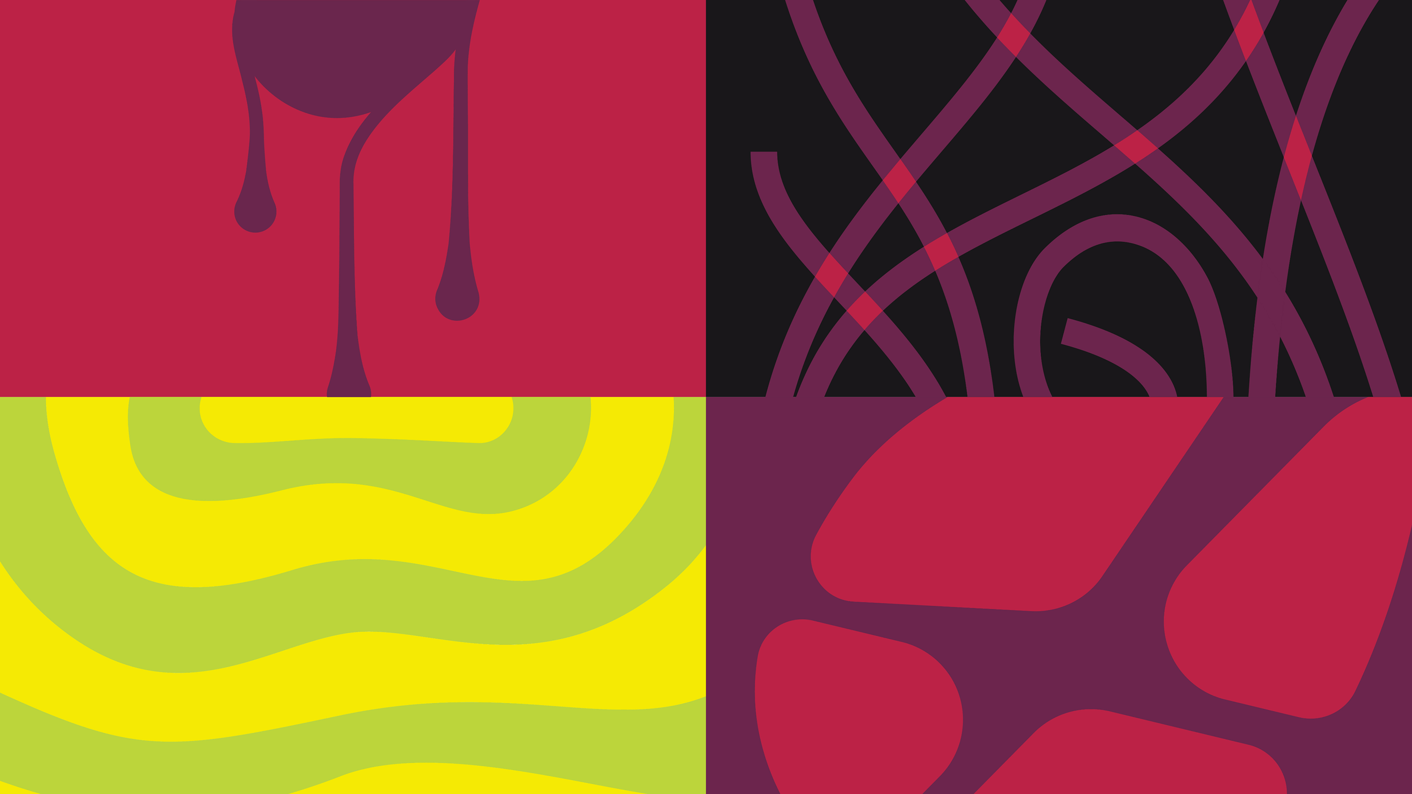
We paid close attention to Bigly’s existing touchpoints, particularly their digital presence
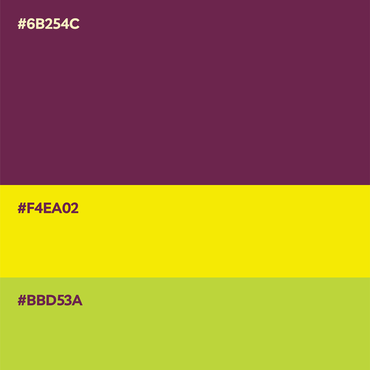
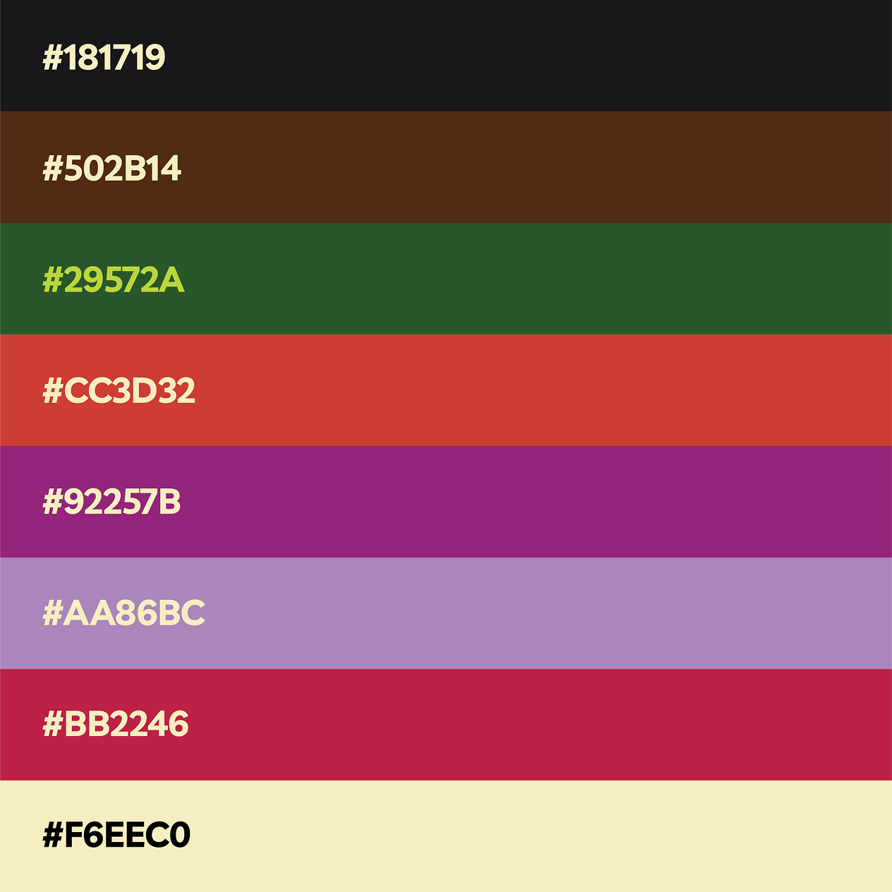
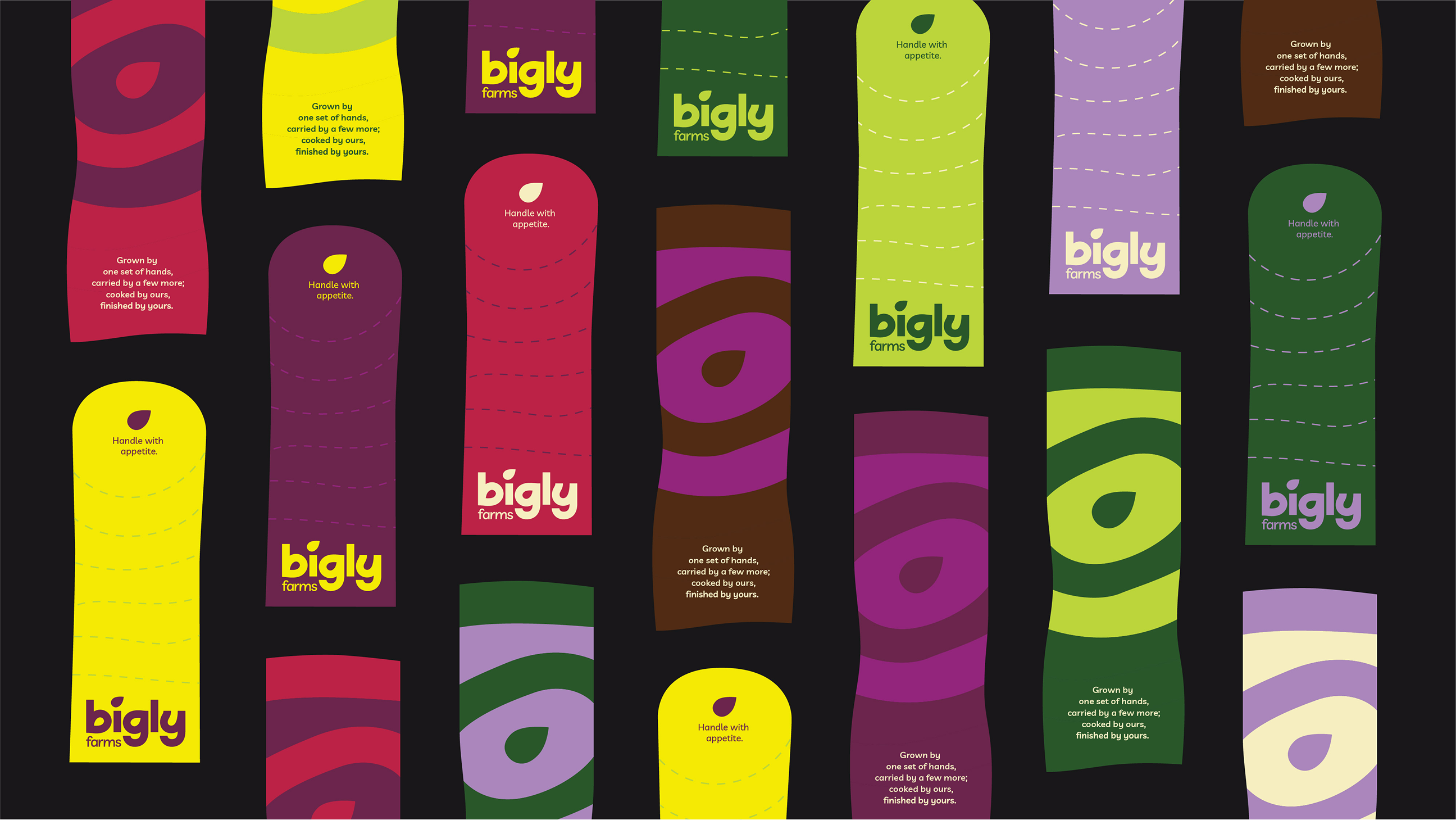
The primary plum tone and supporting palette arrived from this study. These colours carry a duality which is expressive and playful at first glance, but grounded enough to align with a sense of quality and care. The idea of slowly building the identity through layers of understanding, allows each element to reveal as parts of a system, rather than explaining it all at once.

We began with the idea of a seed and its gradual transformation into stem, leaf, and eventually a larger ecosystem.
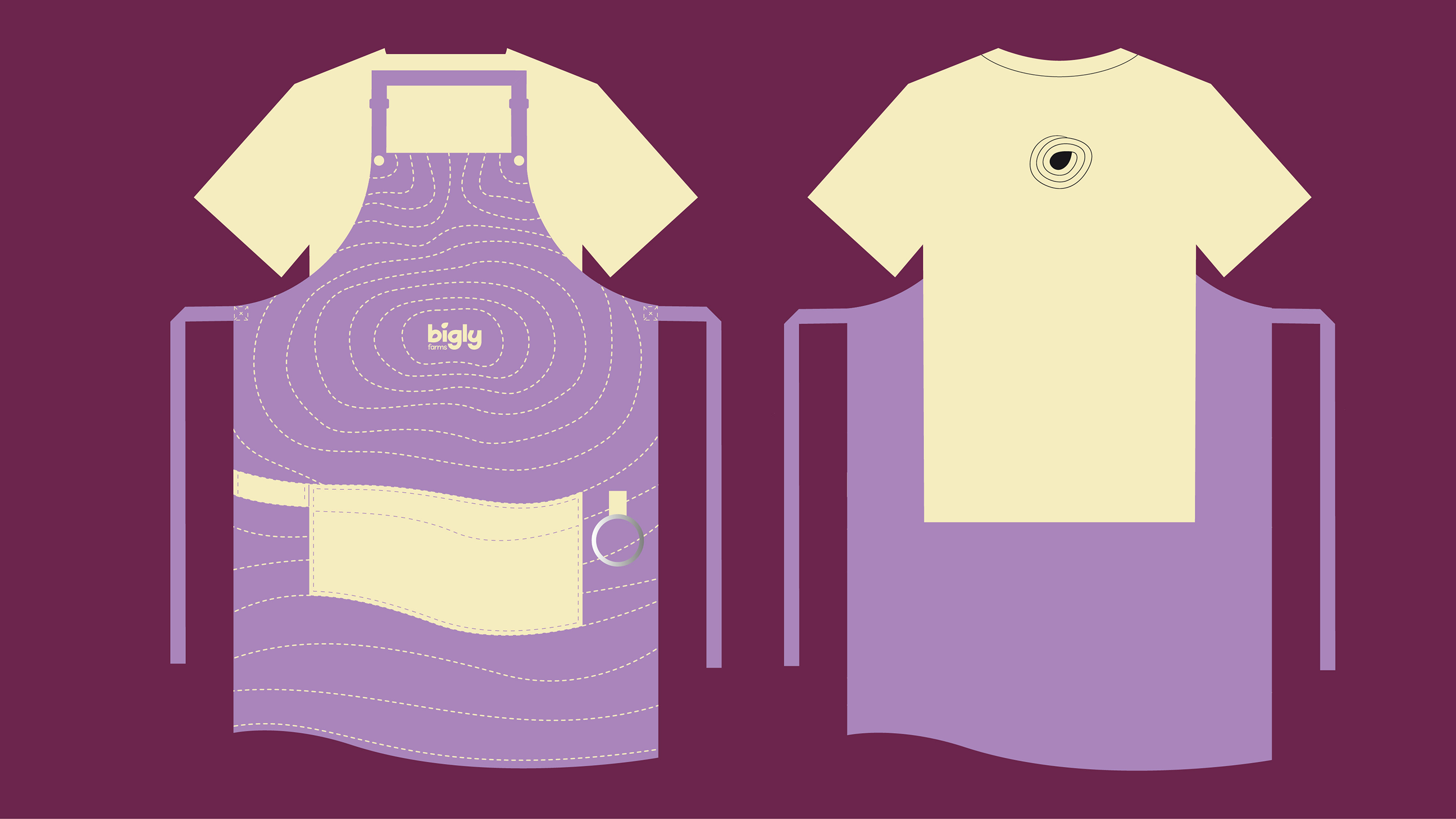
This logic extended into multiple layers of the program. Within their restaurant, it imagined different interactions- the staff wore these stages as seed, pulp, and crust. The same idea applies to the menu and other collateral.

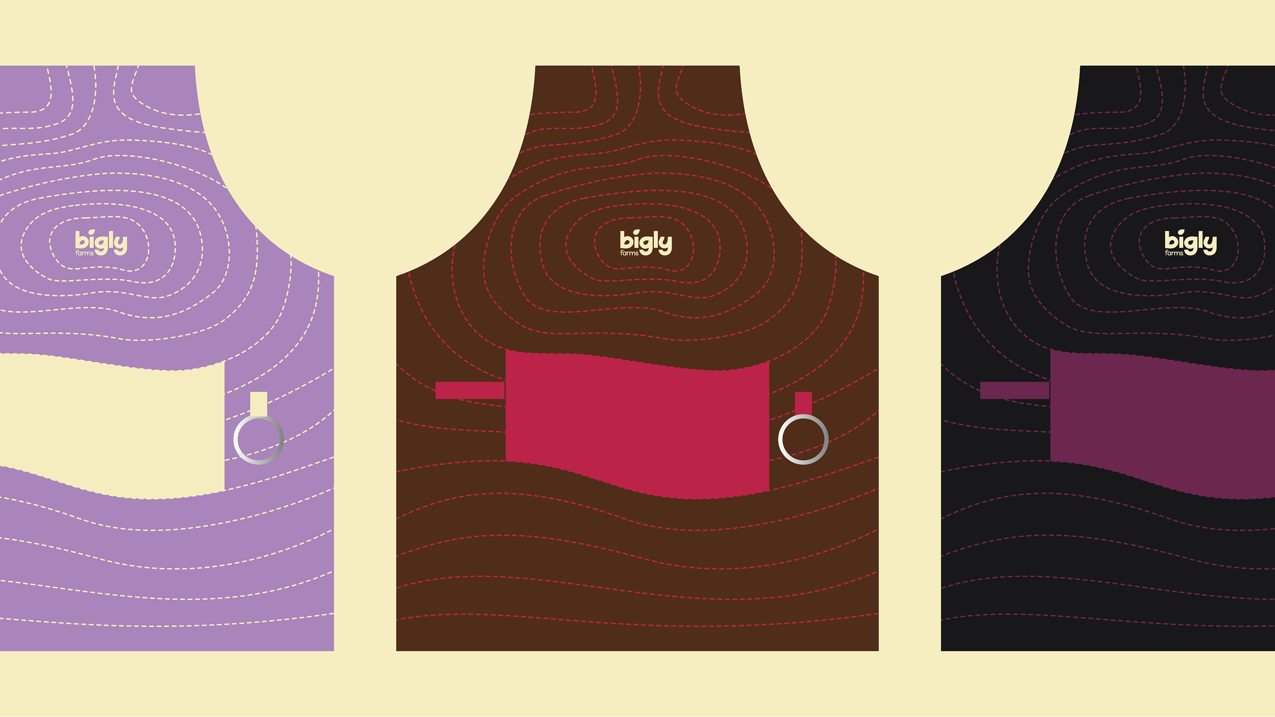

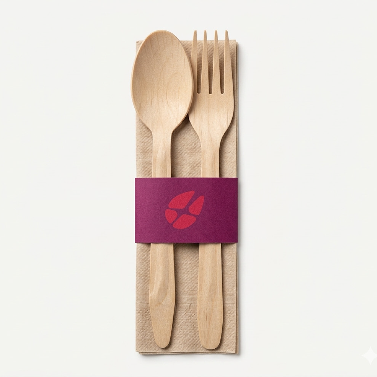

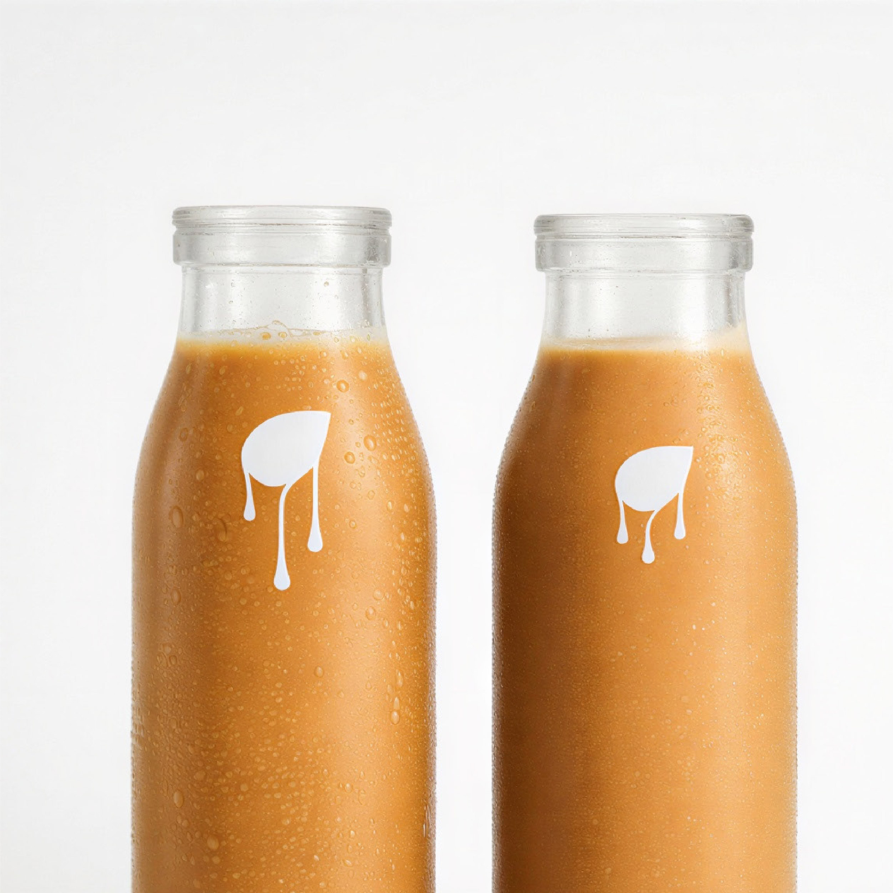
The result is an identity that invites curiosity to look at food as a living system.
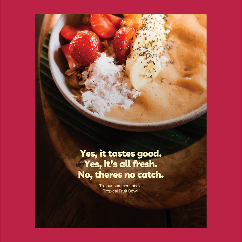
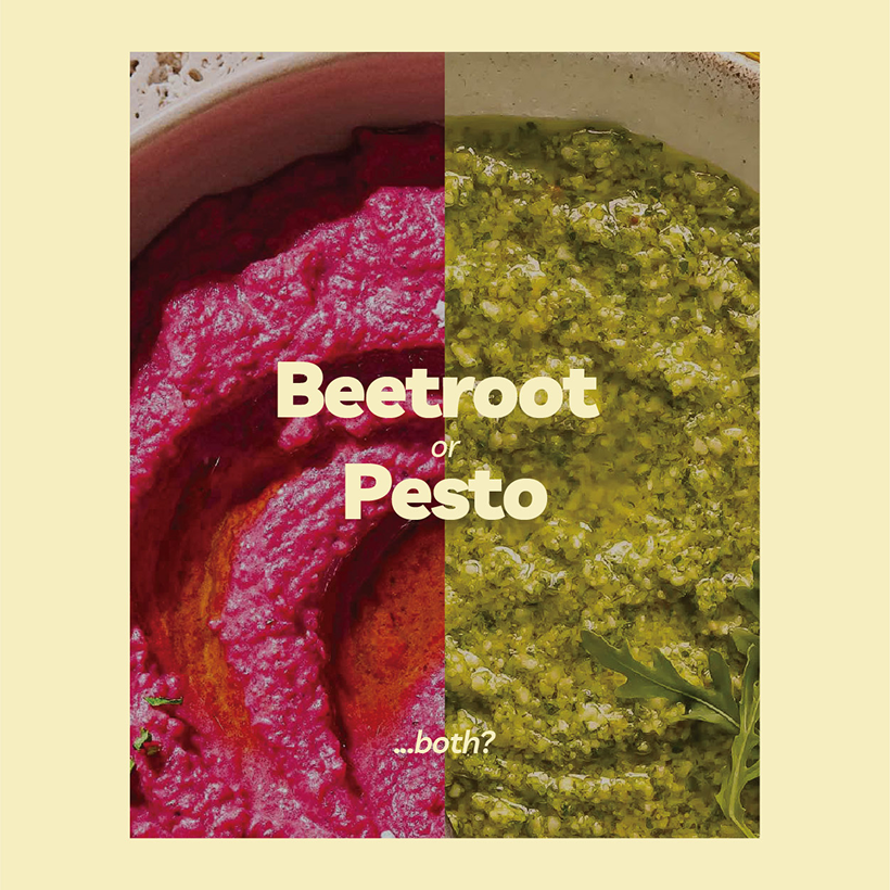
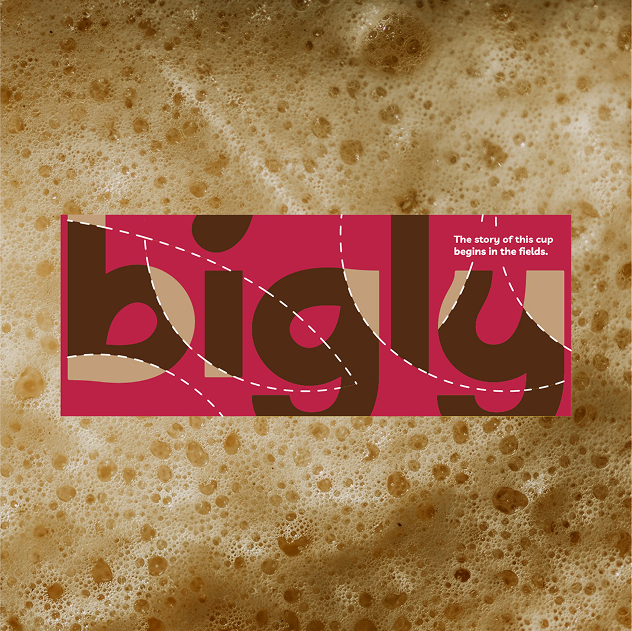
The intent is to let the customers move between the visual and the sensory, where they are able to make connections between what they see and taste.

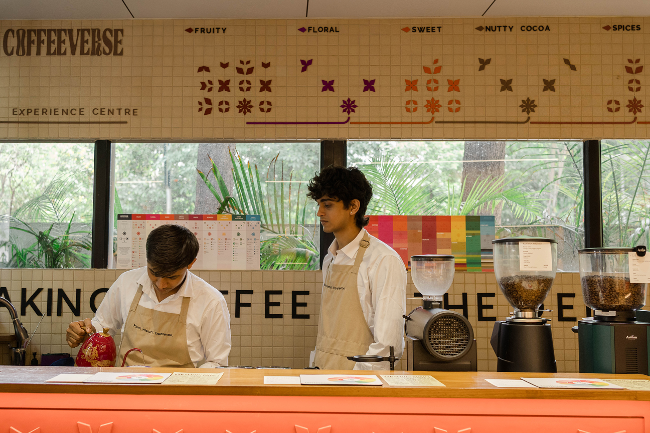
Coffeeverse Experience Center
2025