Raw Collaborative
Deliverables:
- Logo Identity
- Social Media Campaigns
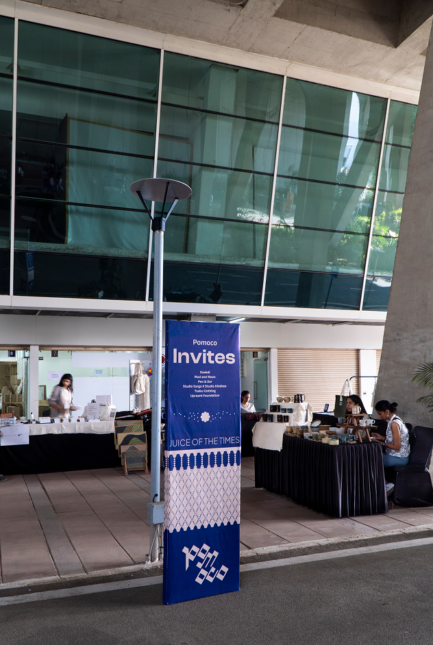
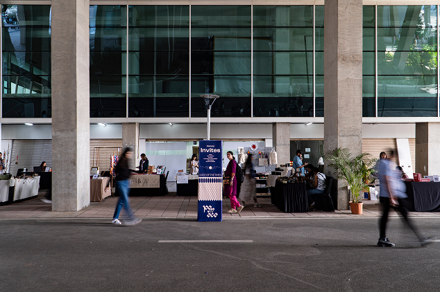
- Posters and Invites
- Website Design
- Exhibition Space Graphics
- Brochure Design
Raw Collaborative stands as a platform shaped over seven years and five editions, committed to representing India’s creative landscape through design, craft, architecture, and material innovation
Conceived as a space to celebrate Indian design thinking, the festival brings together designers, artists, architects, and makers from across the country to reinterpret tradition through contemporary lenses. Its foundational idea is rooted in the notion of building a creative ecosystem, one that does not merely exhibit but also informs, provokes, and nurtures.
What began as an idea to showcase the spectrum of Indian design has now grown into a movement that connects the past to the present with an eye on the future.
Each edition serves as a confluence of regional voices, sustainable practices, heritage techniques, and experimental ideas. The intent has always been to inspire a culture of conscious living, not through spectacle but through substance.

As Raw Collaborative continues to evolve, it remains anchored in its mission to push the conversation forward, making design accessible, locally relevant, and globally aware
The sixth edition arrived at a moment of introspection and reinvention, calling for a sharper sense of identity and renewed clarity in how the platform is visualized and experienced.
Pomoco was tasked with reimagining the brand’s visual and narrative identity. The rebrand sought to reflect a sense of rooted ownership, both in terms of cultural context and ideological direction.
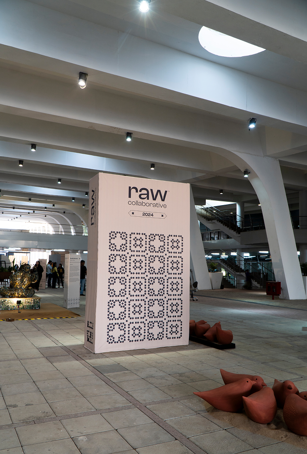
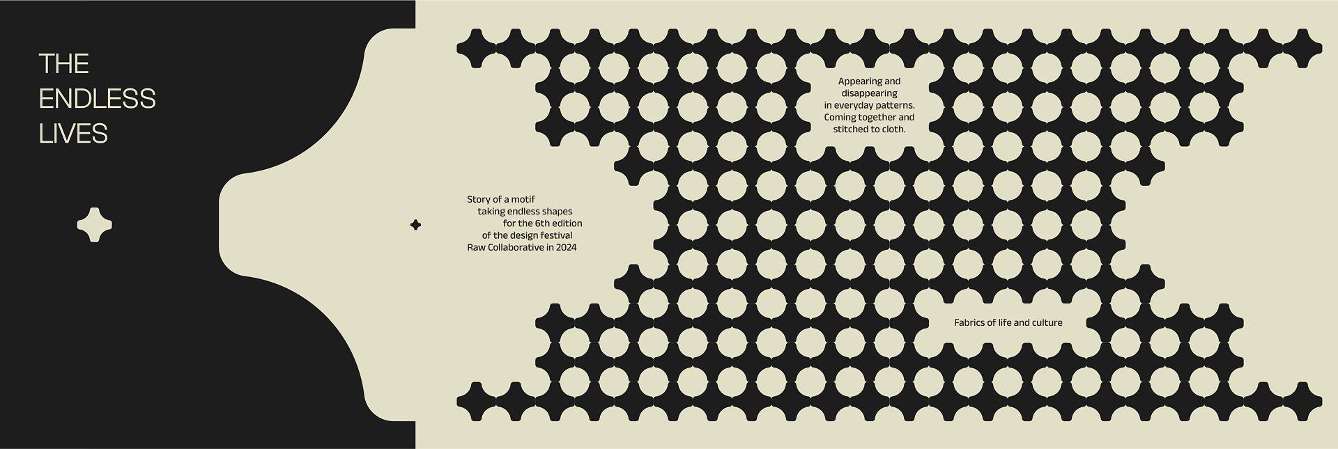
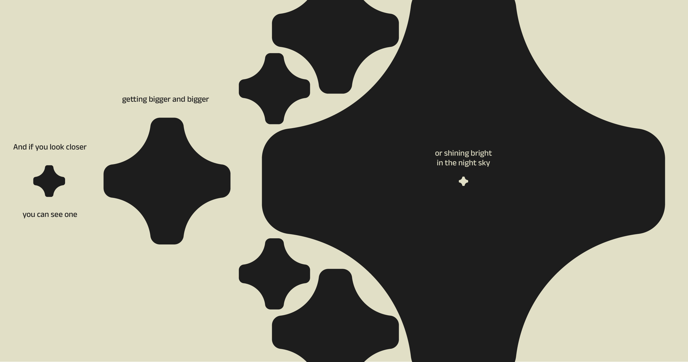
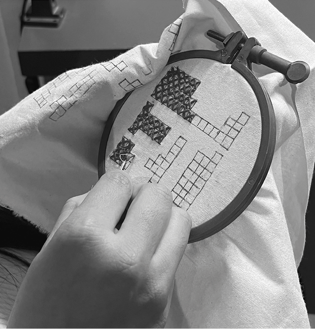
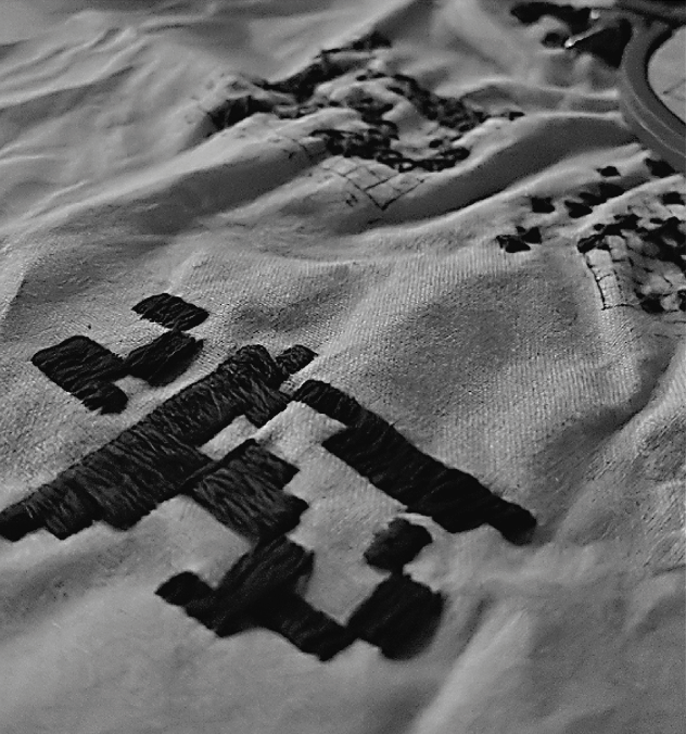
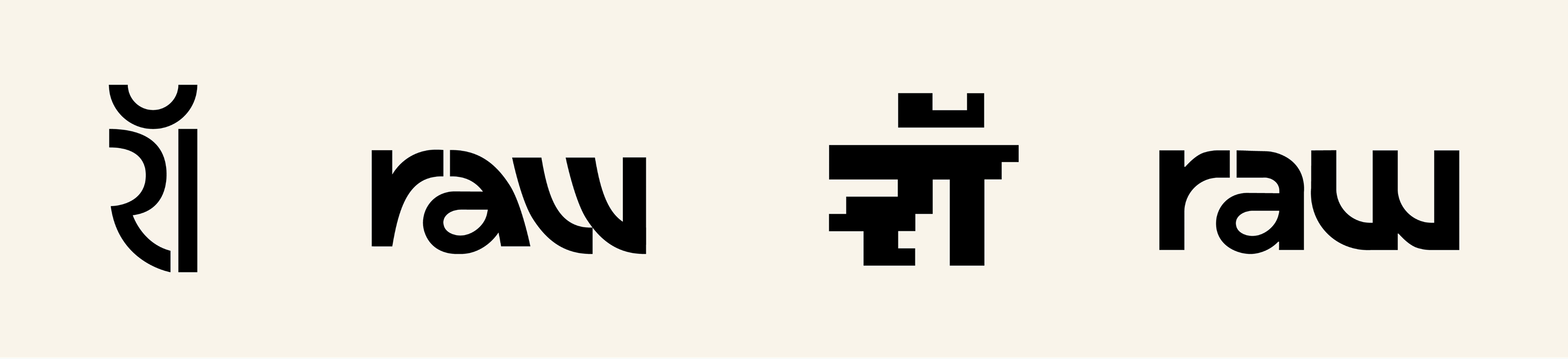
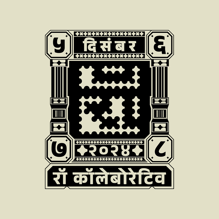
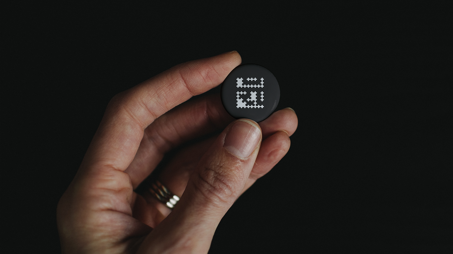
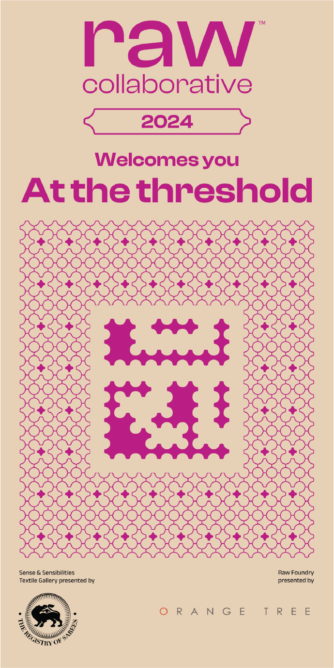
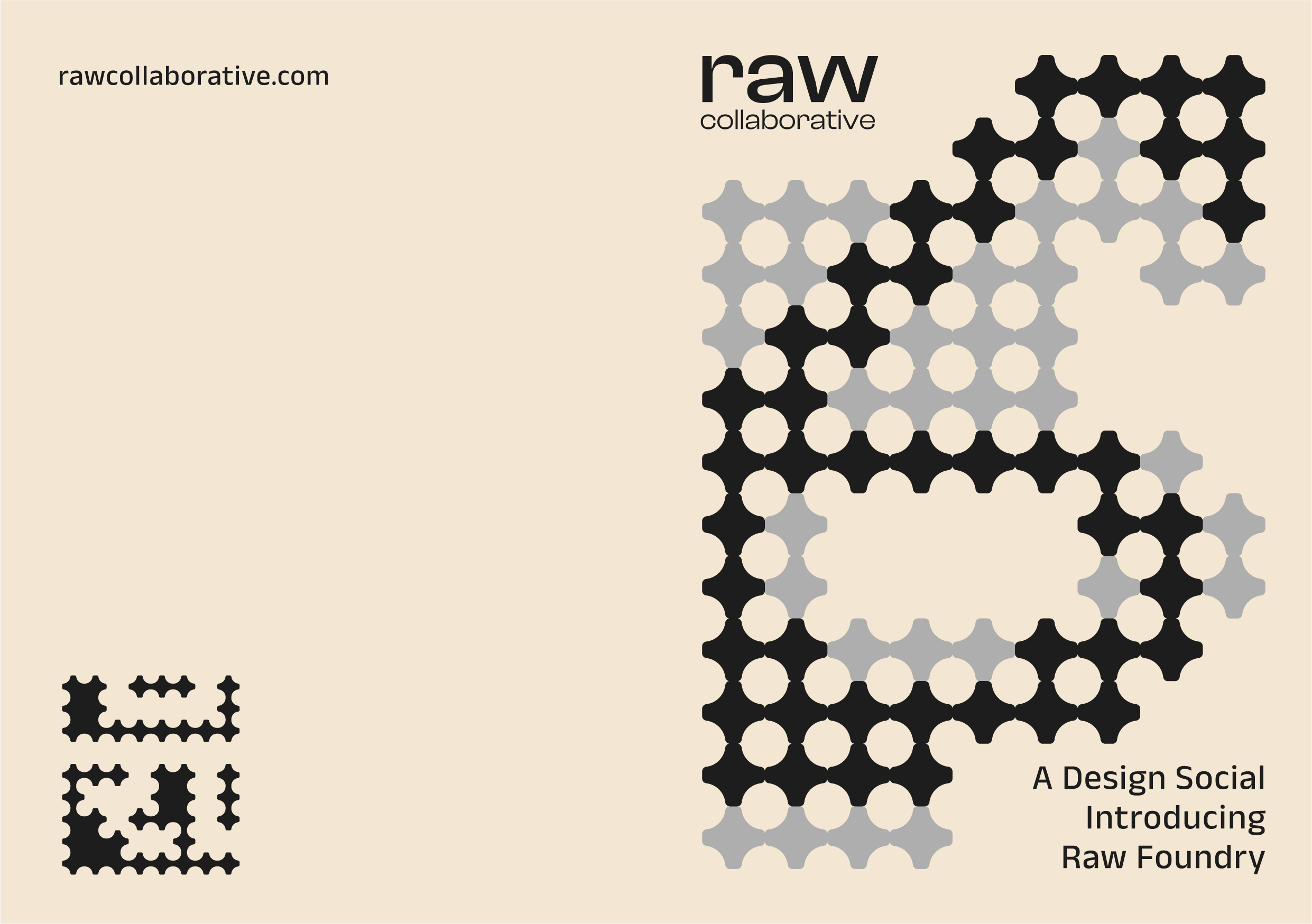
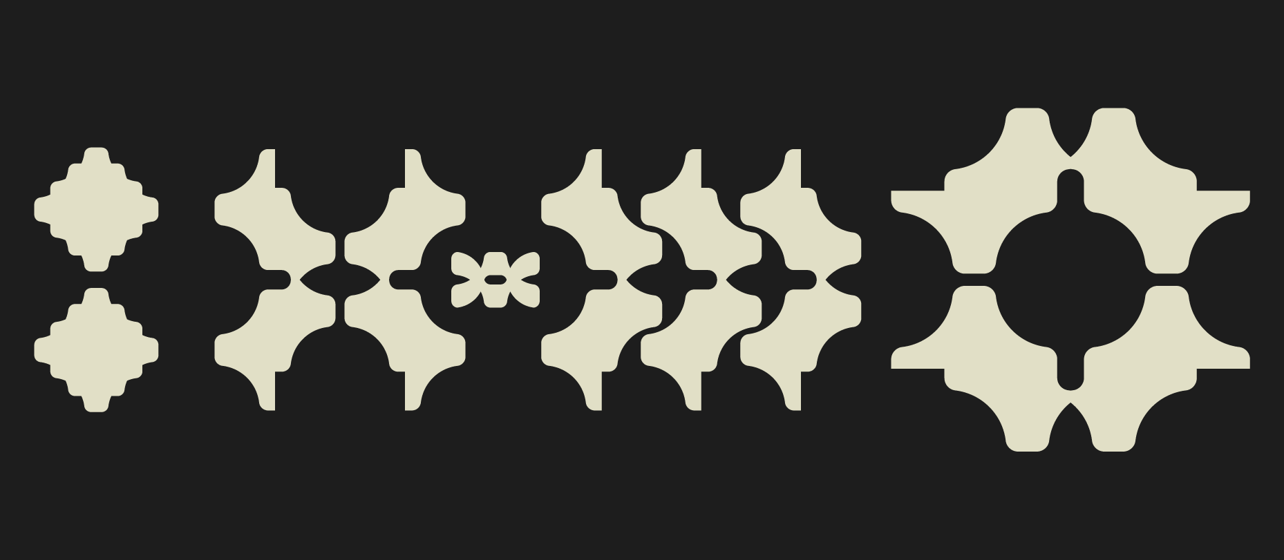
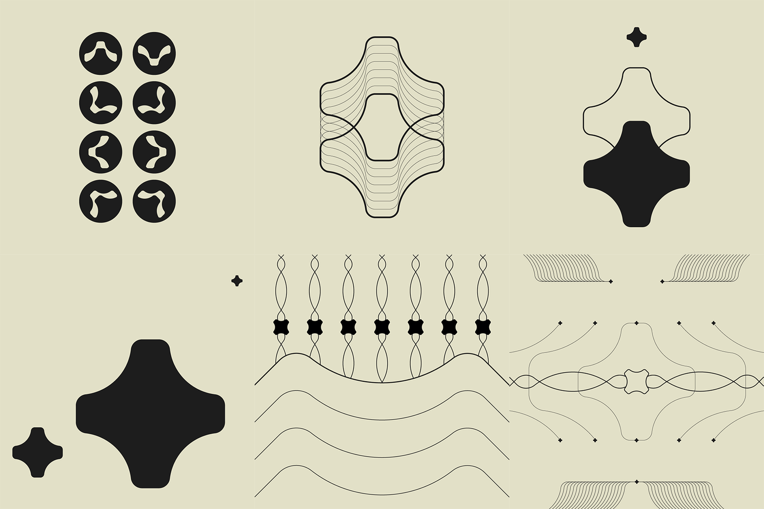
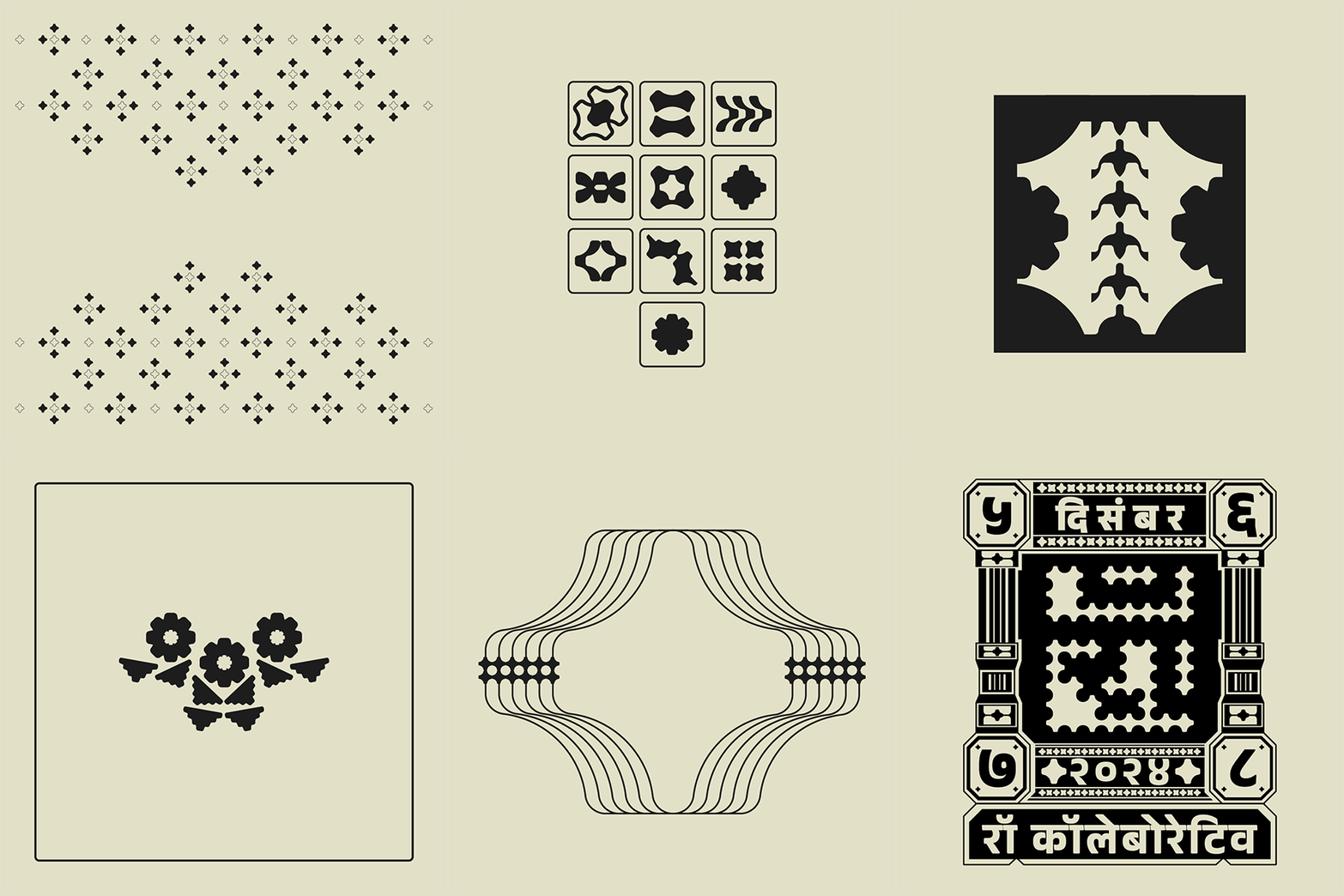
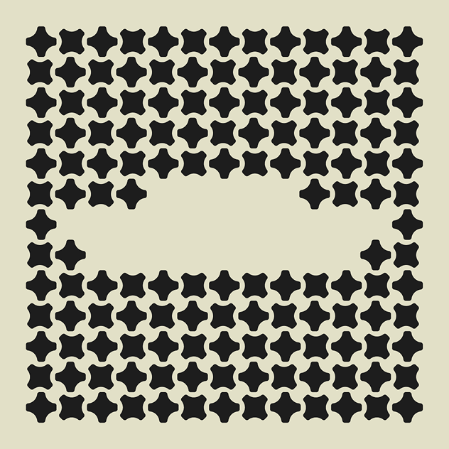
Our starting point was the ‘Bawariyo’ motif, a complex cross-stitch pattern found in Rabari embroidery from Gujarat. Recognized for its intricacy, this motif became the foundation for the new brand identity, reinterpreted into a minimal, modular form.
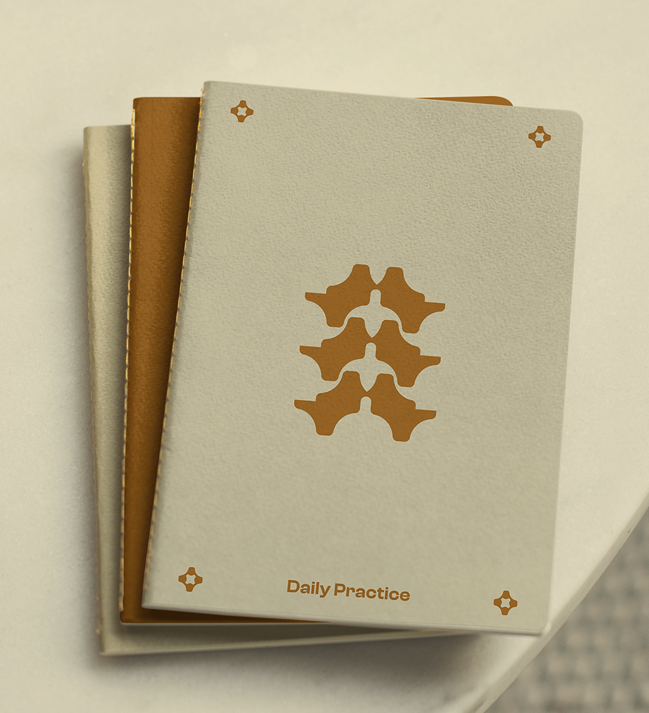
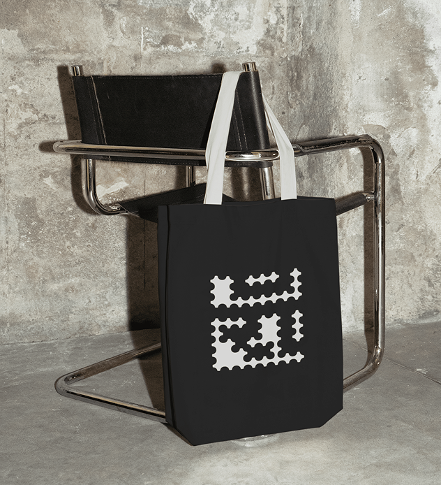
It functions as a visual unit that builds across applications, growing into patterns, signage systems, exhibition walls, and even an embedded wordmark, where the word ‘Raw’ appears in negative space.
Through this symbolic system, we addressed the evolving identity of Raw Collaborative into a platform of layered experiences rather than a traditional exhibition. This shift was crucial to communicate the transition from merely showcasing Indian design to owning its complexity.
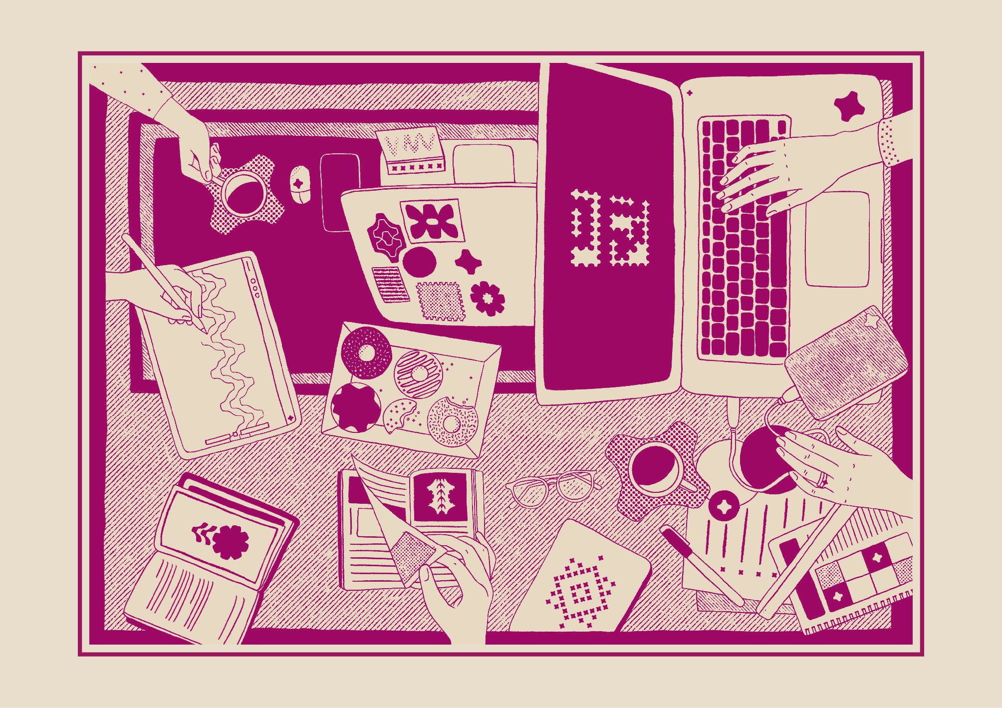
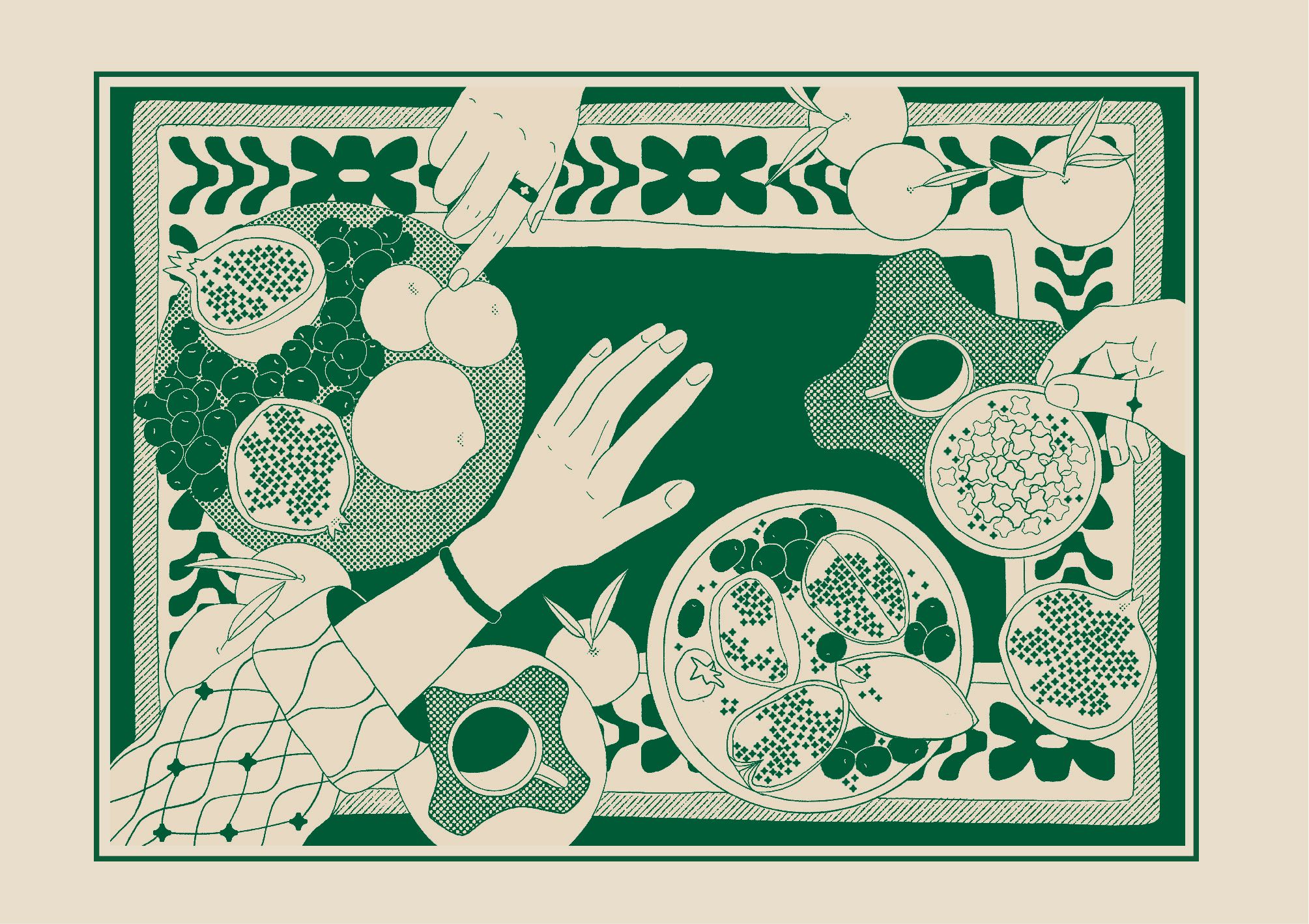
In each execution, the motif becomes a metaphor for multiple paths, different lives, and distinct interpretations, much like the diverse practices that converge at the festival
Our year-long engagement with Raw Collaborative included brand strategy, graphic design, and environmental systems across both digital and physical realms.
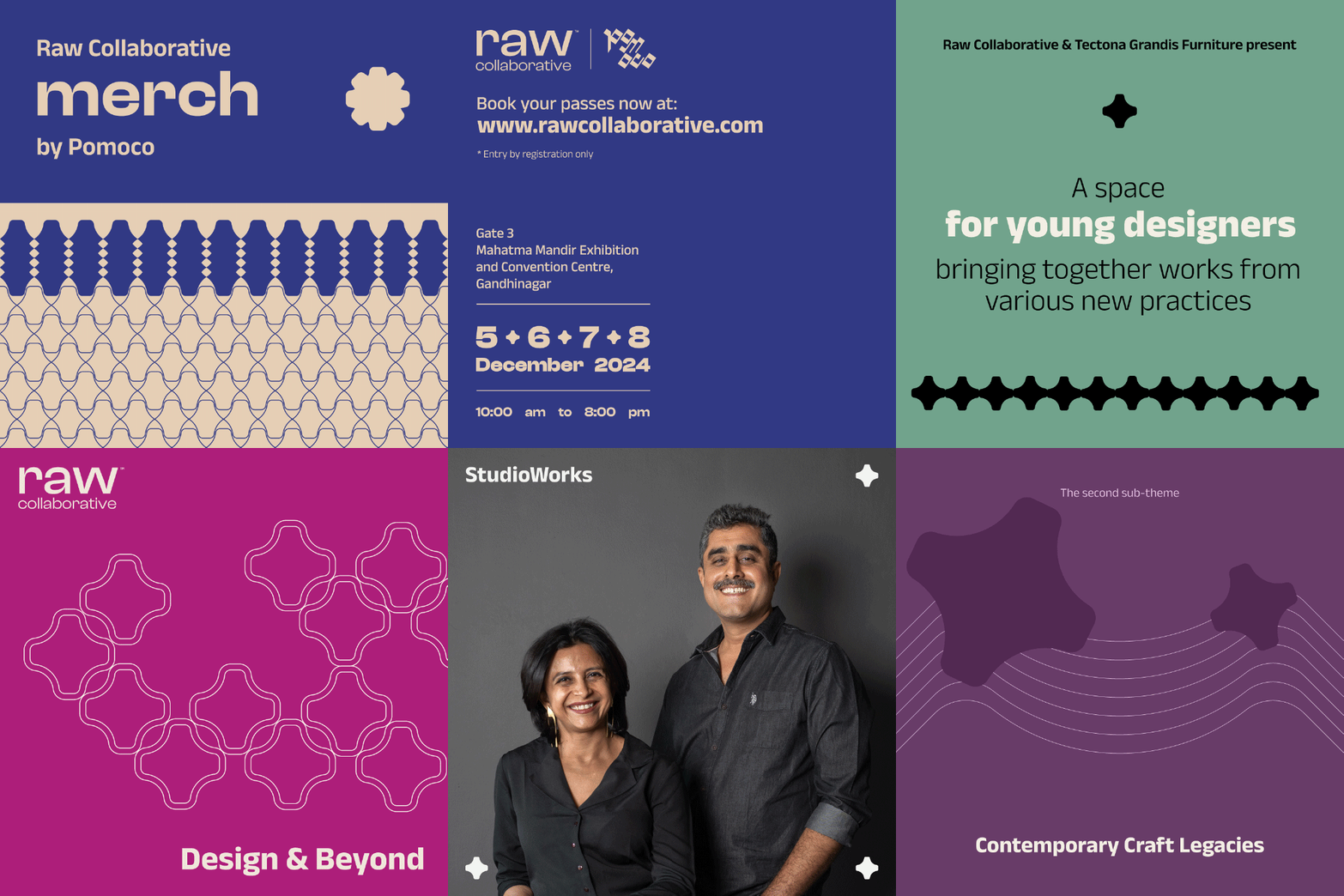
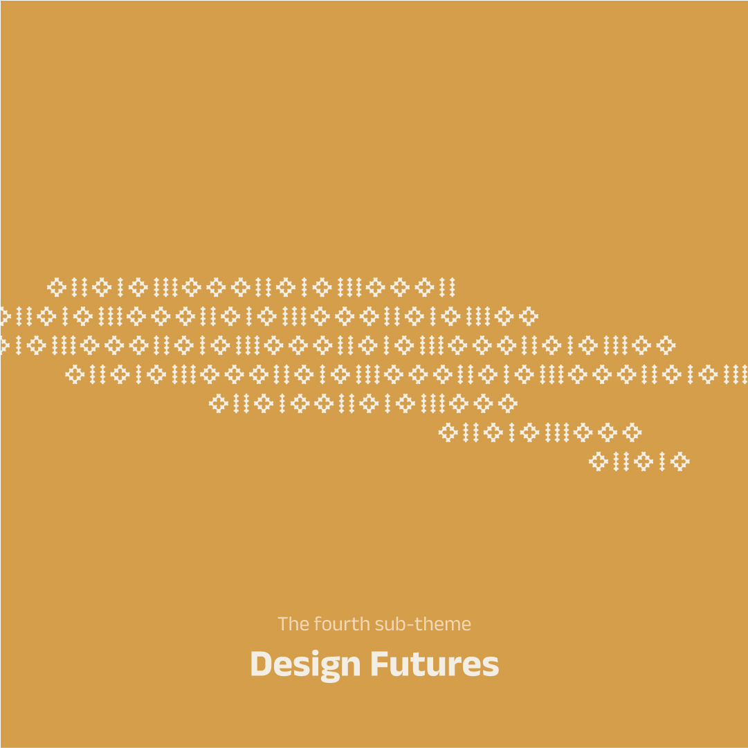
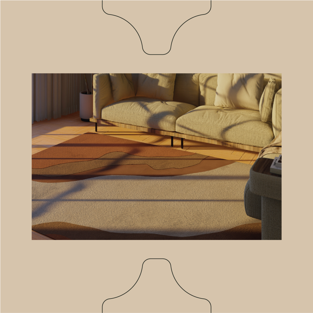
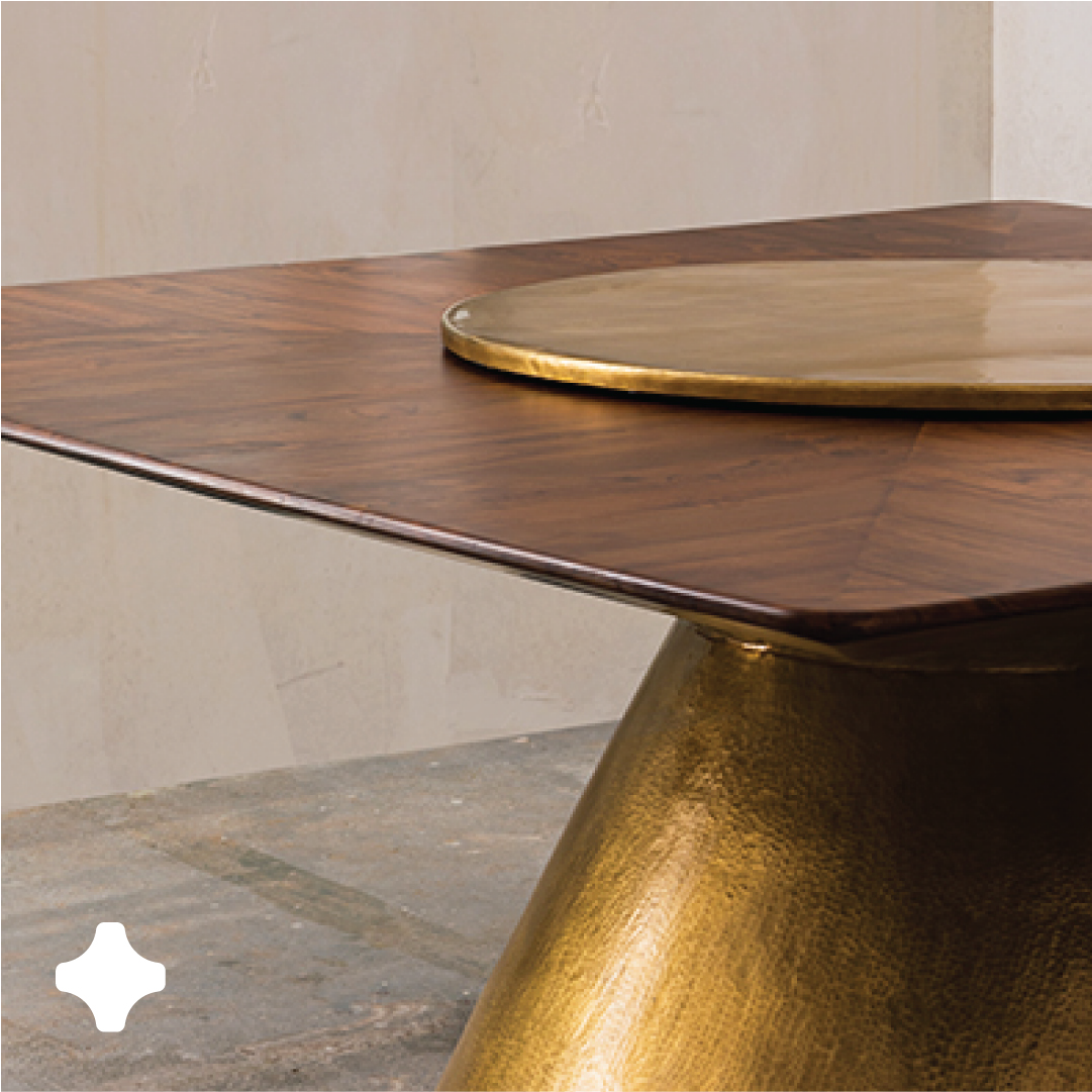
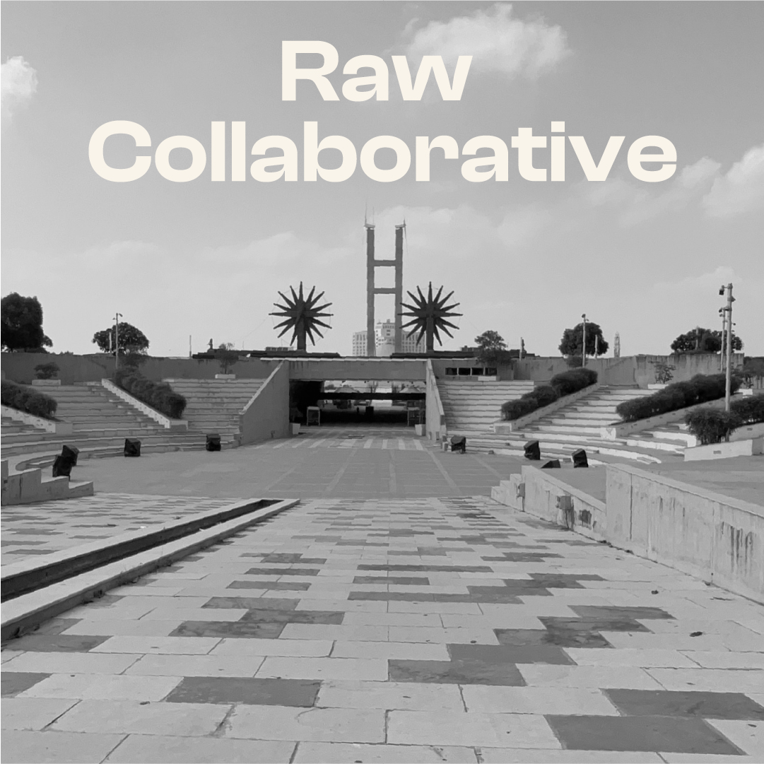
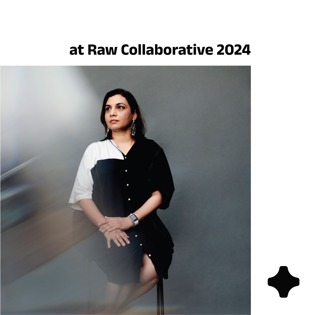
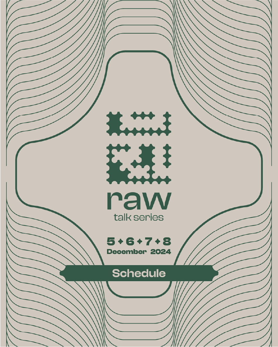
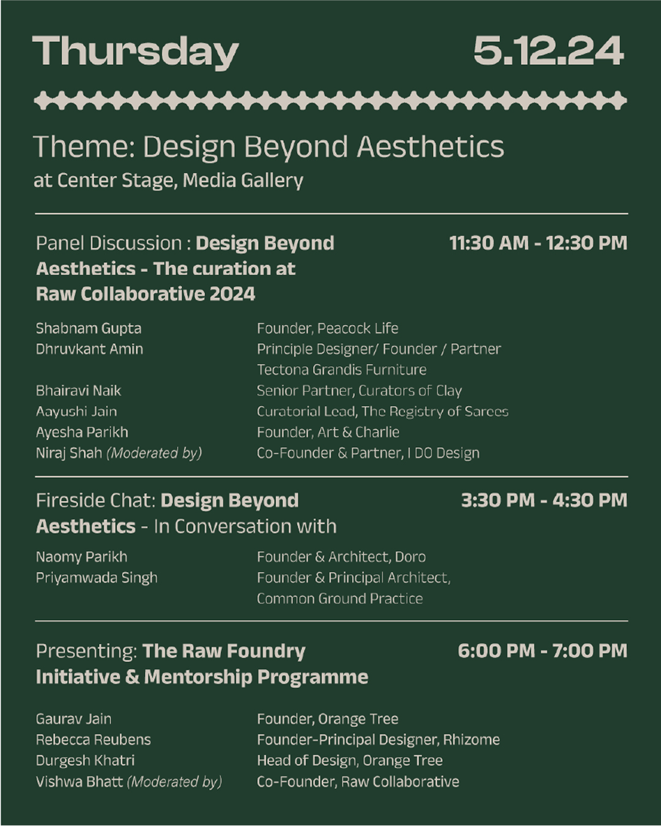
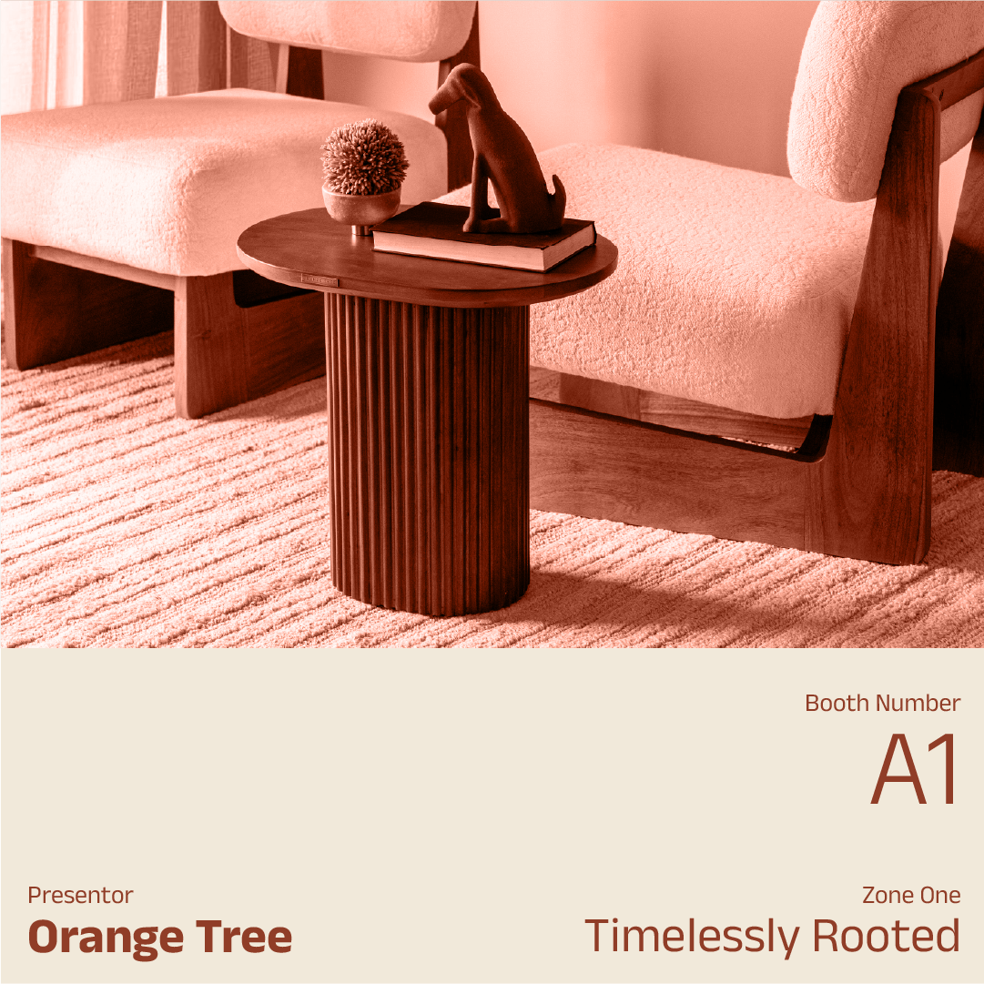
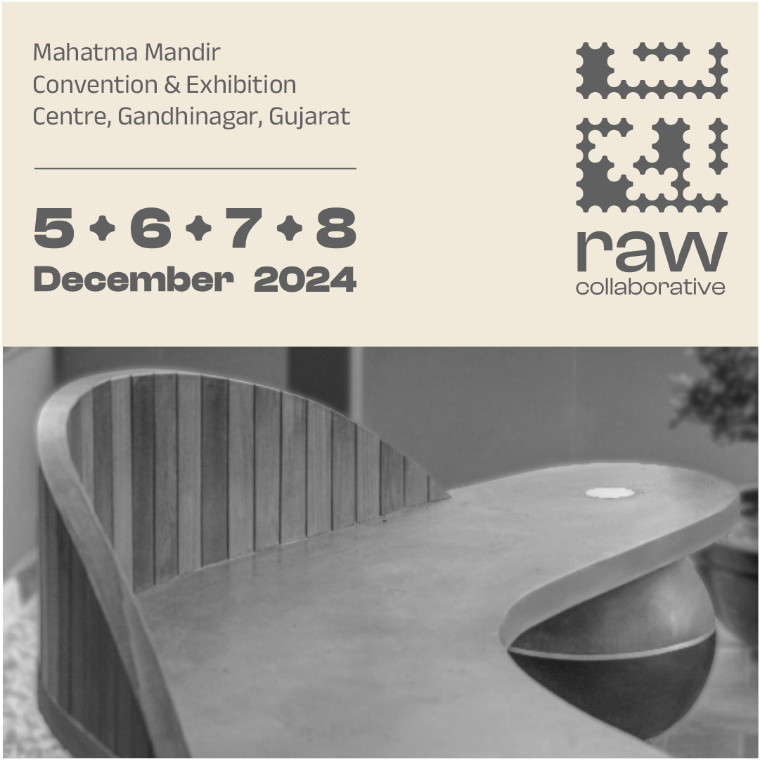

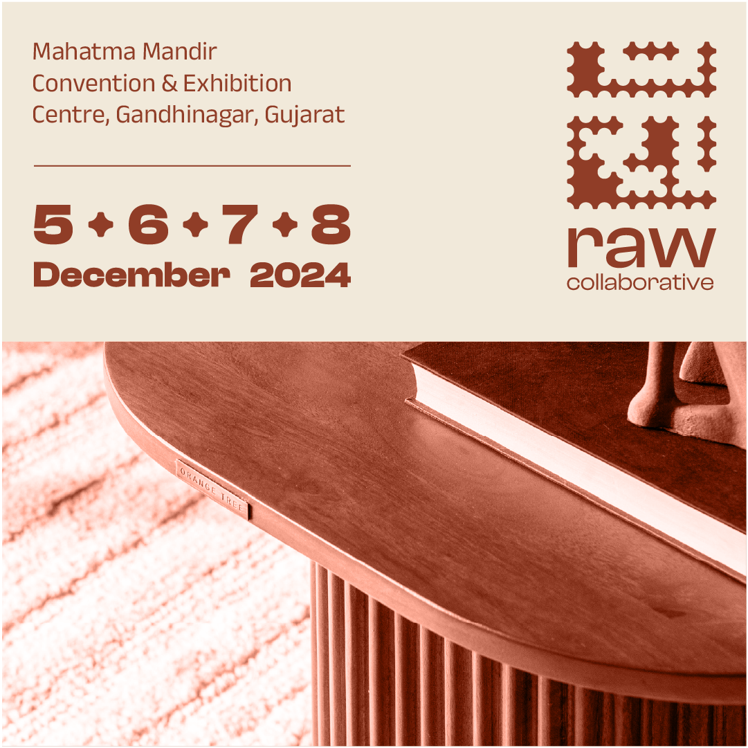
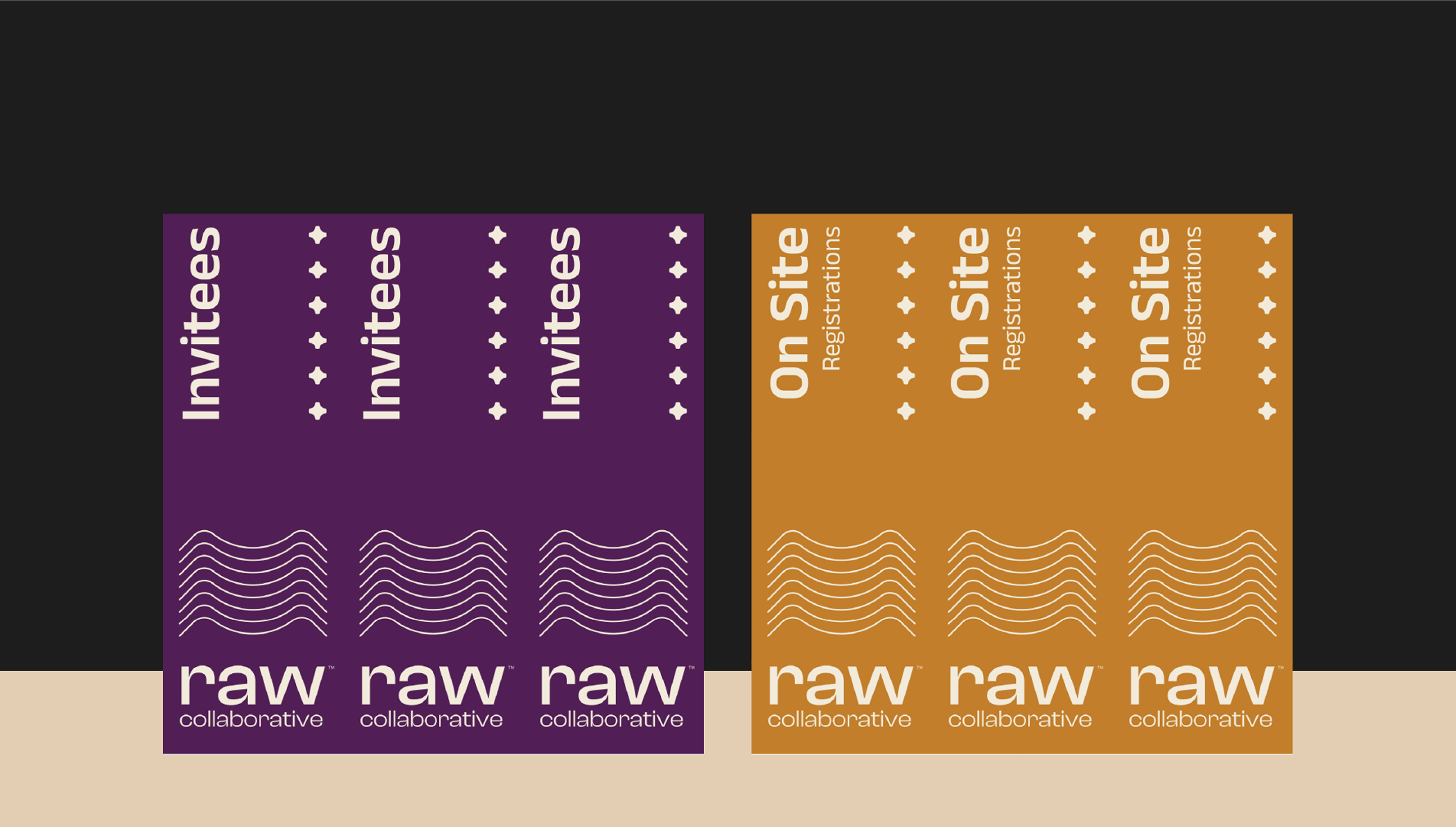
We launched the rebrand on social media and built monthly creative campaigns for satellite events in the lead-up to the main exhibition.
A major deliverable was the newly designed website, aligned with the current edition’s theme of ‘threshold’—a concept that we helped articulate and visualize across all materials.
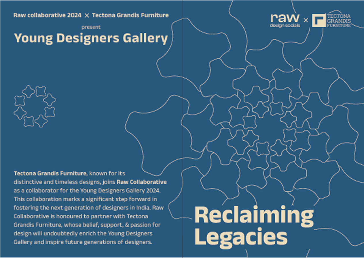
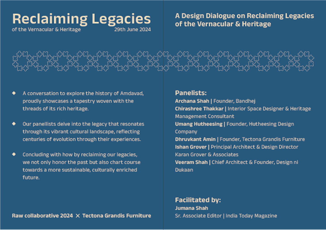
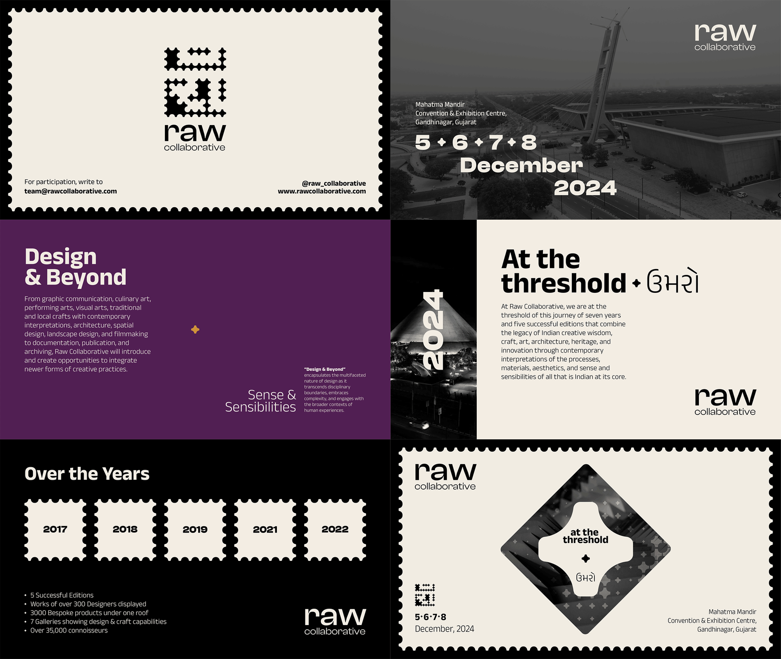
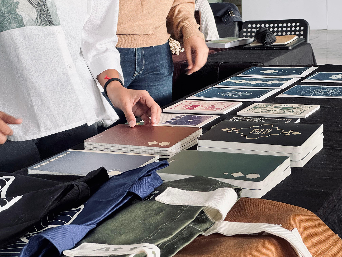
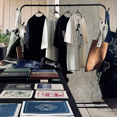
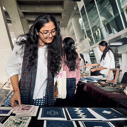
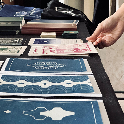
We designed a full suite of functional merchandise under the idea of ‘designer essentials,’ with bold, purposeful copy such as “No Wrong Answers” and “Beyond the Threshold.” These products were built to support both utility and inspiration
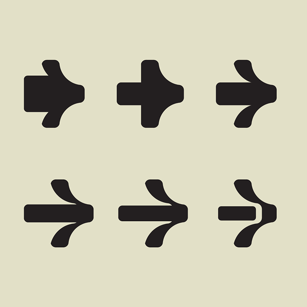
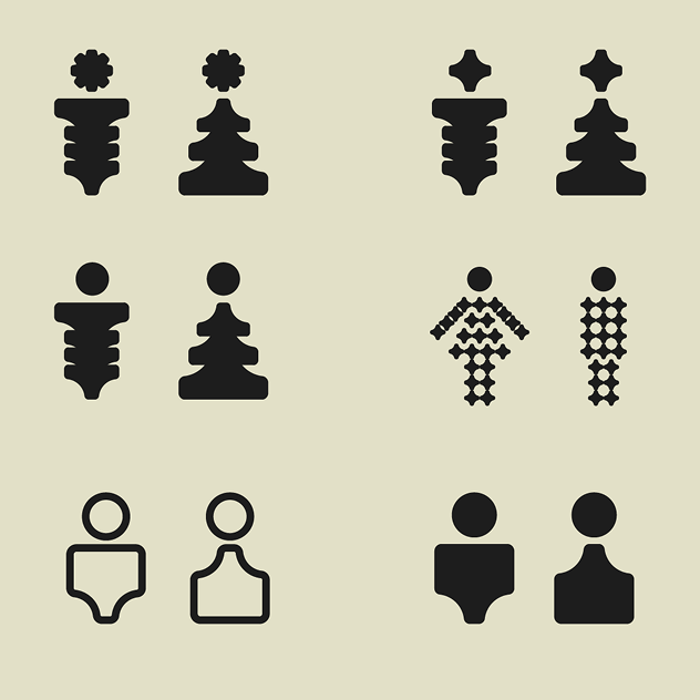

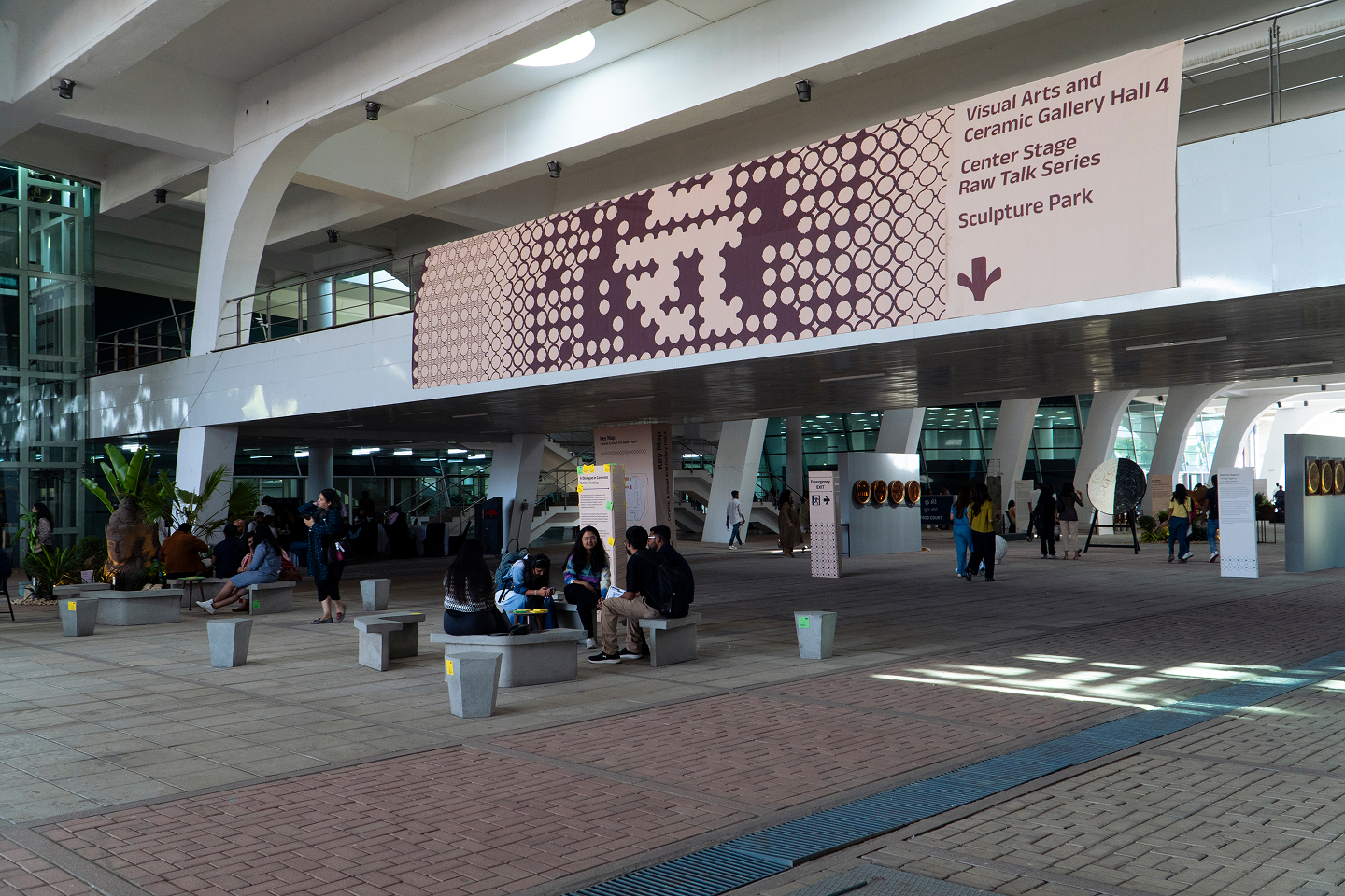
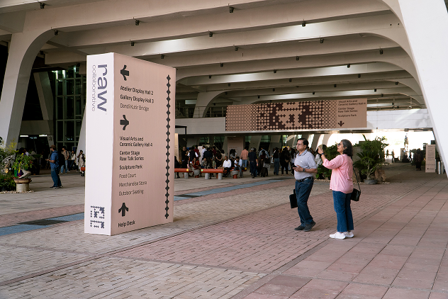
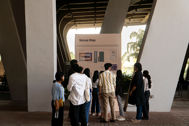
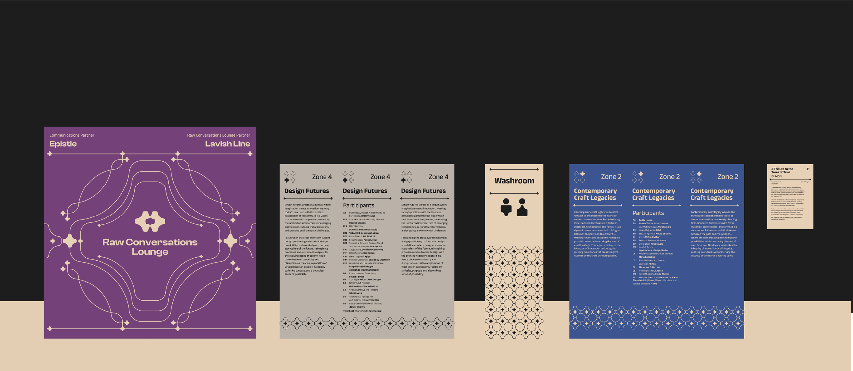
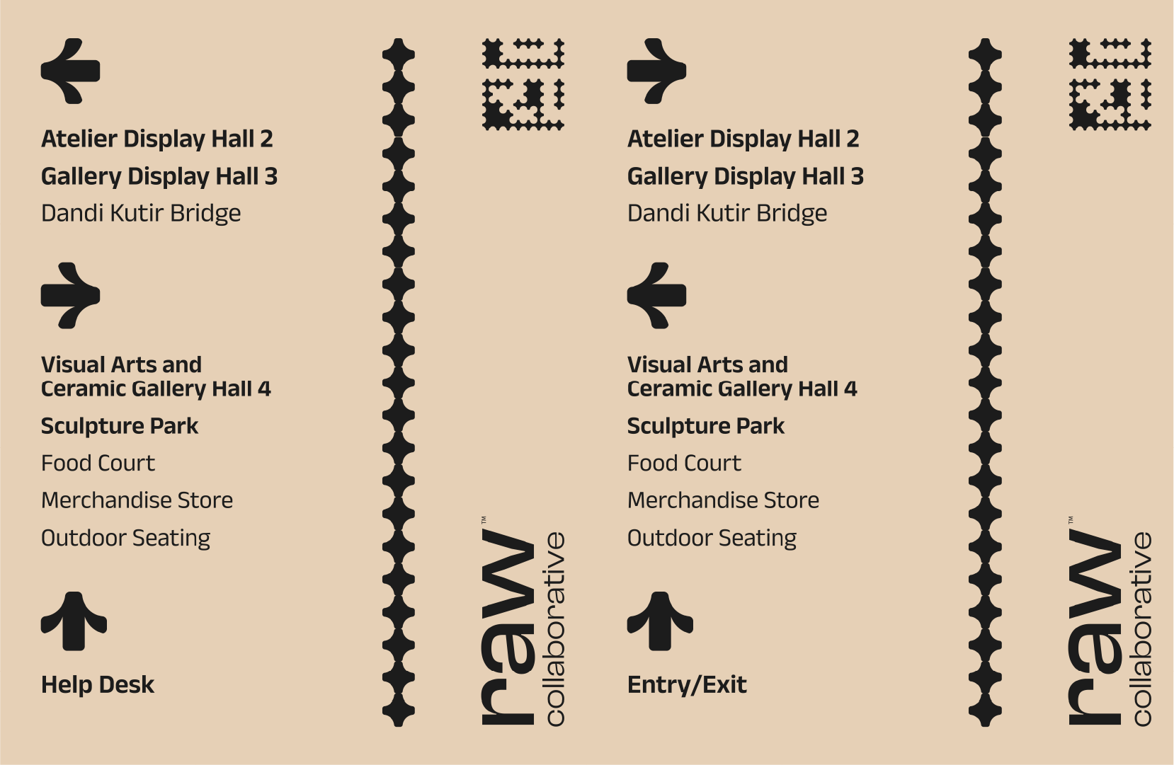
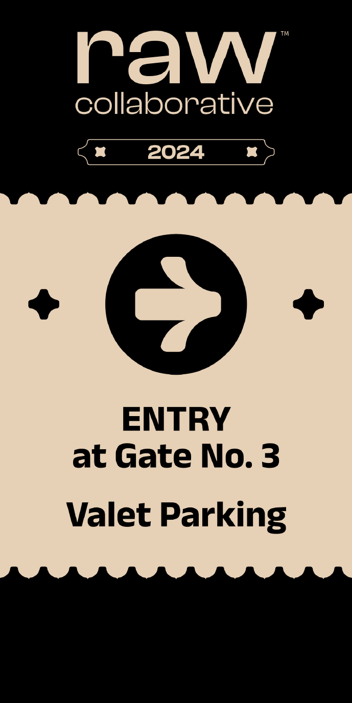
The most complex part of our work came in the form of spatial graphics: a complete signage and wayfinding system designed for the festival venue at Mahatma Mandir in Gandhinagar.
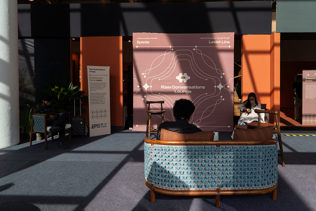
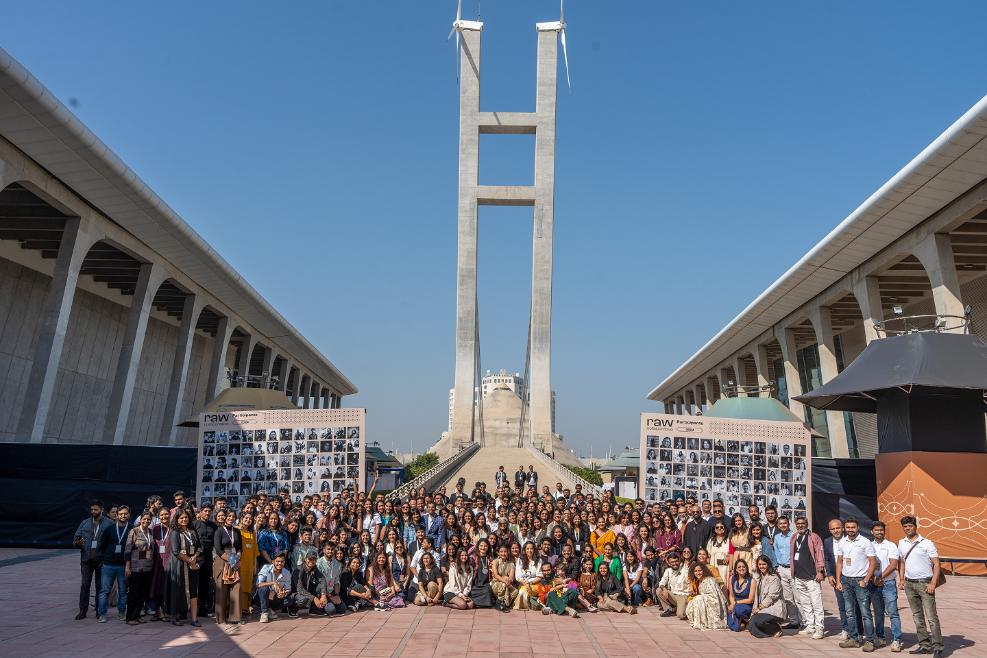
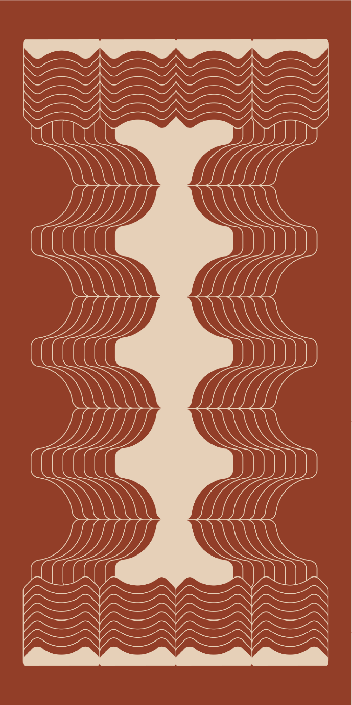
Here, we created a new graphic language for large-scale exhibition design, combining the symbolic motif with high-visibility information systems. From environmental graphics to directional signage, the branding extended into every corner of the space, making the act of navigating the exhibition a continuation of the brand story itself.