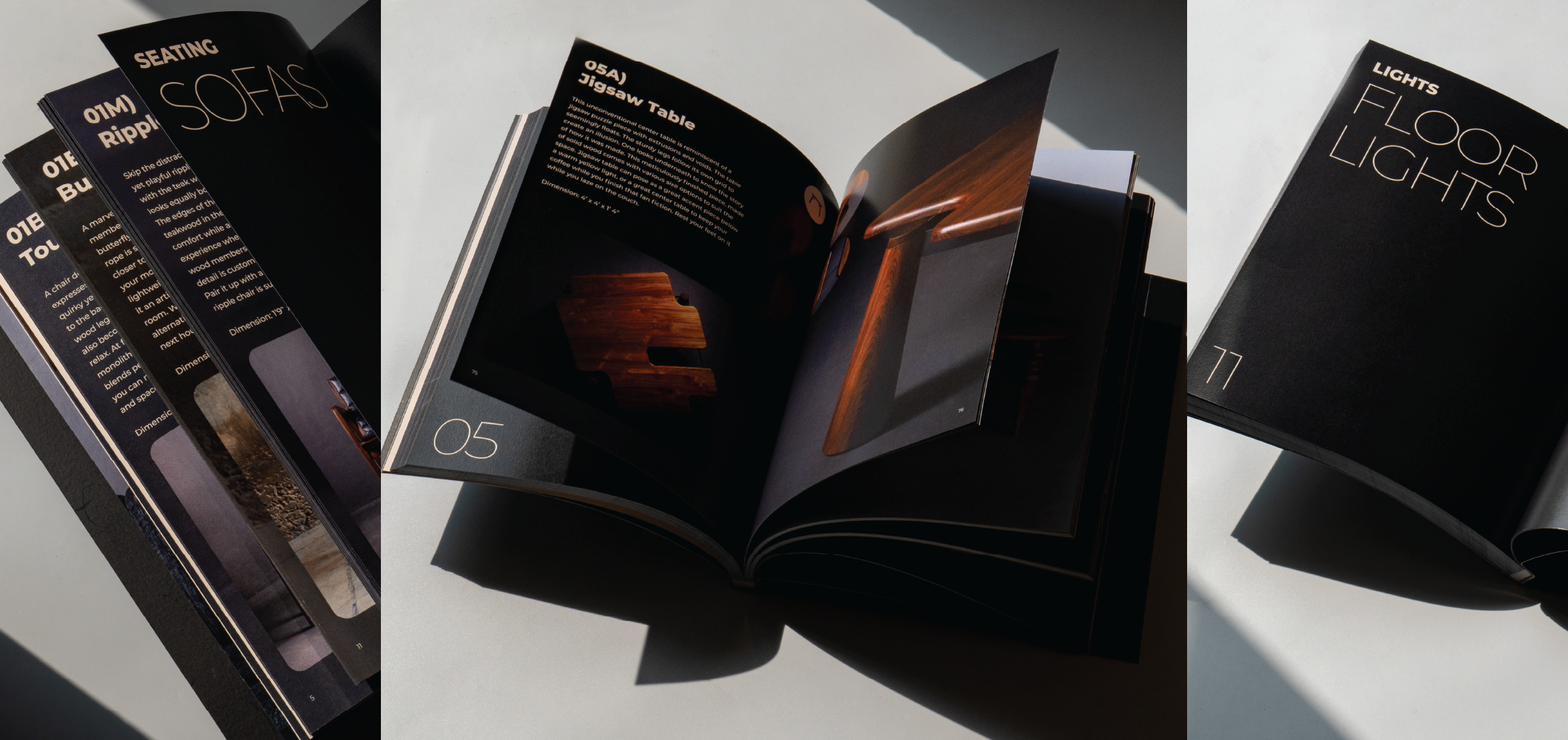
Gulabo & Co
Deliverables:
- Logo Identity
- Packaging
- Illustrations
- Menu Design
- Spatial Graphics
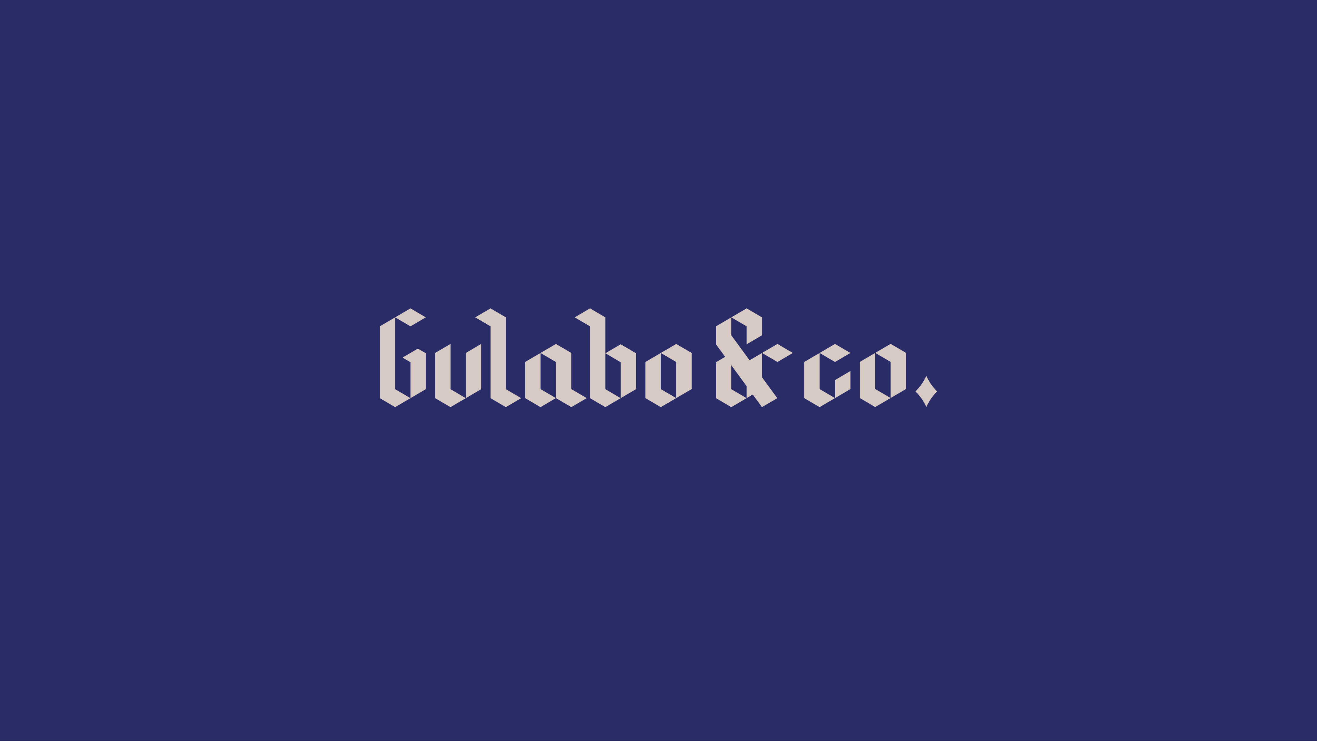
Gulabo is a specialty coffee space rooted in the craft of coffee-making, but shaped by a distinctly desi sensibility
The brand tone of Gulabo is sincerity with a quirk. We worked closely with its founder and head chef, Rishab, to develop an identity that reflects both its origin and its inclination towards cultural hybridity adopted by many Indian brands today.
The process began with imagining a central character - a Rajasthani woman who embodies the brand’s eccentricity and boldness. Draped in a ghoonghat and wearing sunglasses, she becomes a way into the brand’s world, holding sincerity and play.
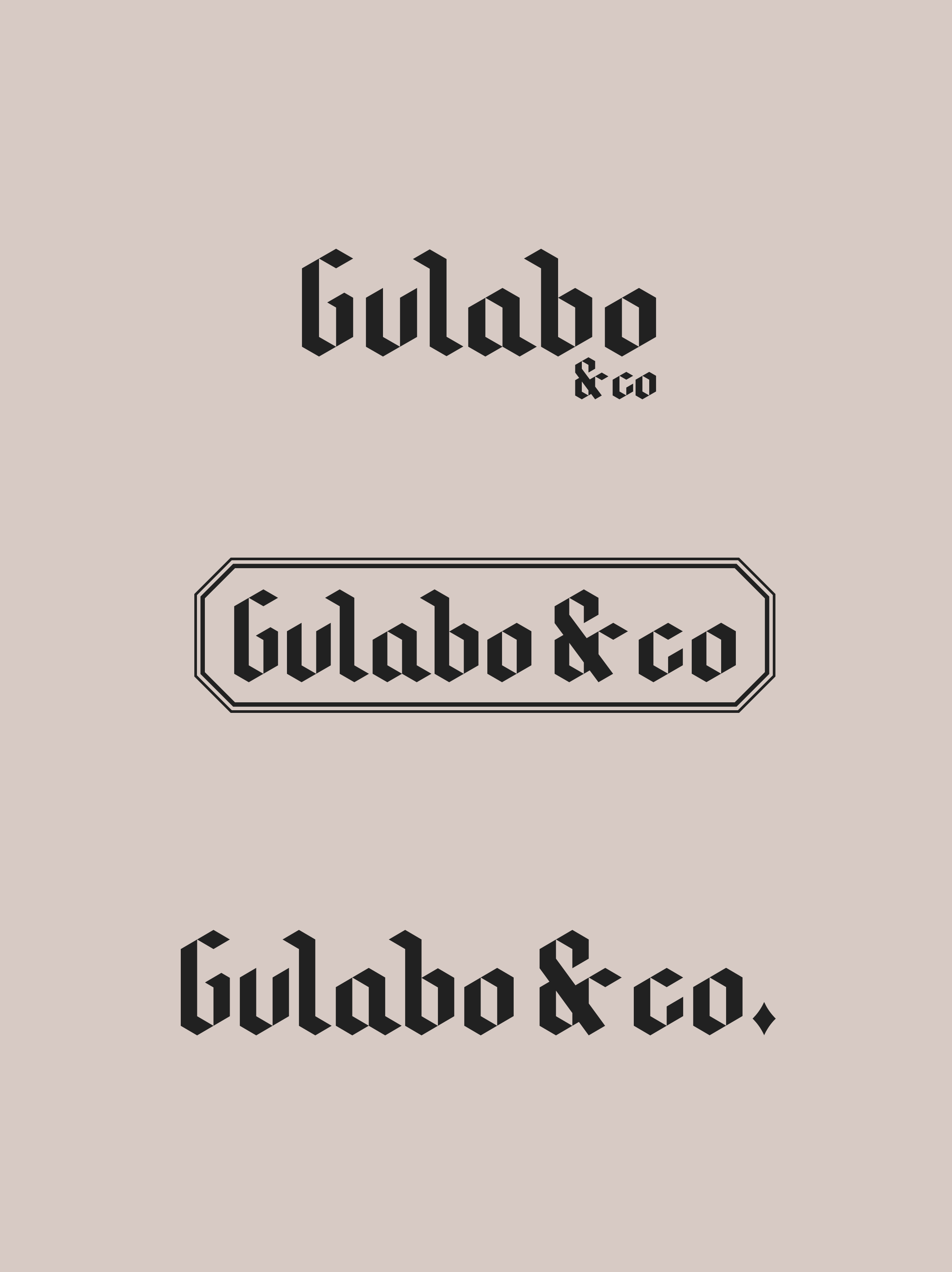
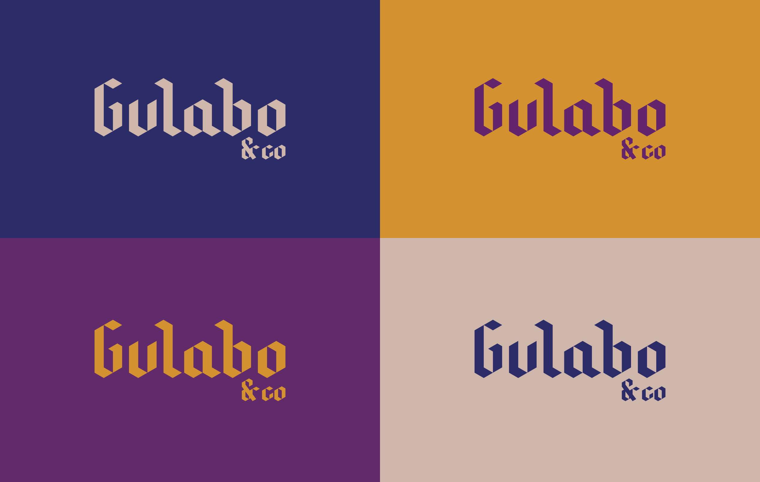
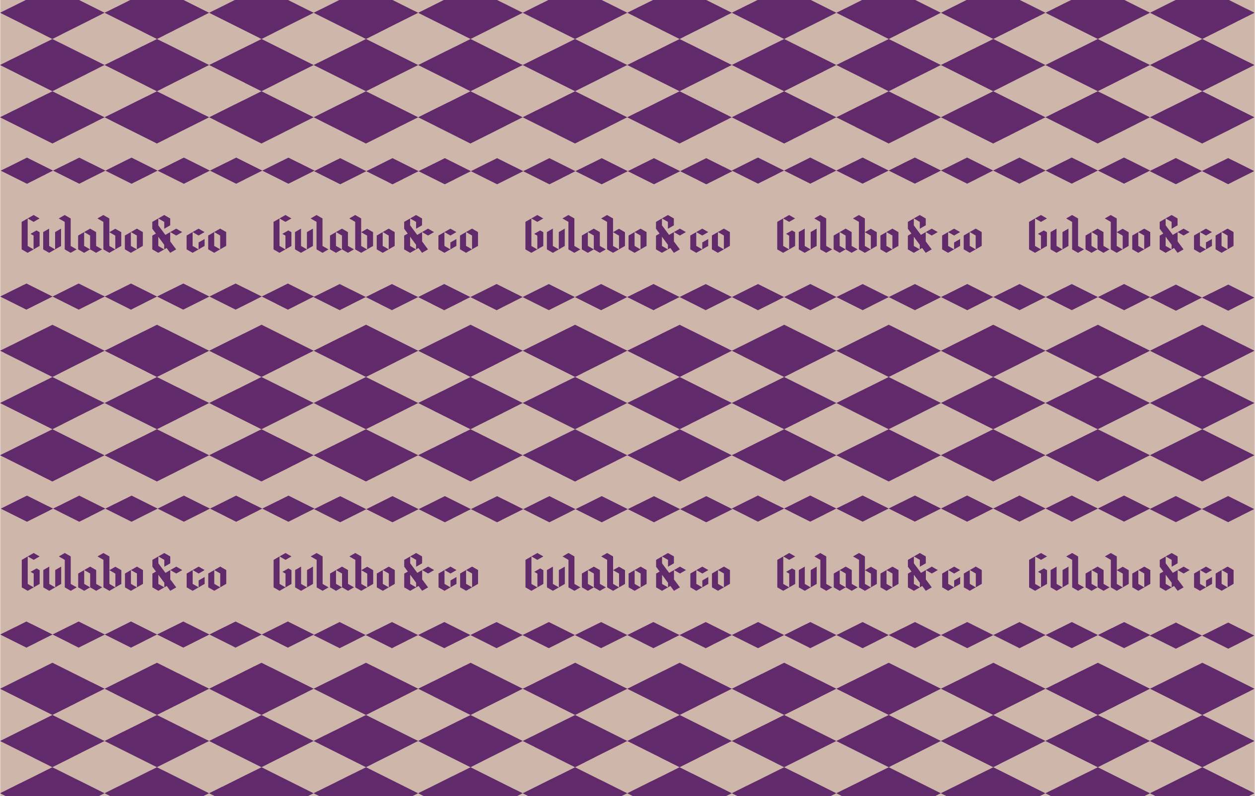
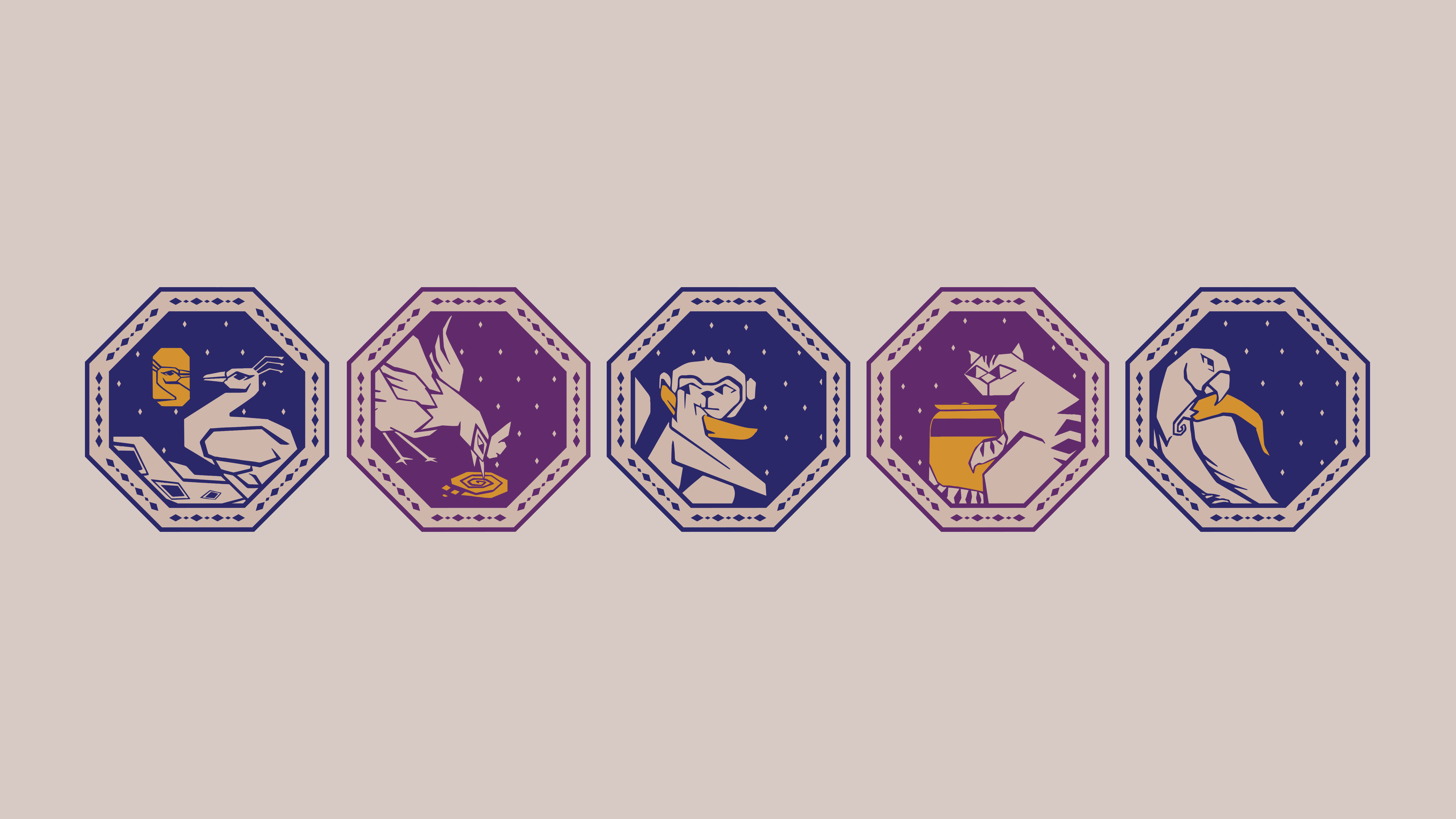
This thinking extended into the logotype, which draws from retro and Victorian influences, with strokes that echo calligraphic gestures. Together, the character and type begin to set the tone for how the brand speaks and behaves. From here, the identity opened into a larger system of characters and interactions. Animals became recurring motifs, carrying a certain temperament and name.
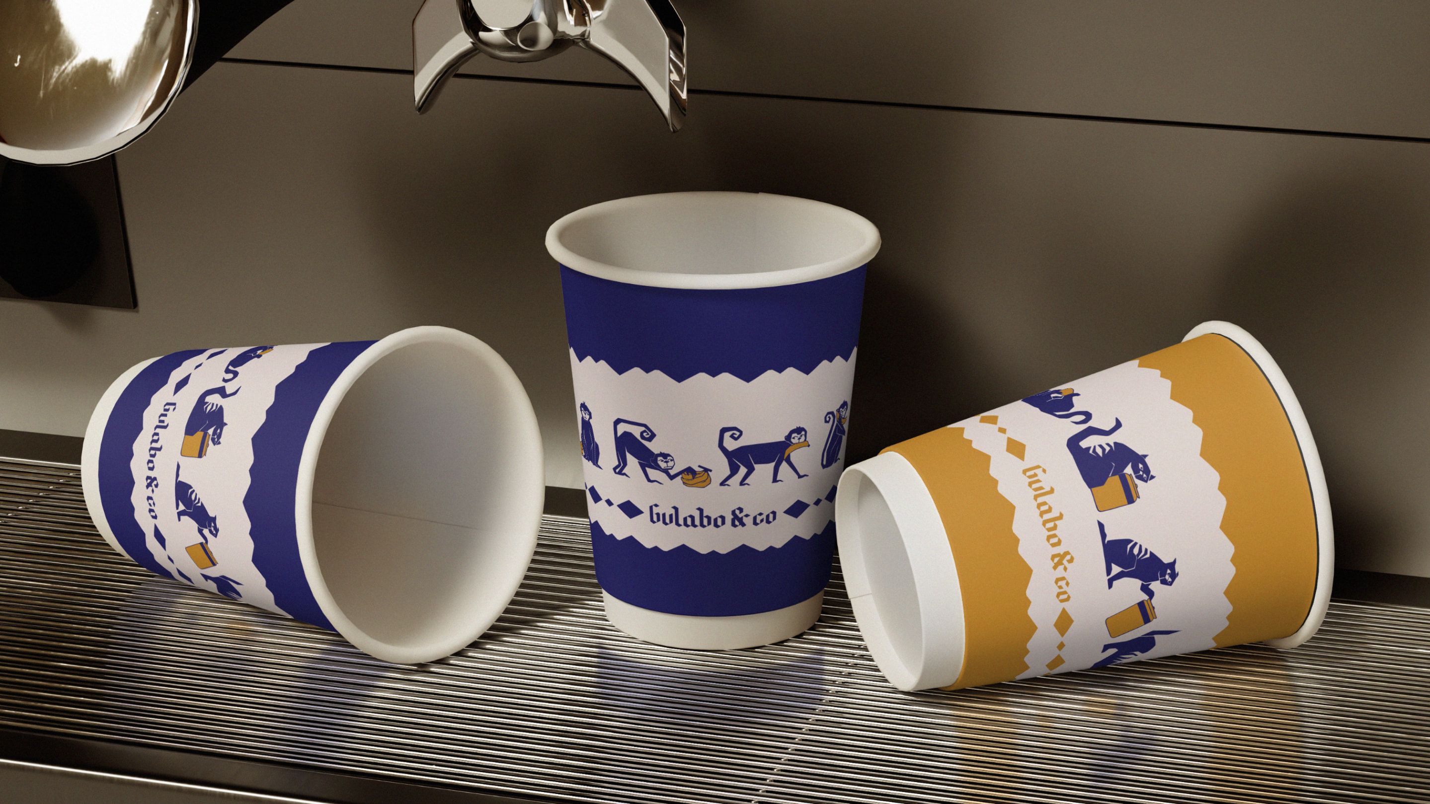
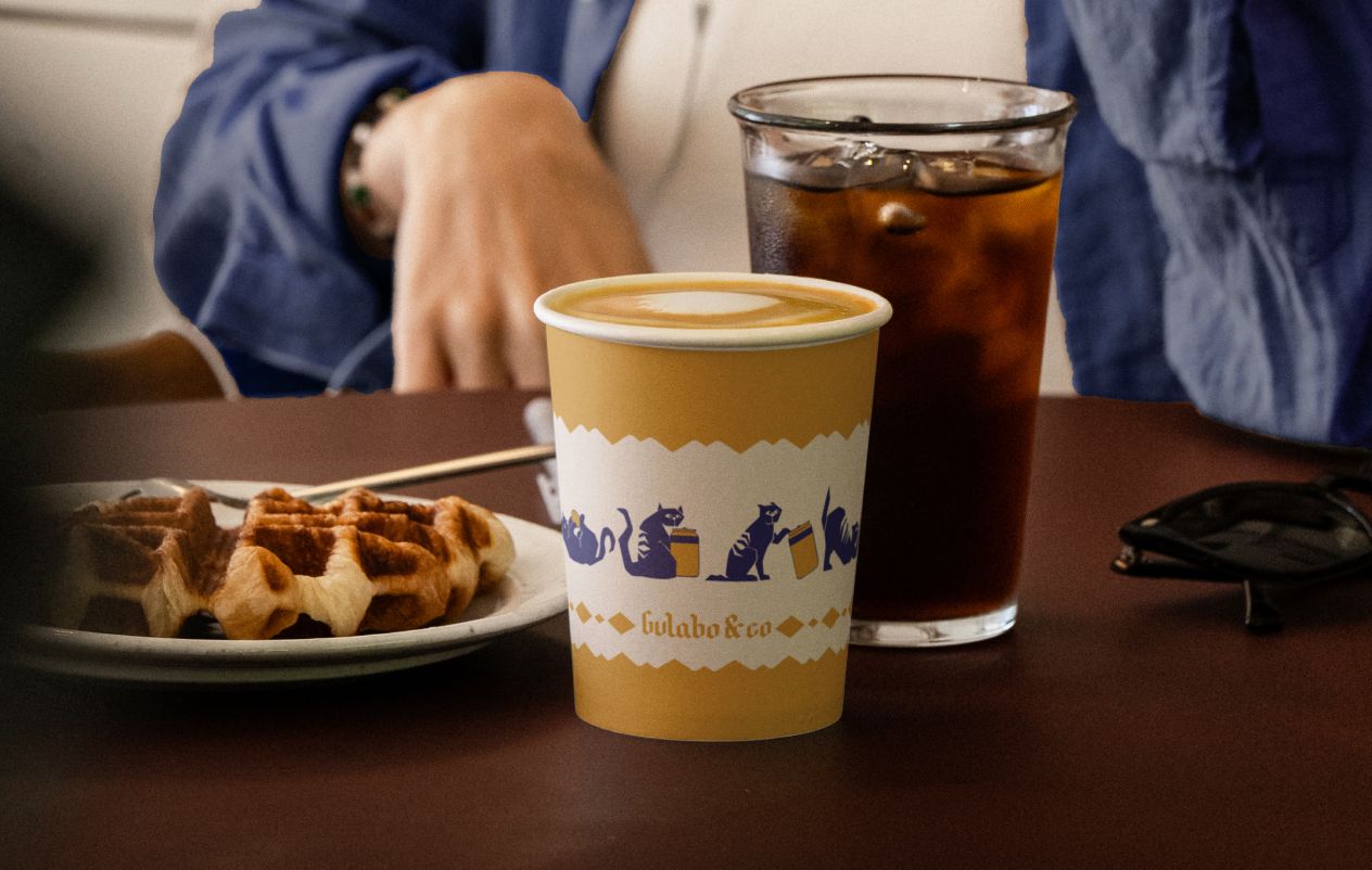
A monkey, for instance, plays with a banana across the coffee cups, turning a simple object into a small moment
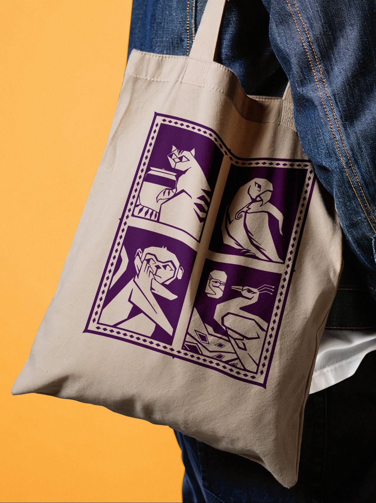
Similar gestures appear across other collateral, with peacocks, parrots, and roosters shaping a language that is intentional and playful. Across surfaces and formats, these elements build a world that extends beyond the space itself. This world, we believe, strengthens the perception and memory of Gulabo’s image. The experience of the brand moves from object to object-so the eyes and the mind linger a little longer.
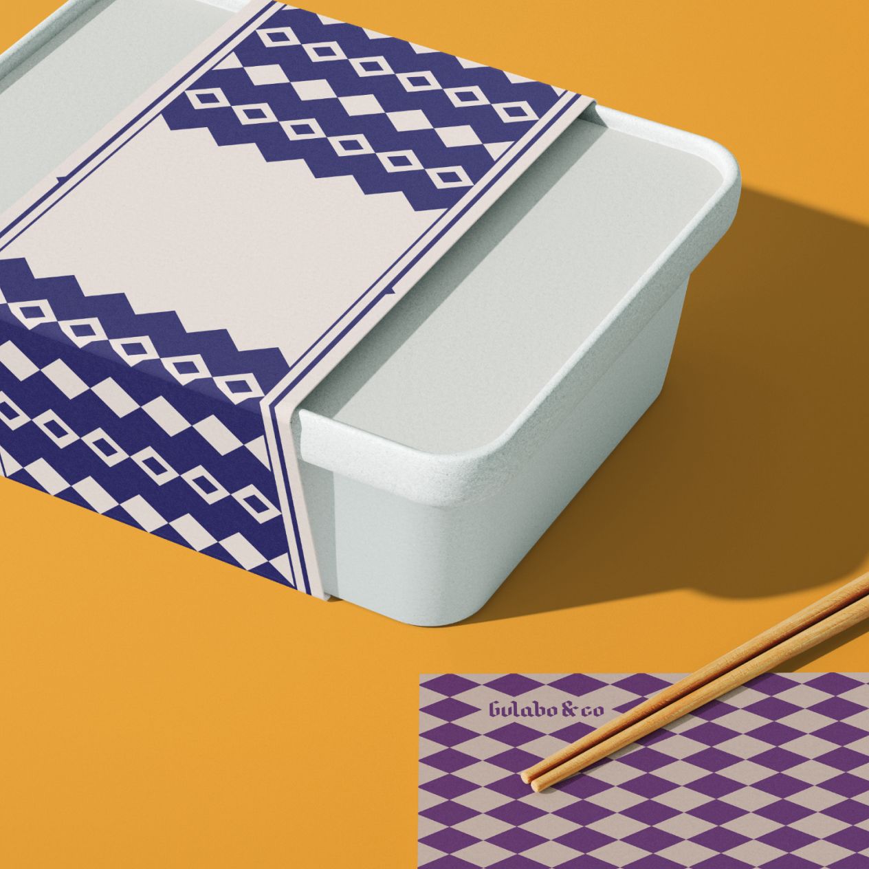
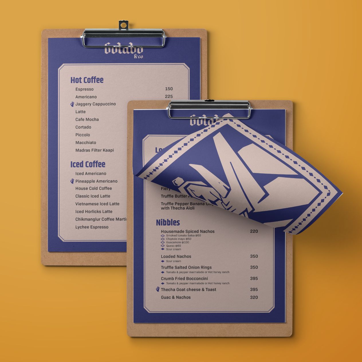
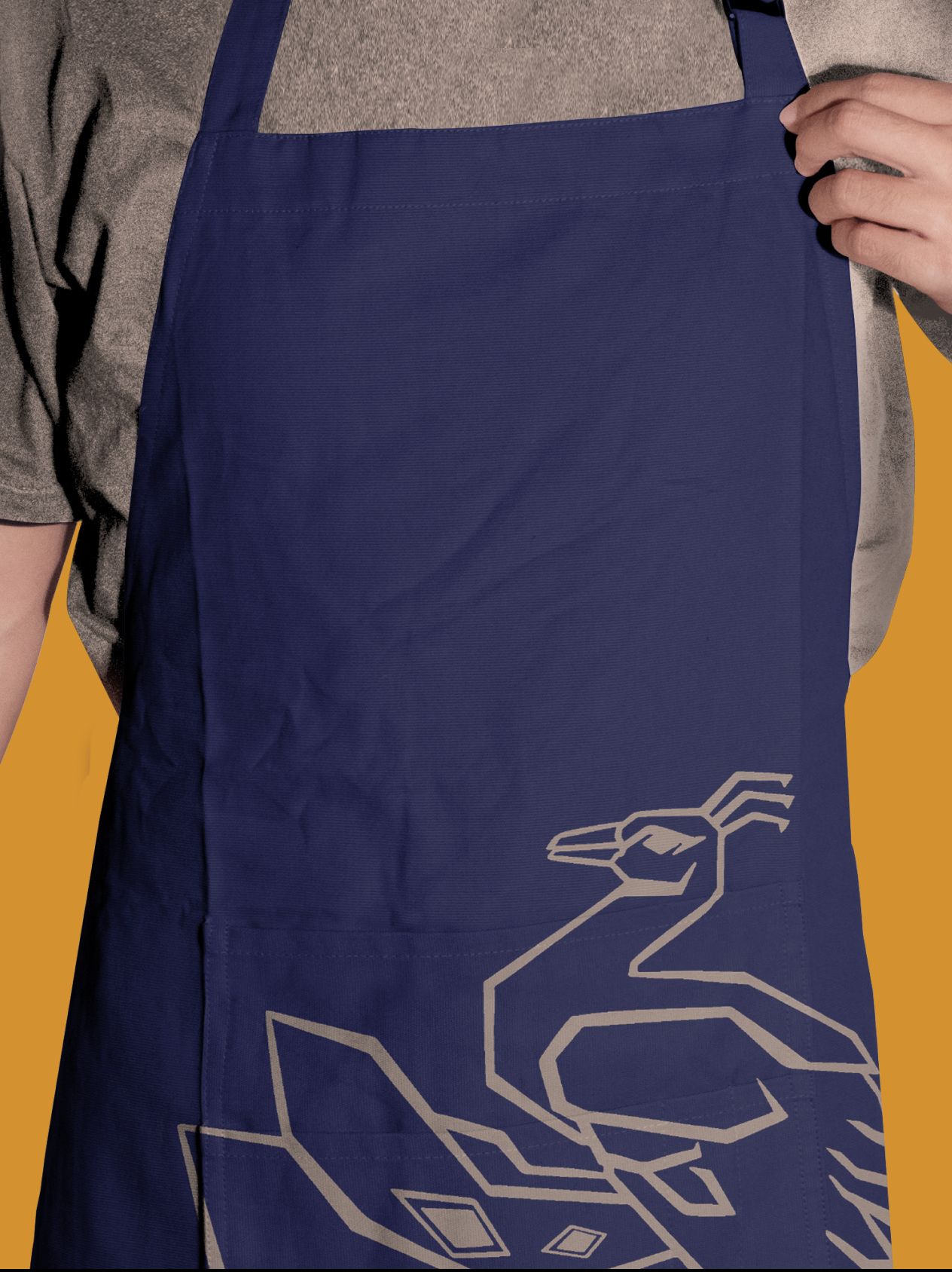
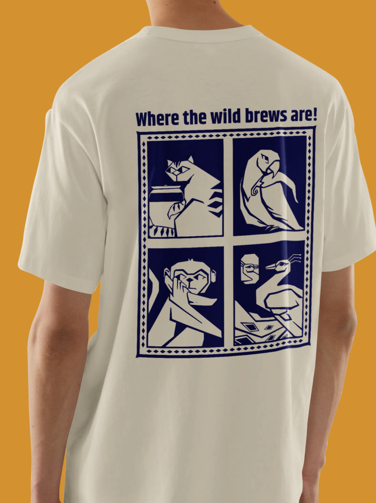
From the moment one learns about Gulabo, enters the space and indulges in their cuisine to long after when one leaves, the story and avenues of interaction continue. The result is a brand that feels like a living system.
Ononnyo
2024