Arisaa
Deliverables:
- Logo Rebranding
- Packaging Design
- Stationary Design
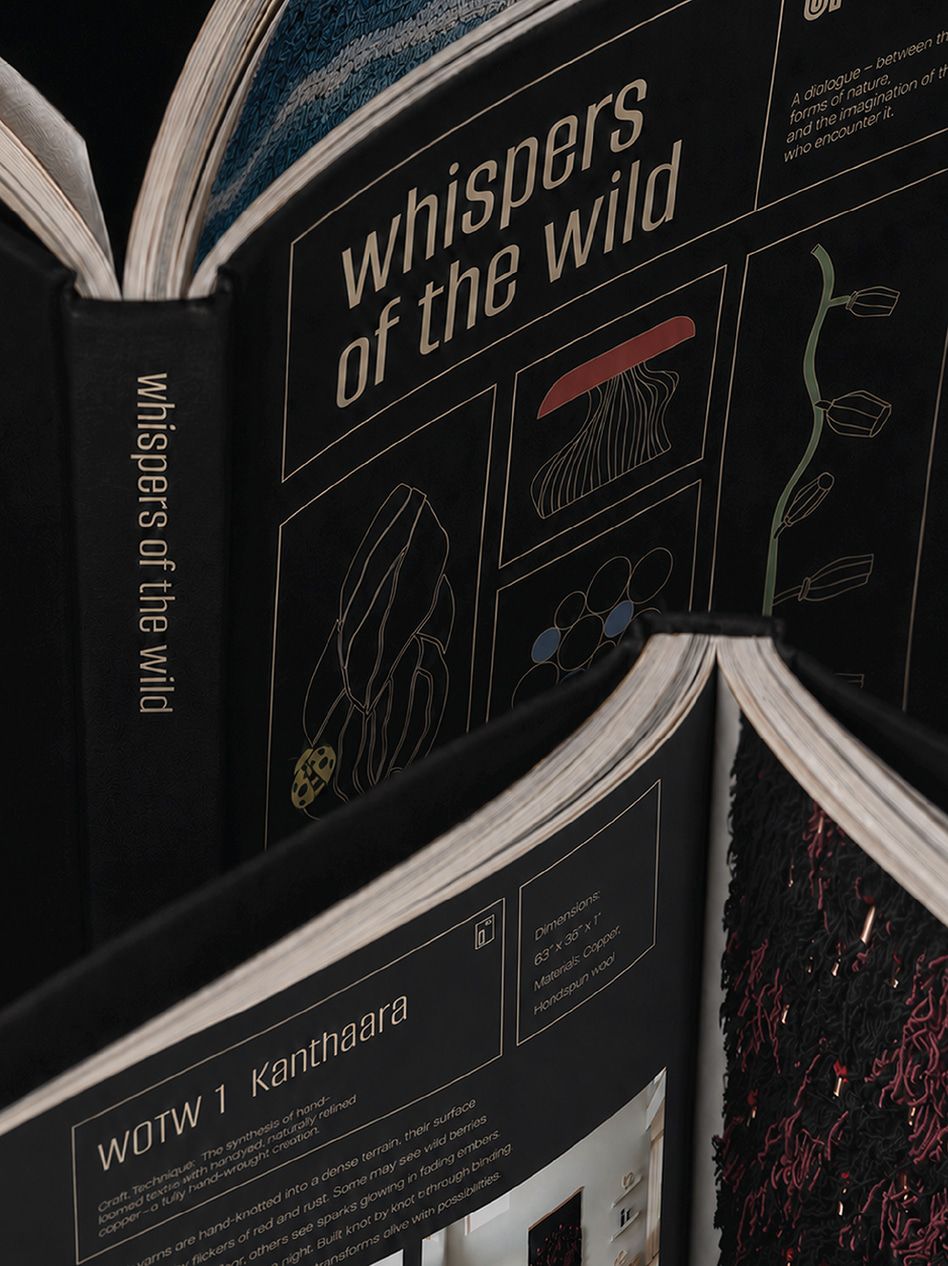
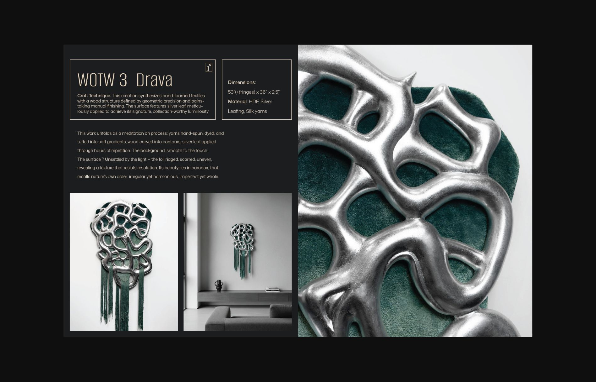
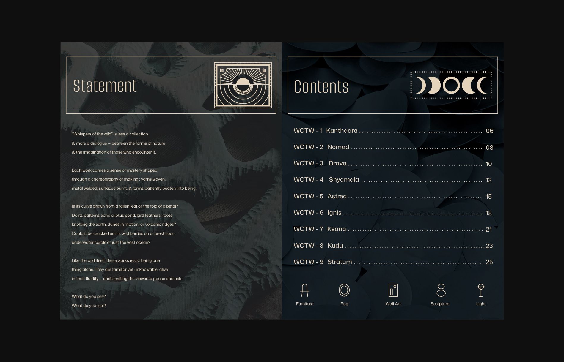
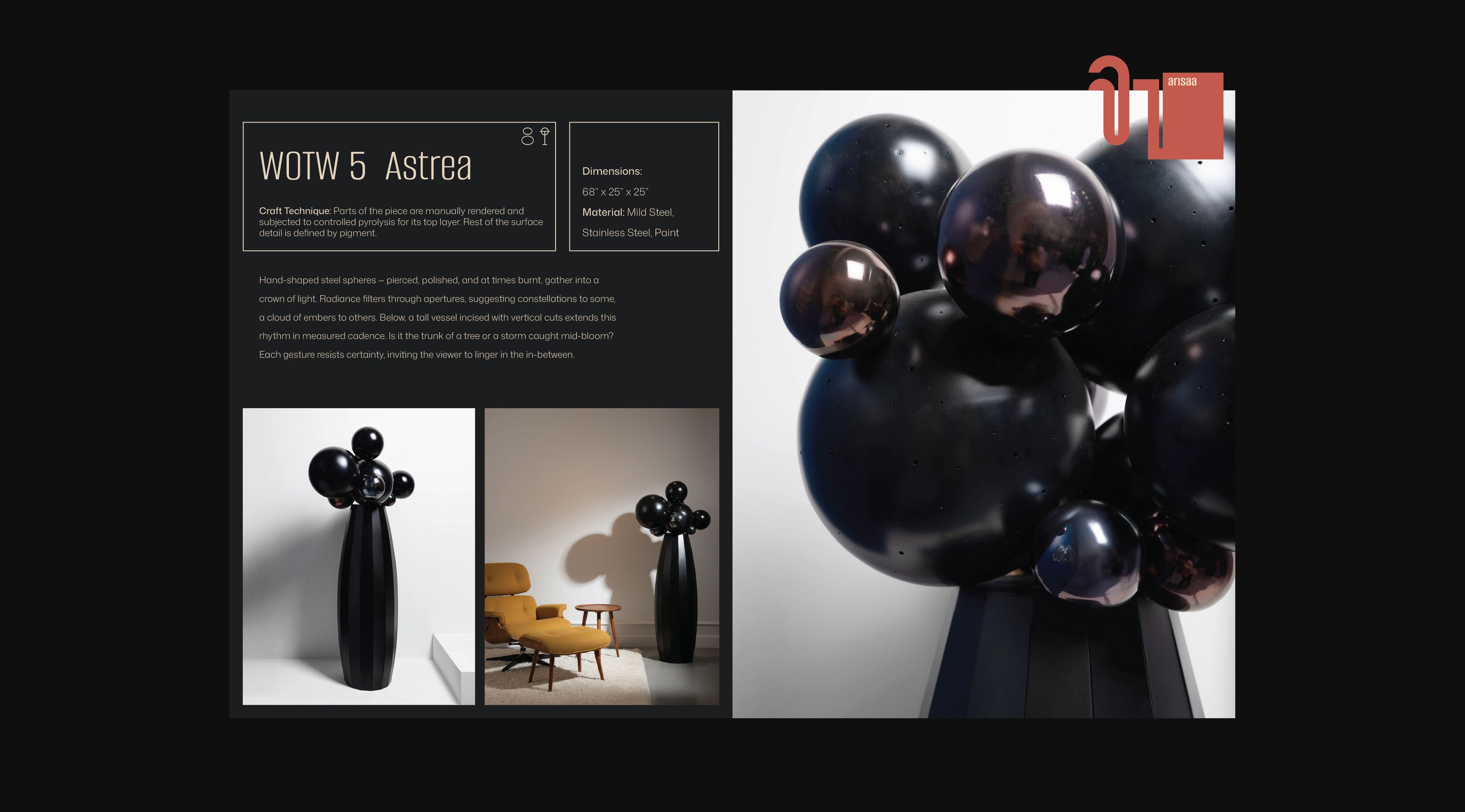
- Catalog Design
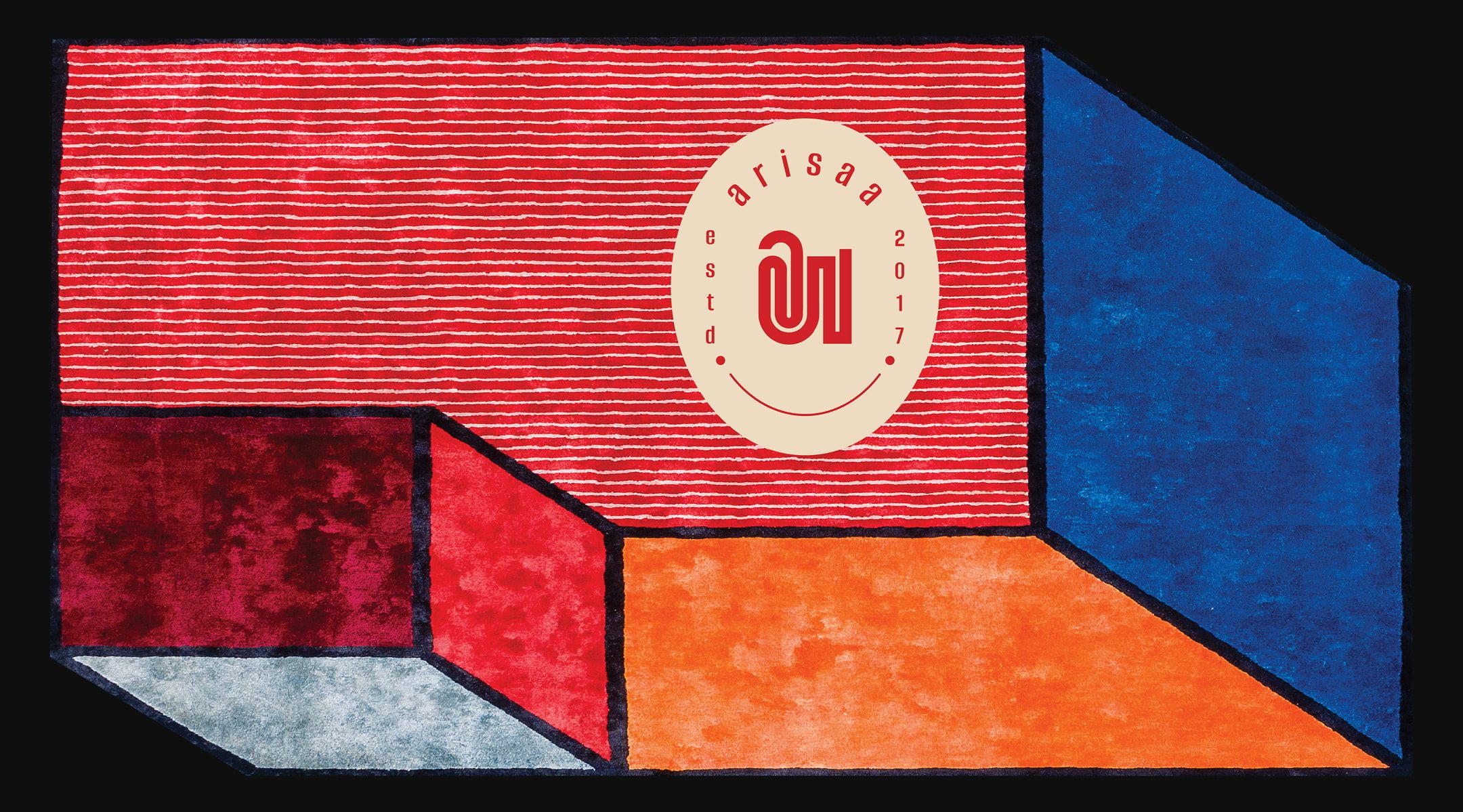
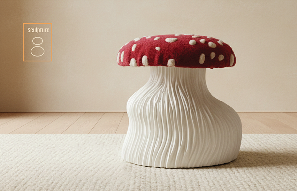
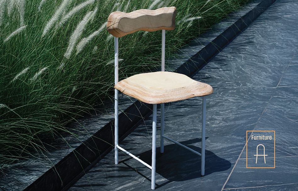
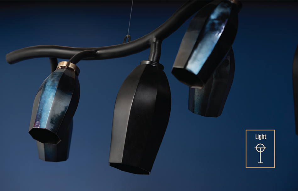
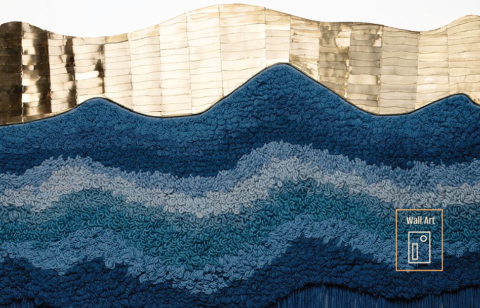
Arisaa founded by Aashka Desai and based in Ahmedabad, began as a journey from making a mirror. It has evolved into encompassing lighting, wall art, furniture and objects between all those realms
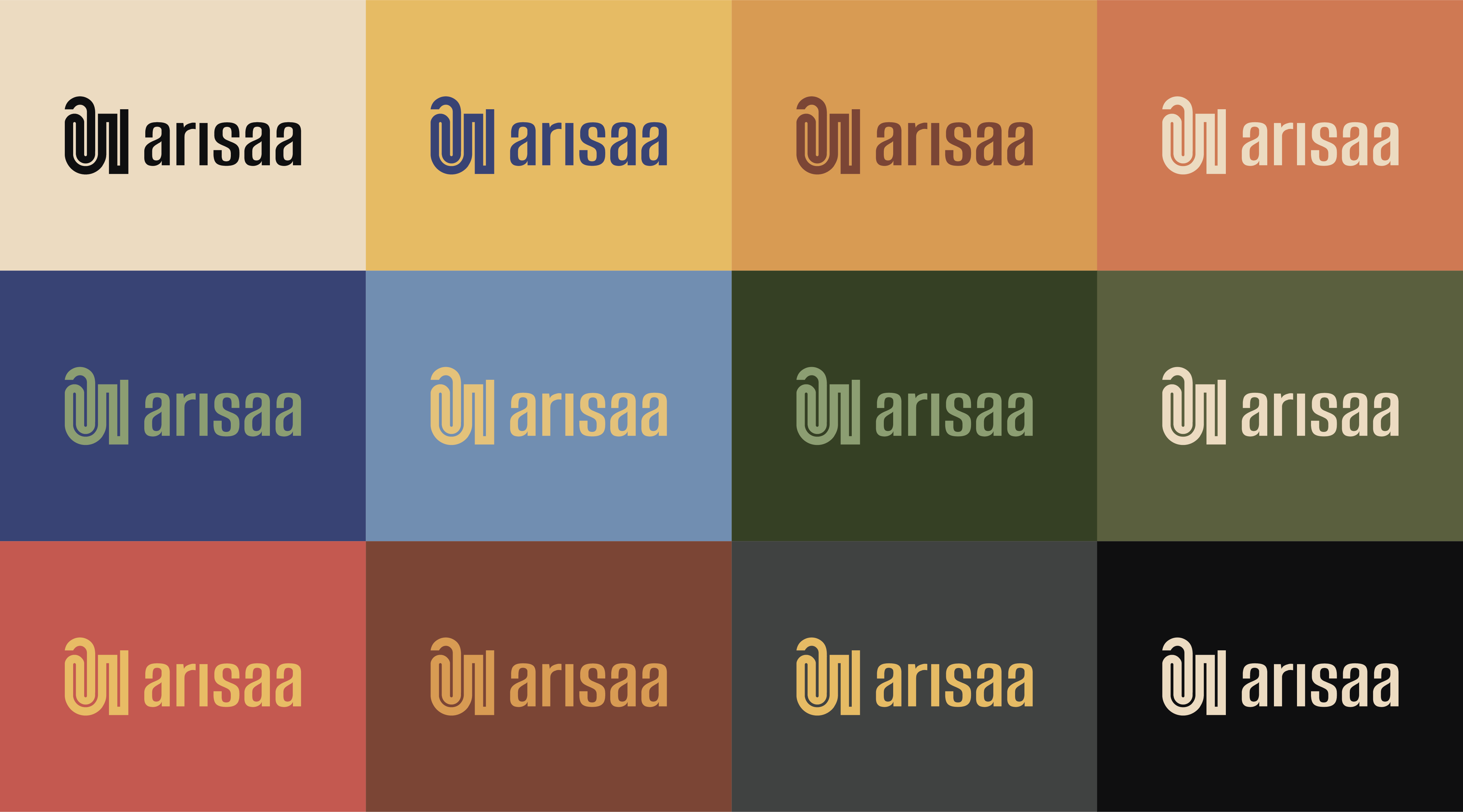
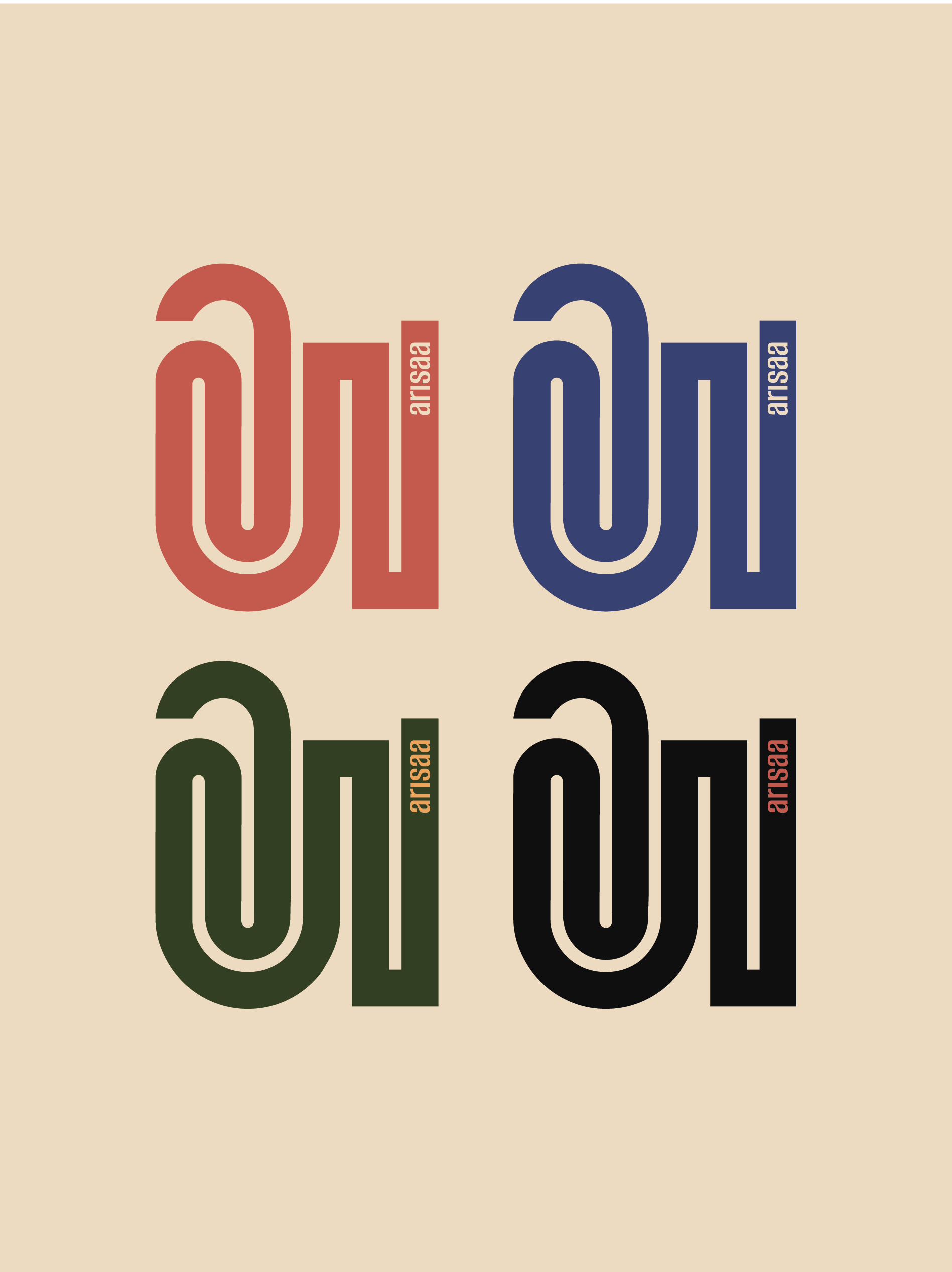
Arisaa means mirror in Gujarati and borrowing from this beautiful account Pomoco rebranded the logo of the studio with its rooted origin in mind, inspired by the Gujarati ‘અ’.
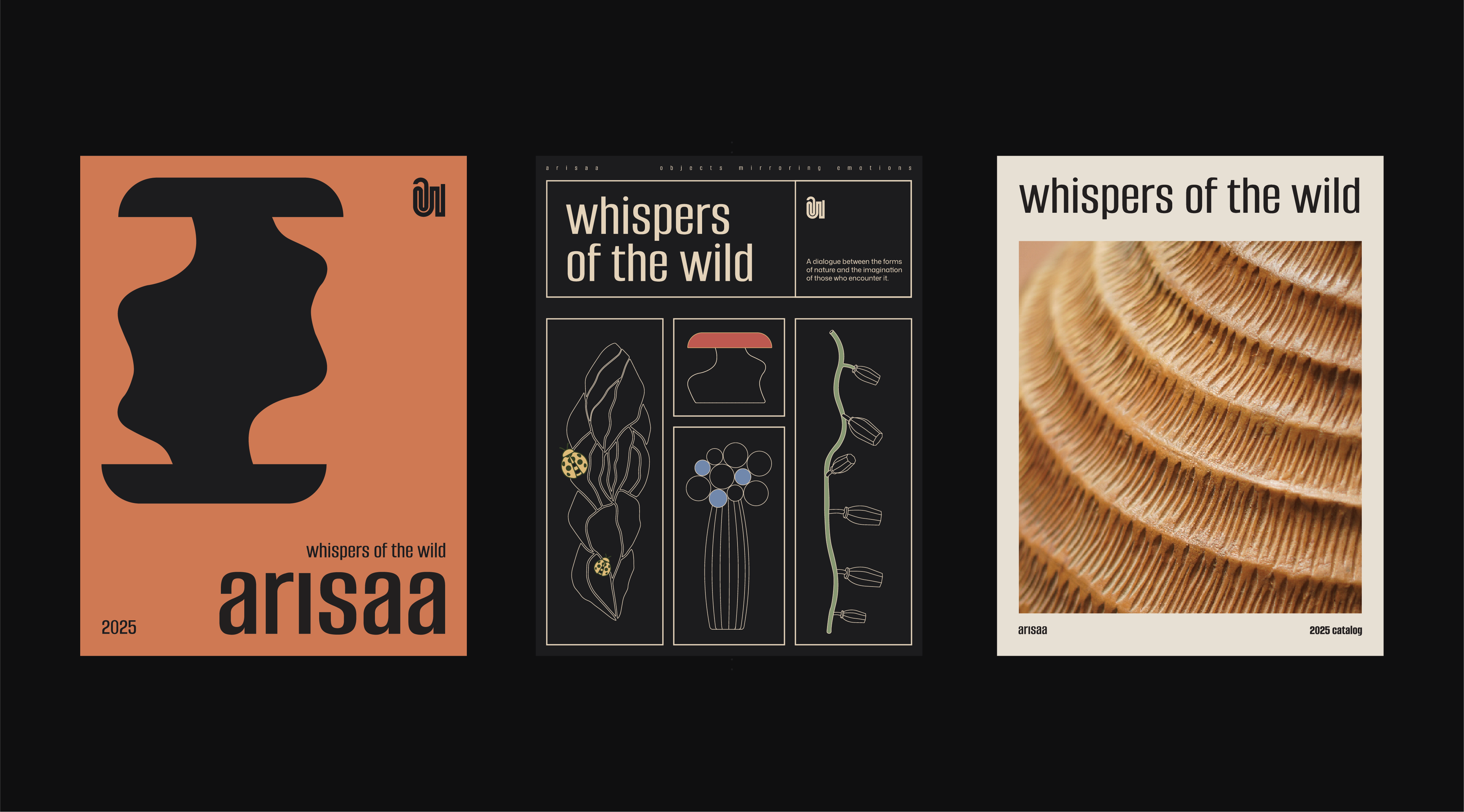
Arisaa’s work is a reflection of traditions, traditions of the artisan communities with whom they collaborate. The organic form of a labyrinth which was the studio’s initial metaphorical inspiration is created through the form of the font.
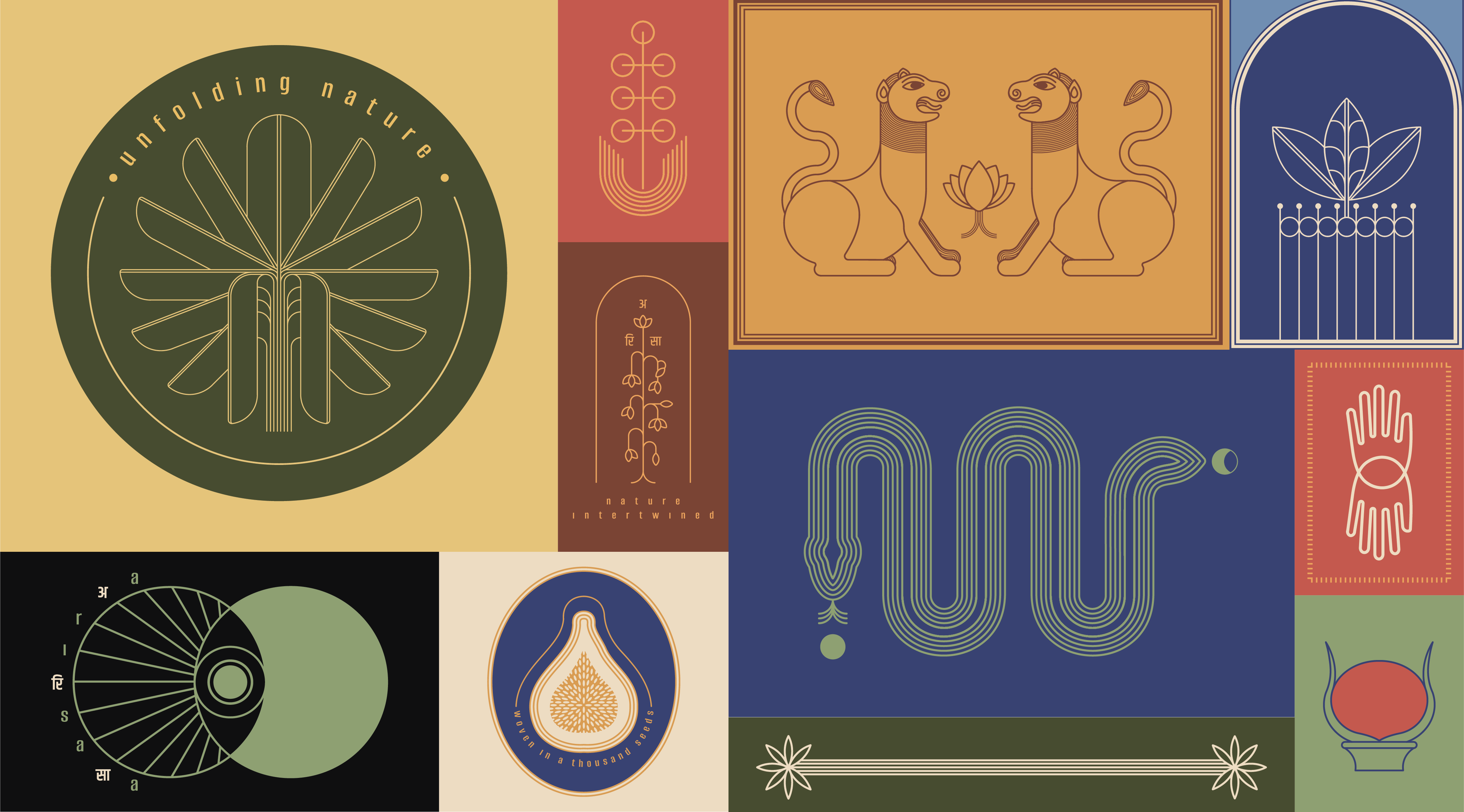
“Objects mirroring emotions”, the tagline Pomoco came up with, also refers to that organic and inspired making methodology.
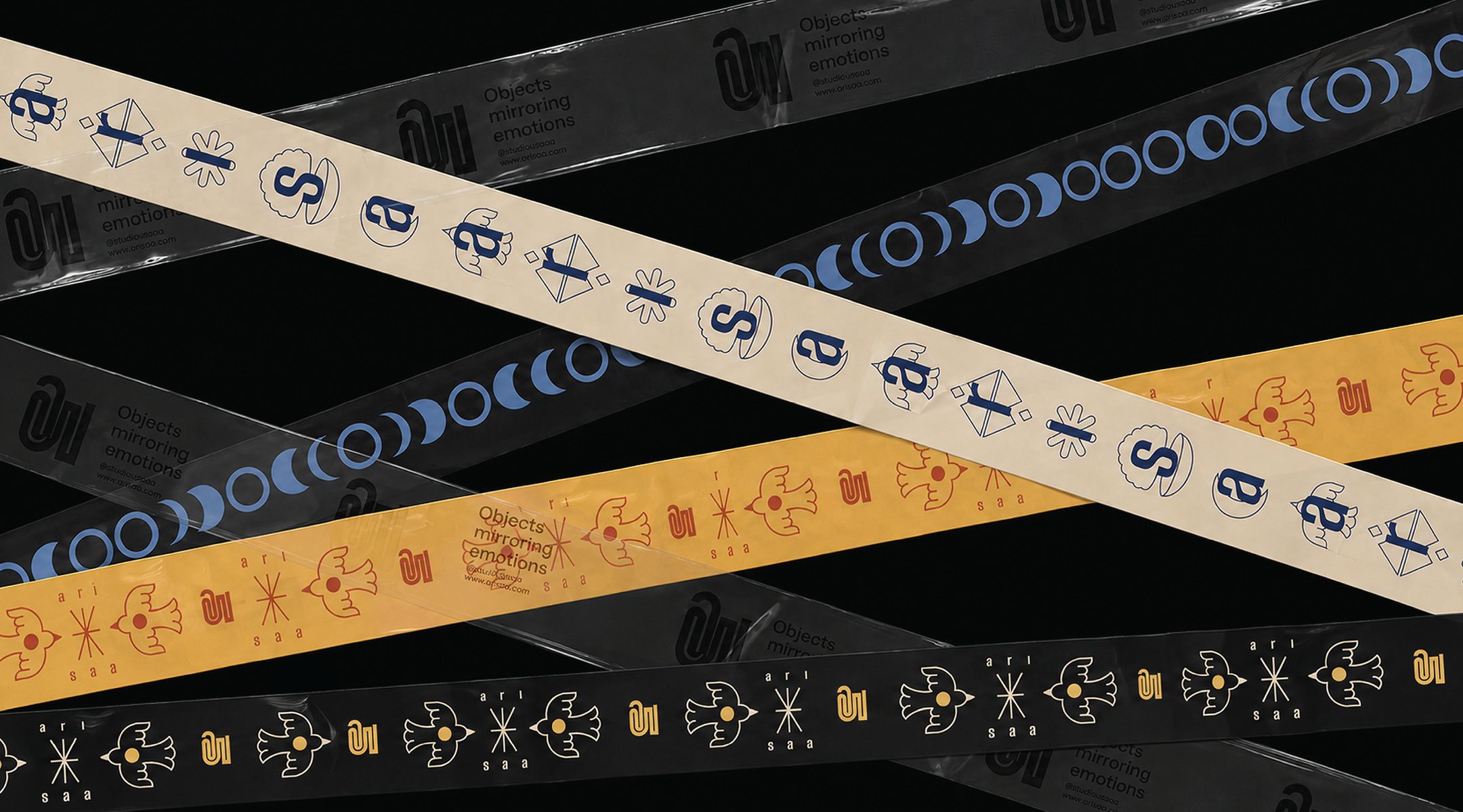
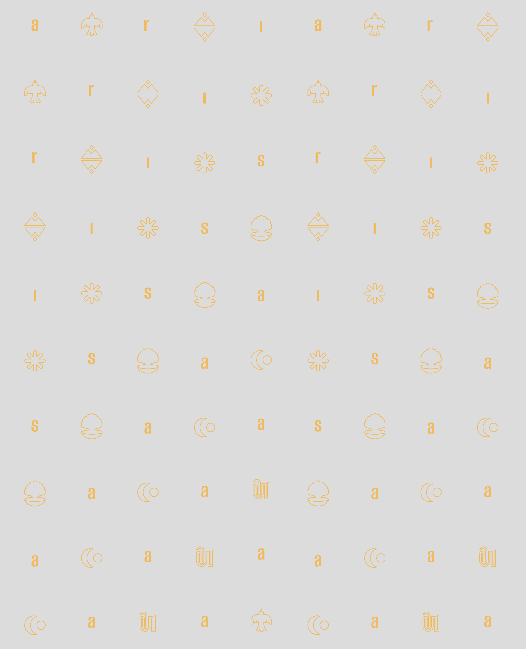
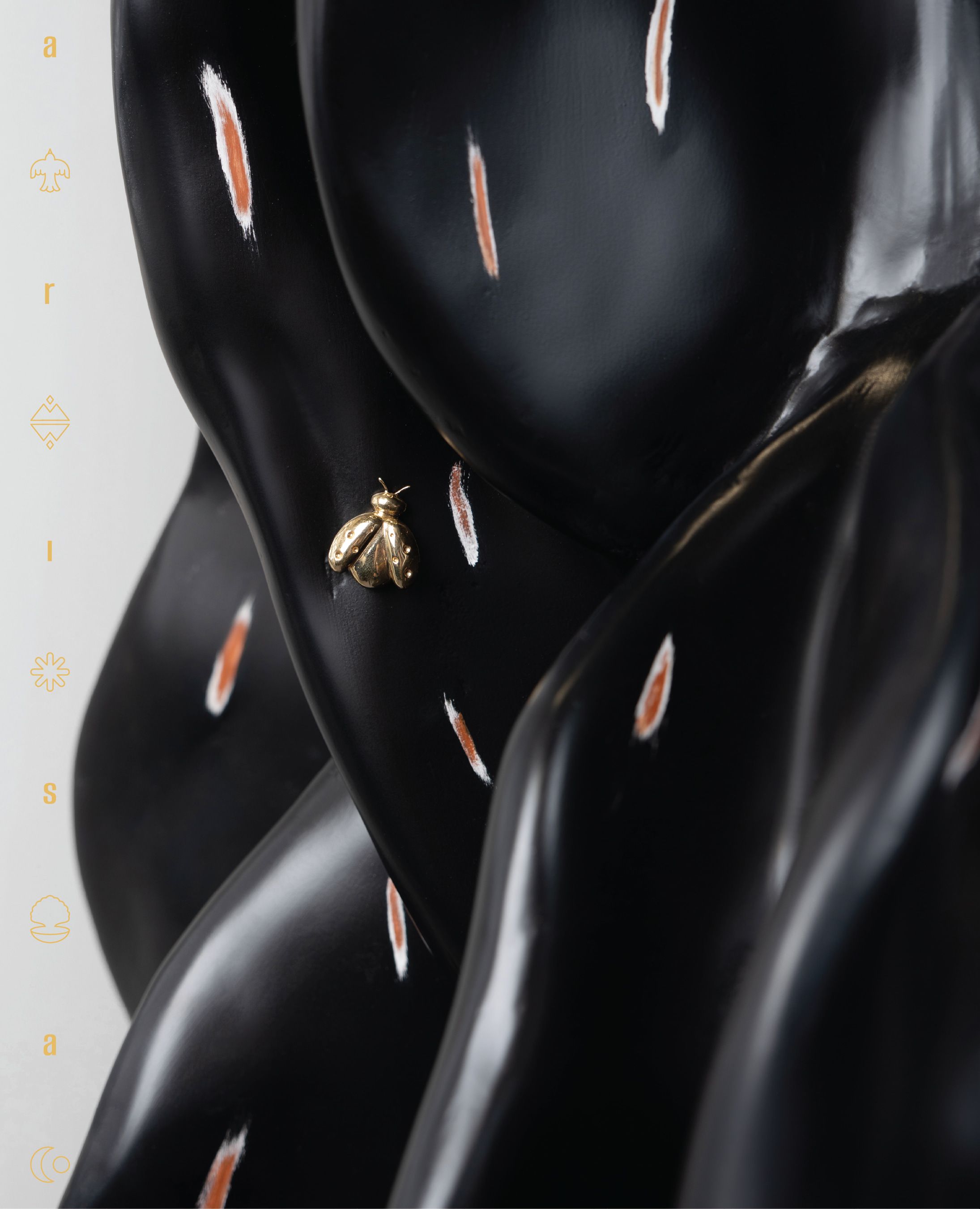
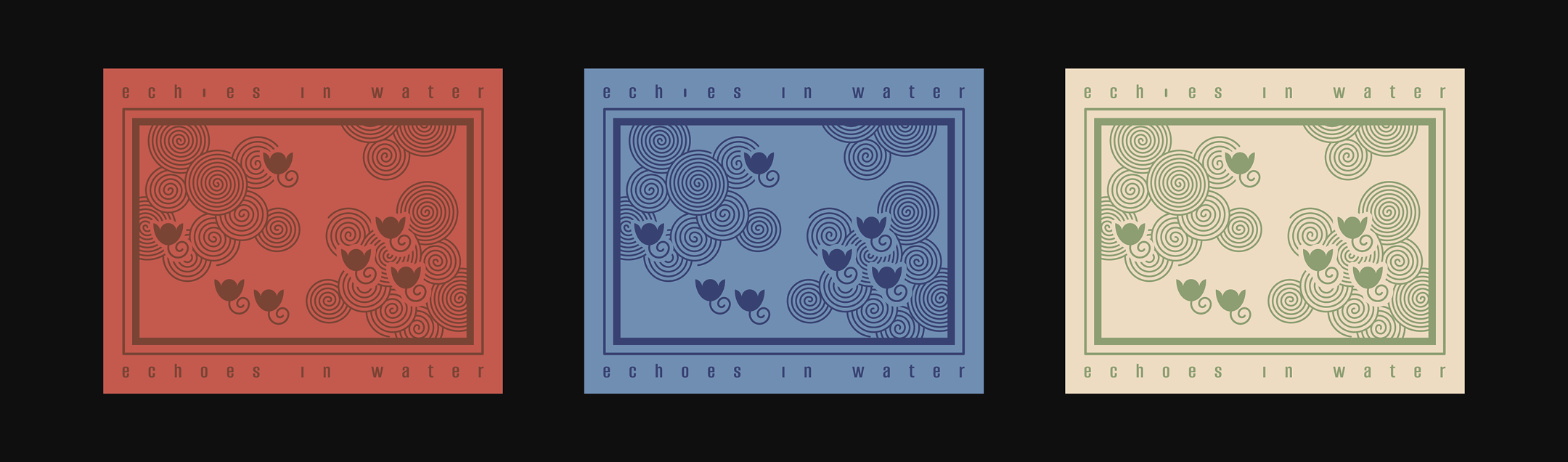
An extended graphic vocabulary was created for free use, natural forms, textures and movements in nature, and an element of reflections pulsing through the graphic language.
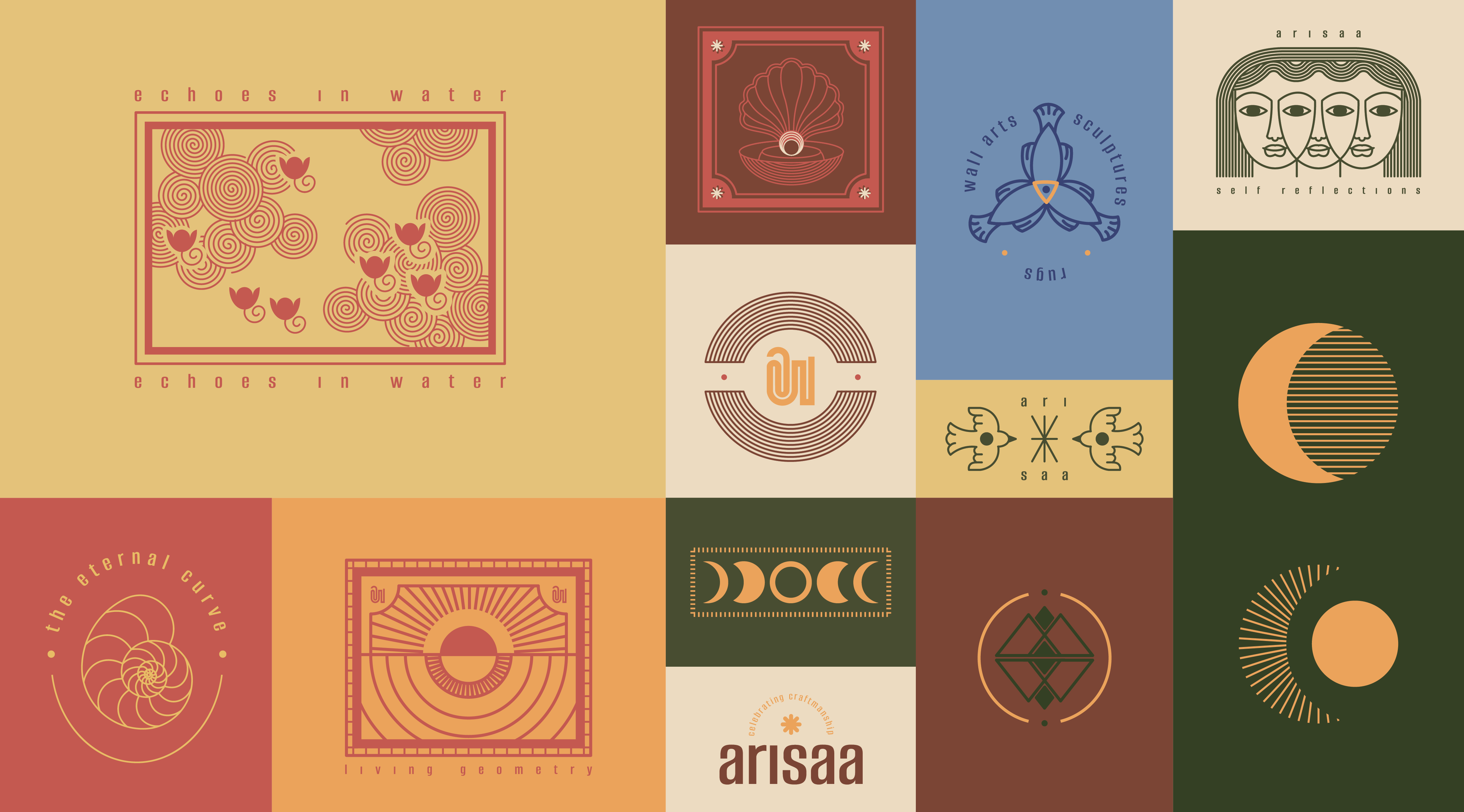
The color palette was inspired by nature and dominant colors used in the product lines of the studio.
The identity extended across a flexible set of collaterals designed to support Arissa’s work across exhibitions, markets and product categories.
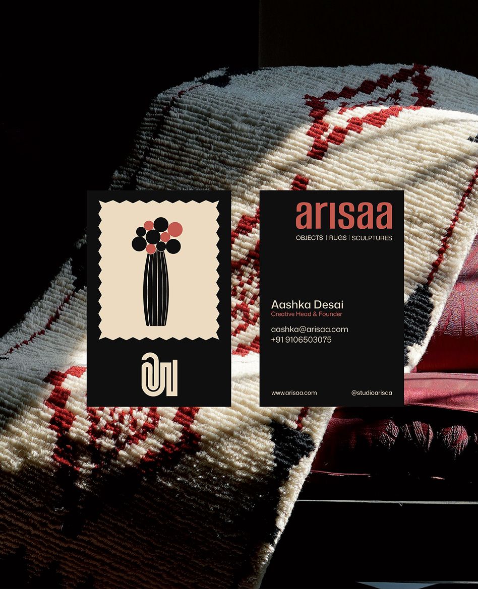
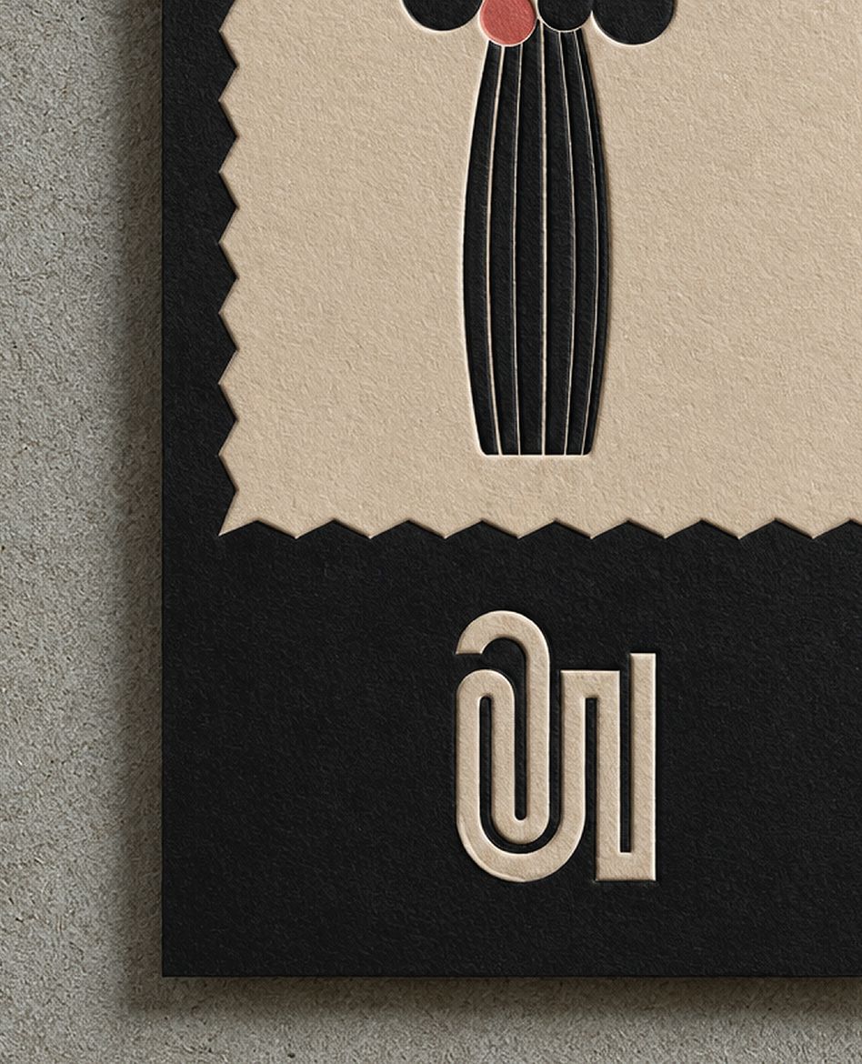
The visiting cards incorporated small swatches and left space for Aashka to attach materials or paint directly onto them, allowing each card to become a variable canvas
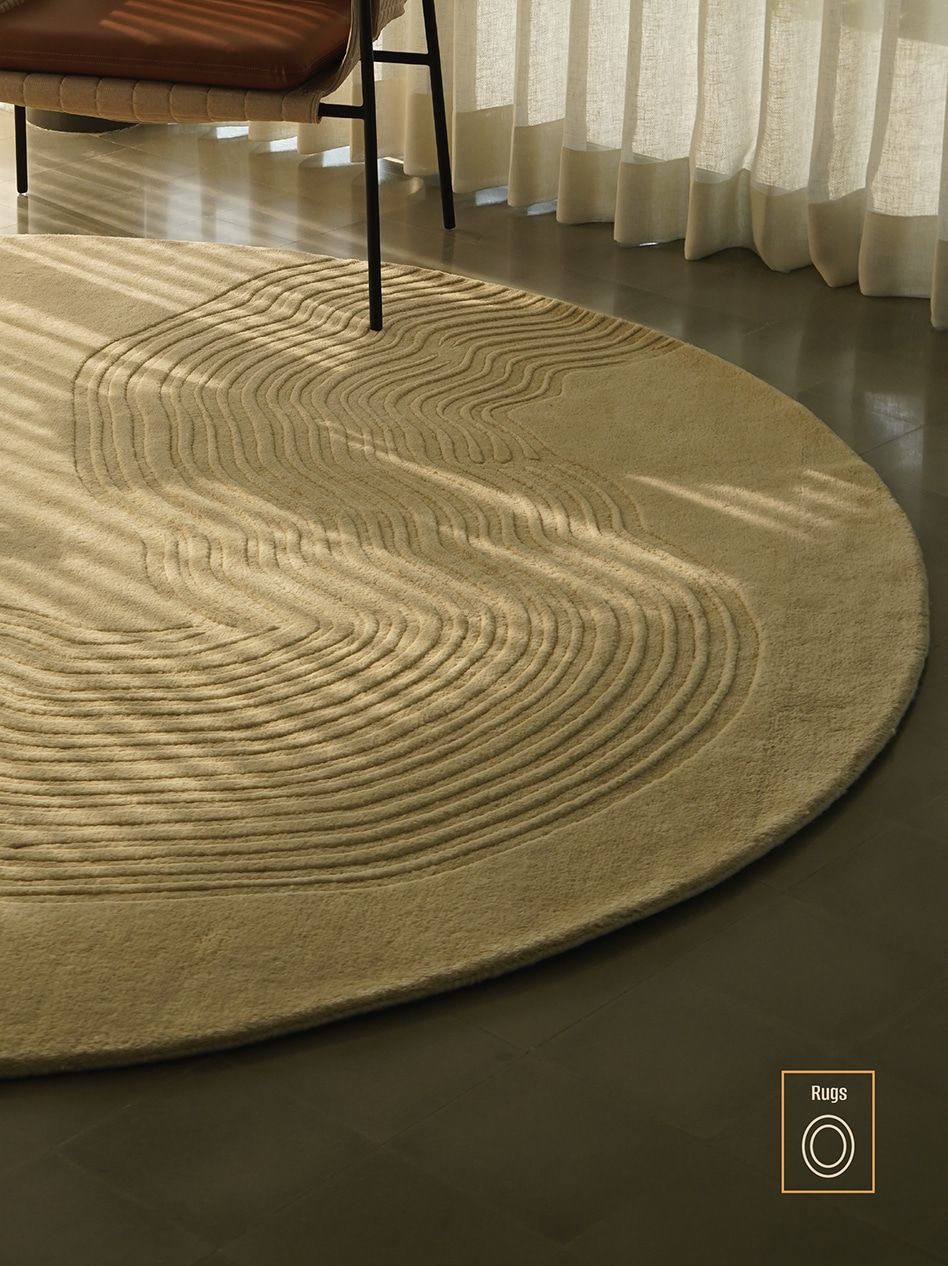
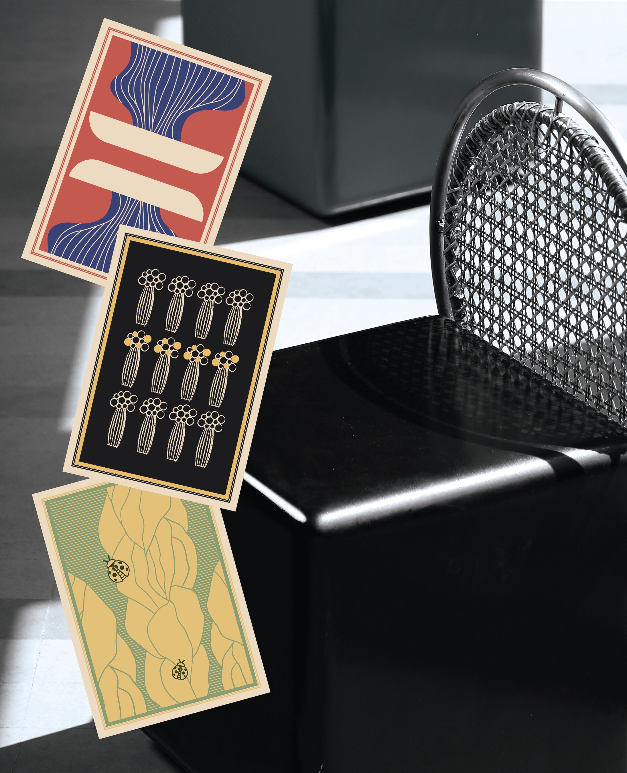
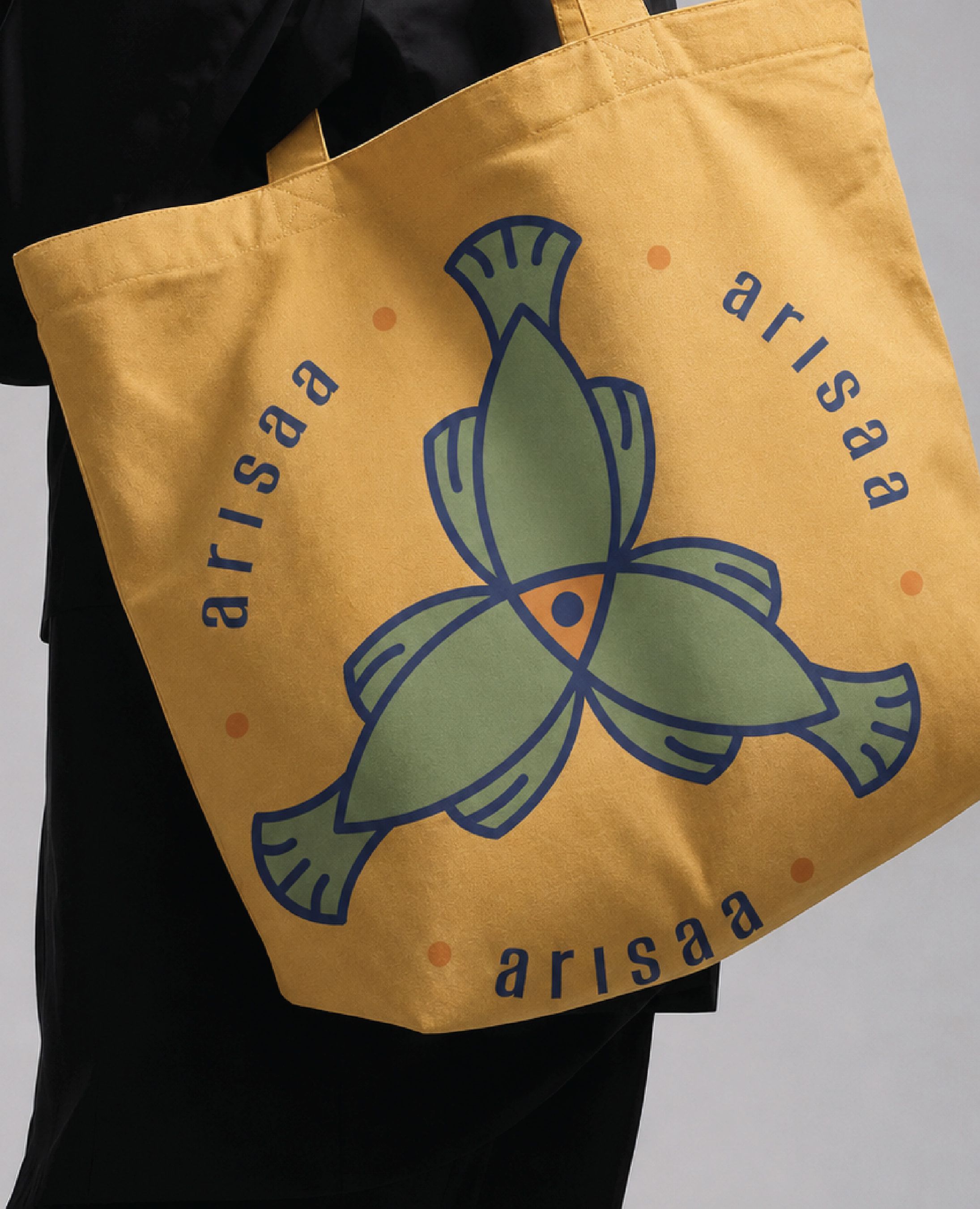
Postcards, packaging tapes that were functional for vendors and delivery workers outside the studio structure, tote bags, special rug packaging, authenticity certificates, and care cards carried the identity into different contexts. Stickers used color to distinguish non-rug product categories from each other.
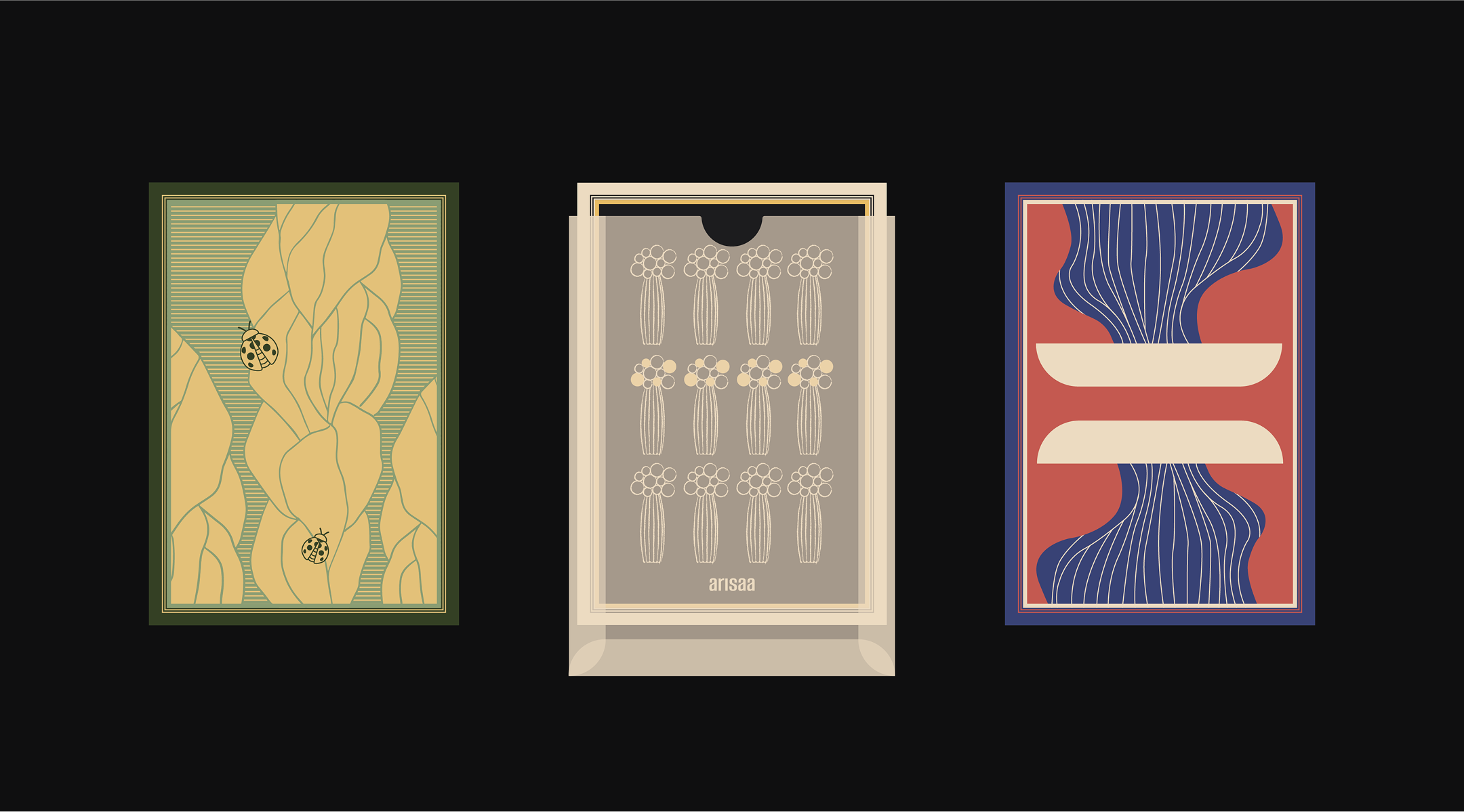
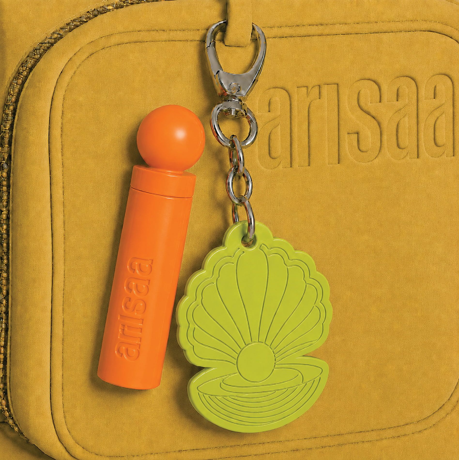
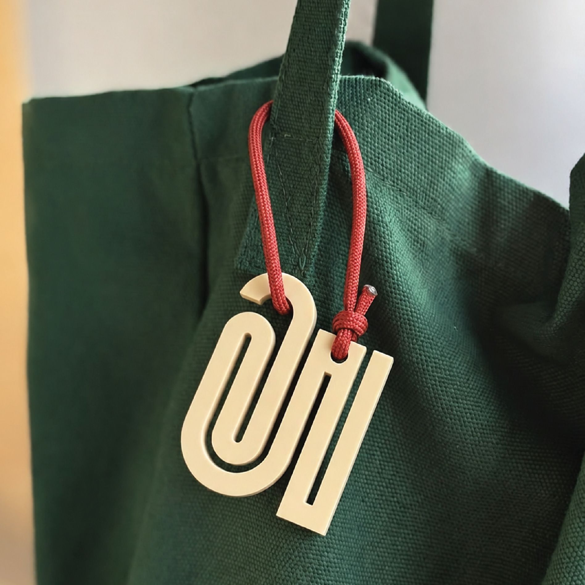
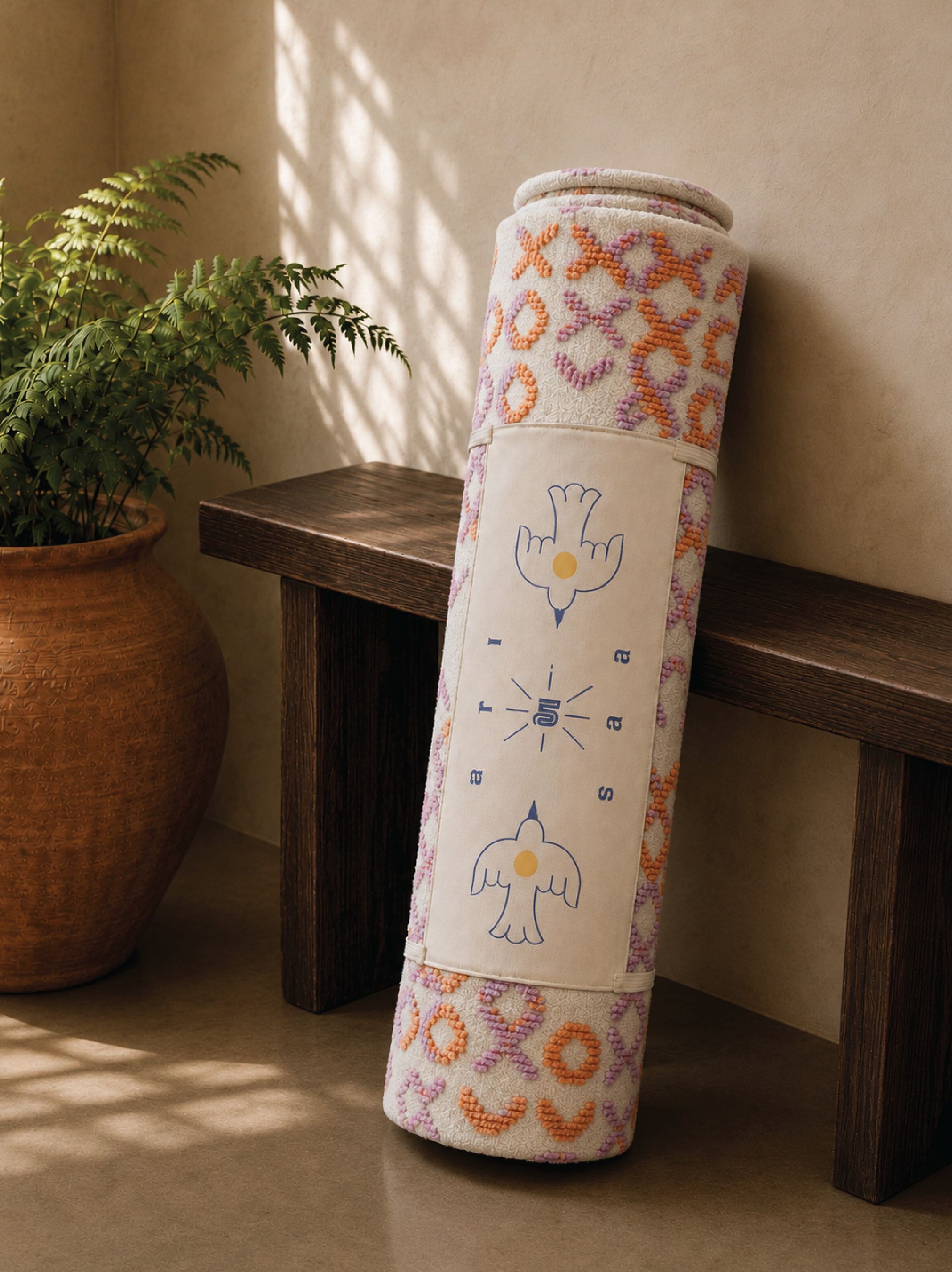
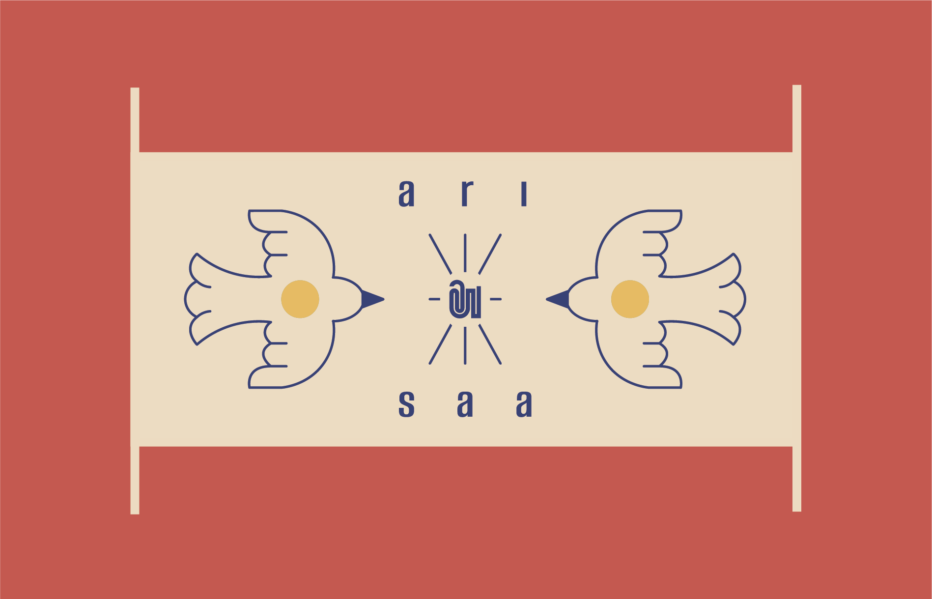
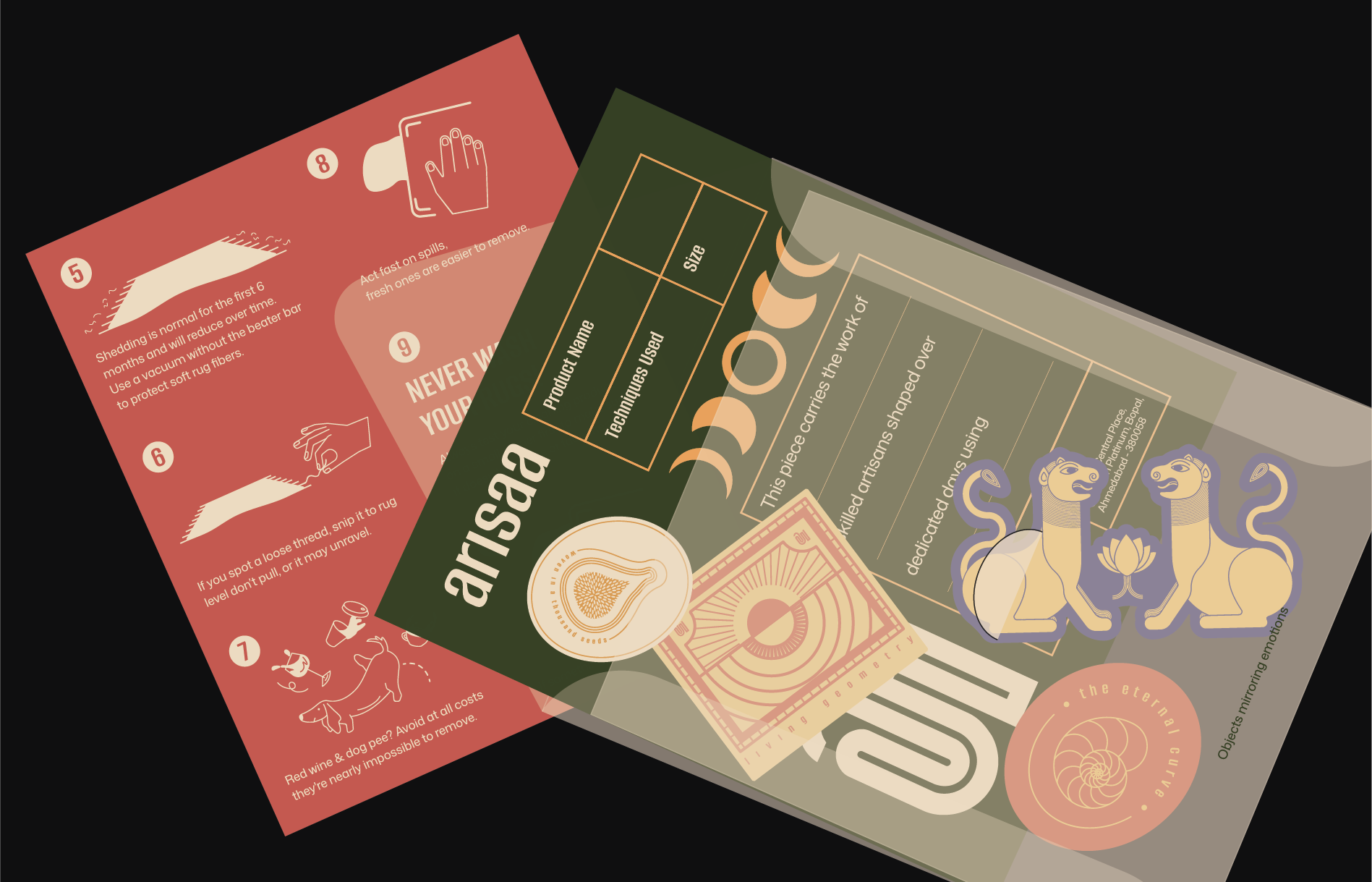
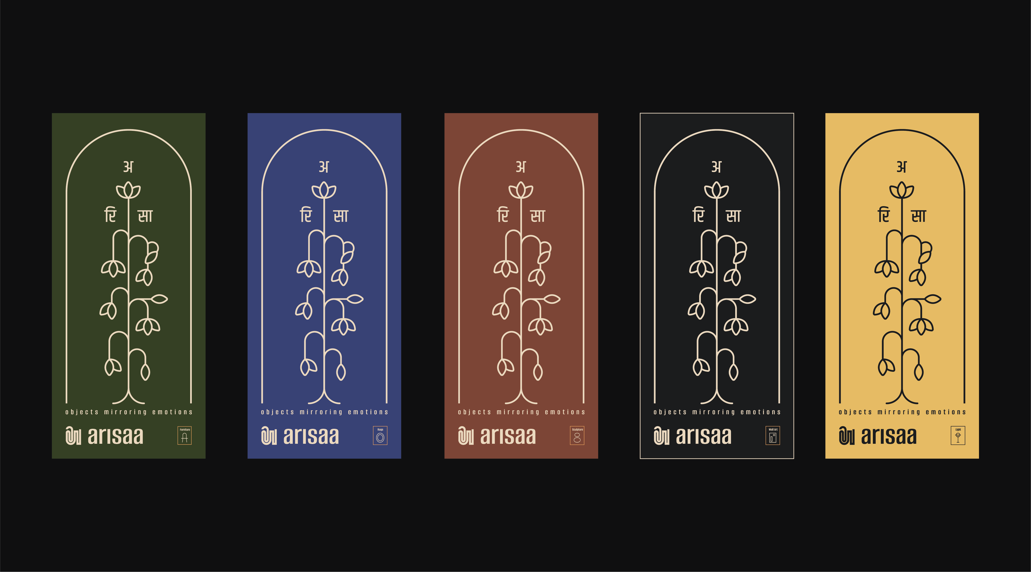
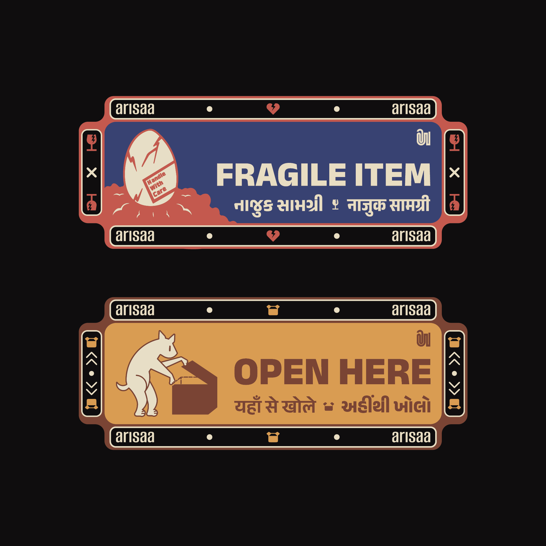
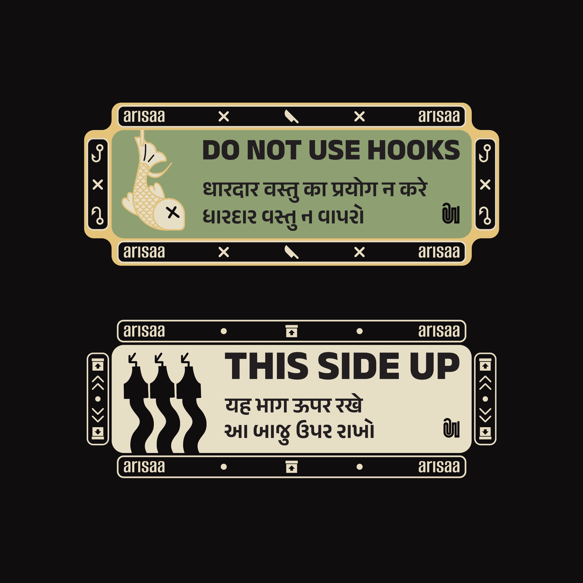
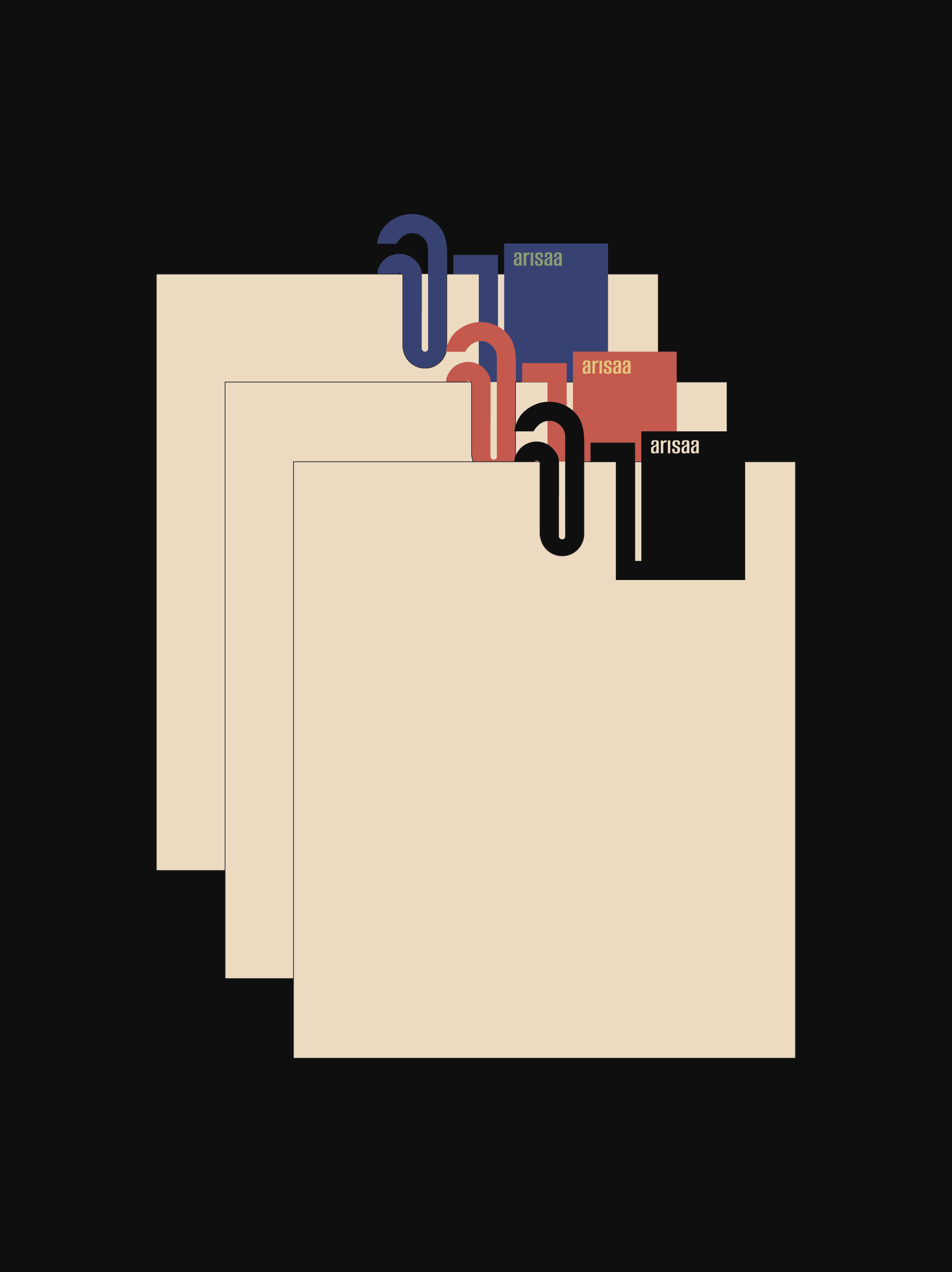

Together, these systems gave Arisaa a clear visual identity without restricting the individuality of its objects, preserving room for material experimentation and expansion, to go with the hands-on nature of the studio’s practice