Enar
Deliverables:
- Logo Identity
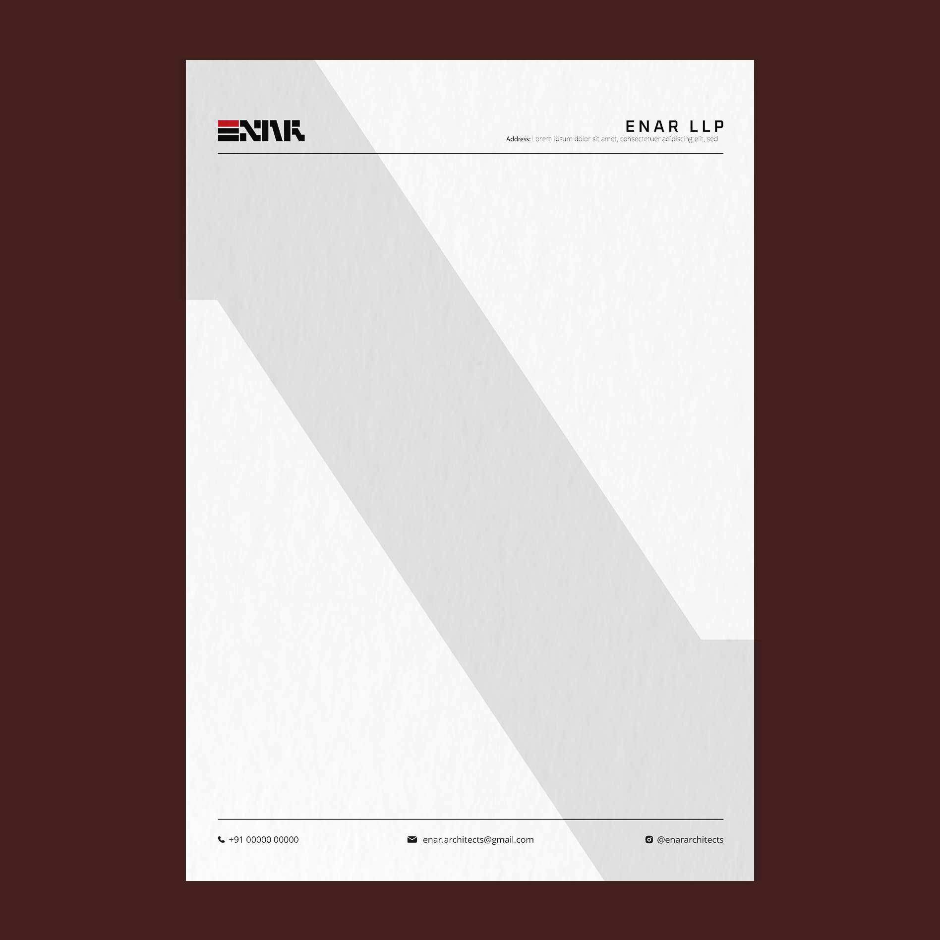
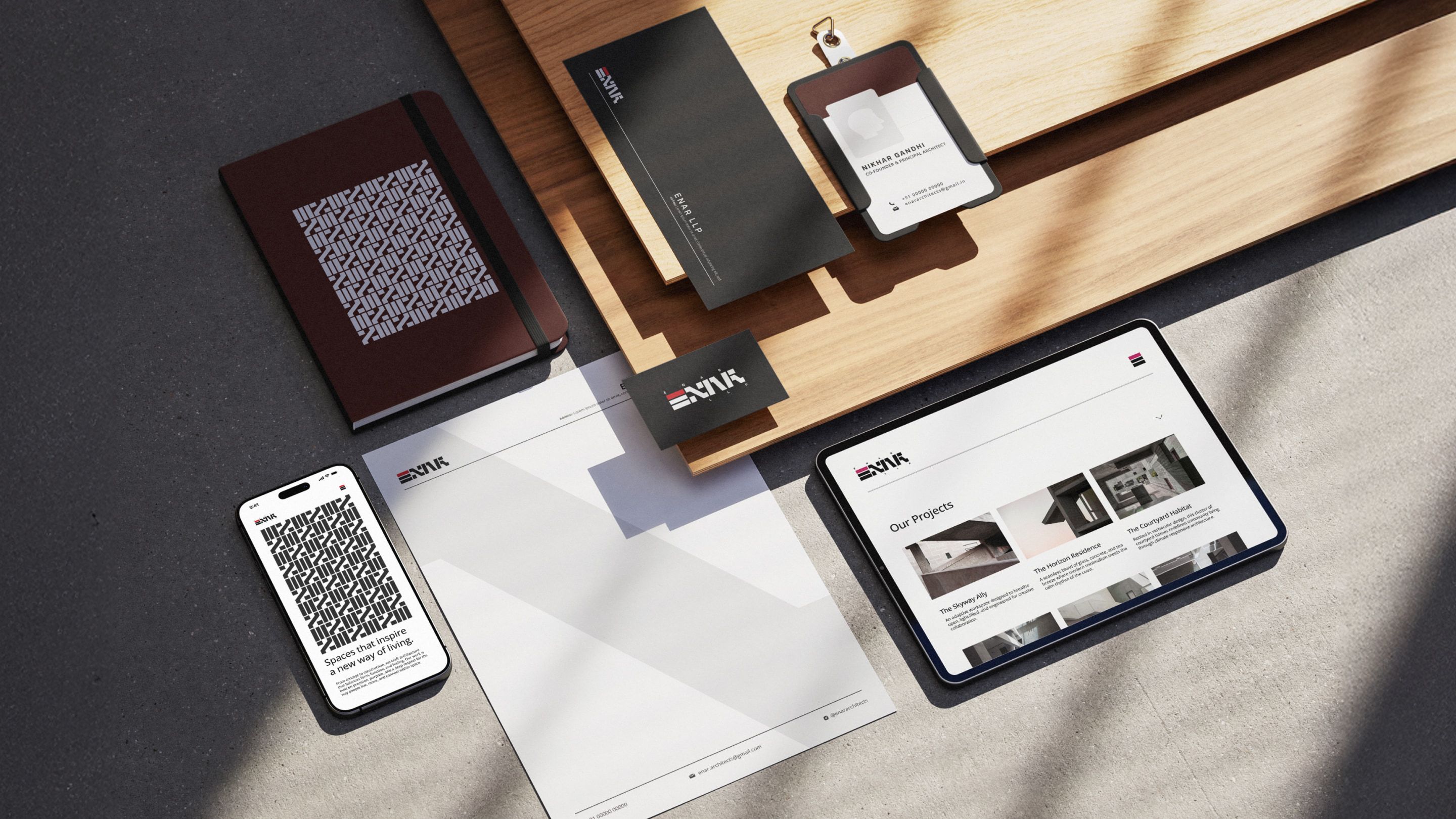
- Office Stationary
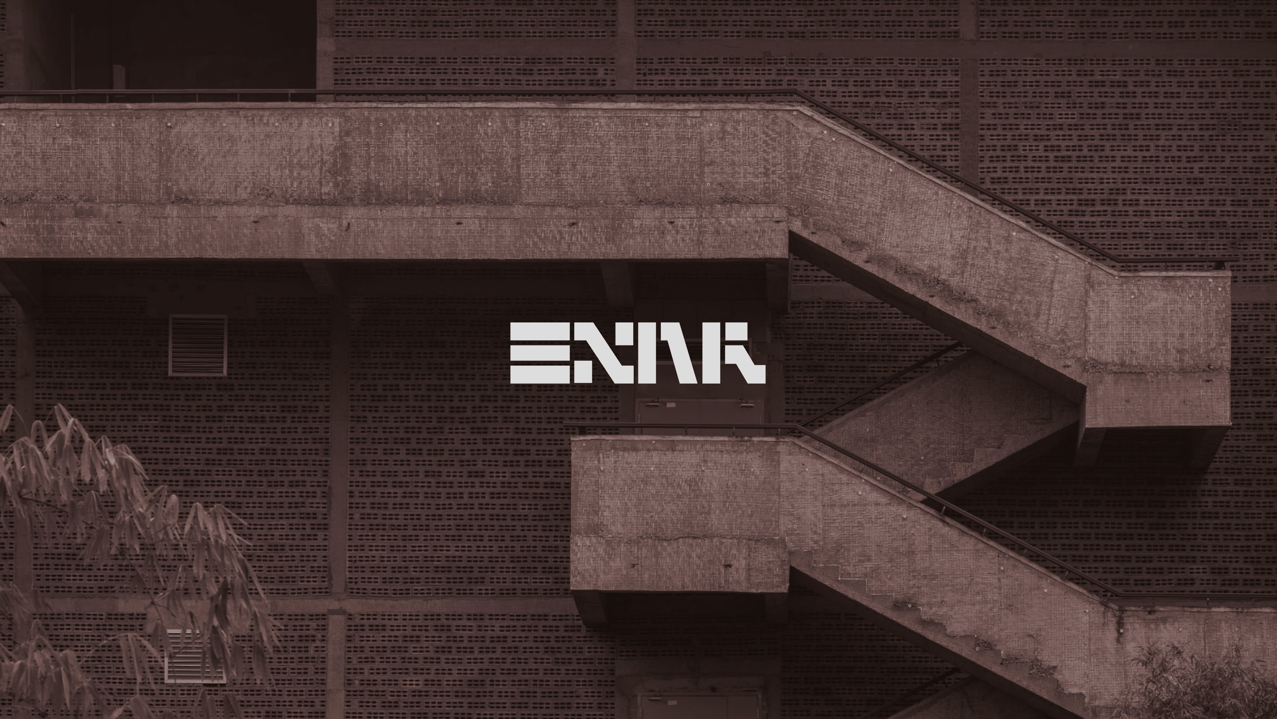
Enar is an architecture firm known for its work in construction-specialty and landscape projects
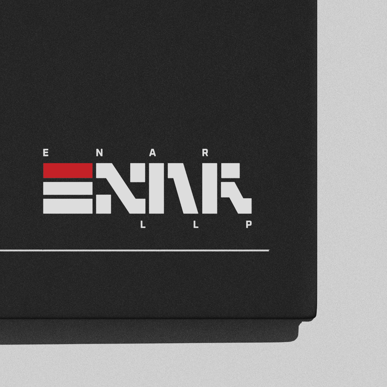
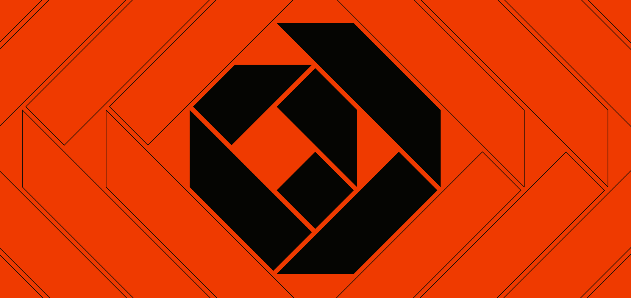
In 2025, we developed a visual identity for them that is reminiscent of architectural elements and drawing symbols. With Enar being a traditional architecture practice, we wanted the scale and operations to reflect in the logo itself. We spent time sifting through plan views and sectional drawings of staircases and buildings, separating the graphic elements from their architectural meaning.
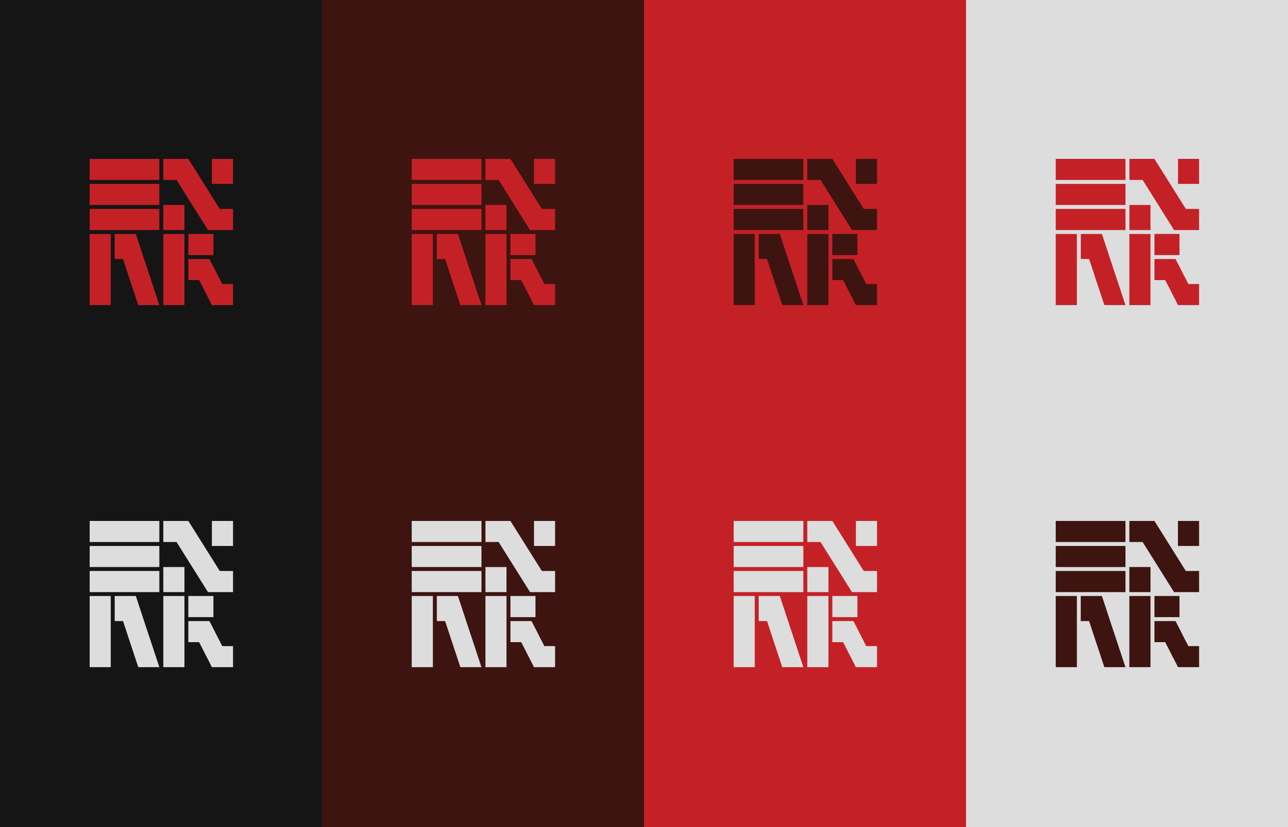
One reference that stayed with us was the scale bar, a key element of architectural communication, usually placed in the corner of a drawing, carrying a strong graphic identity.
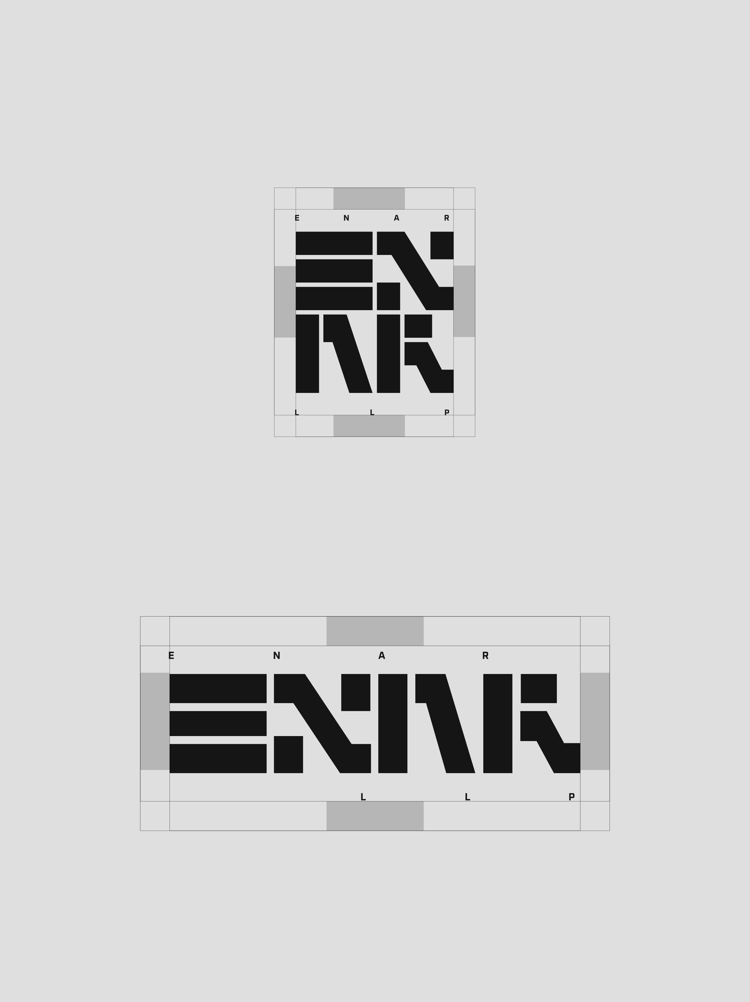
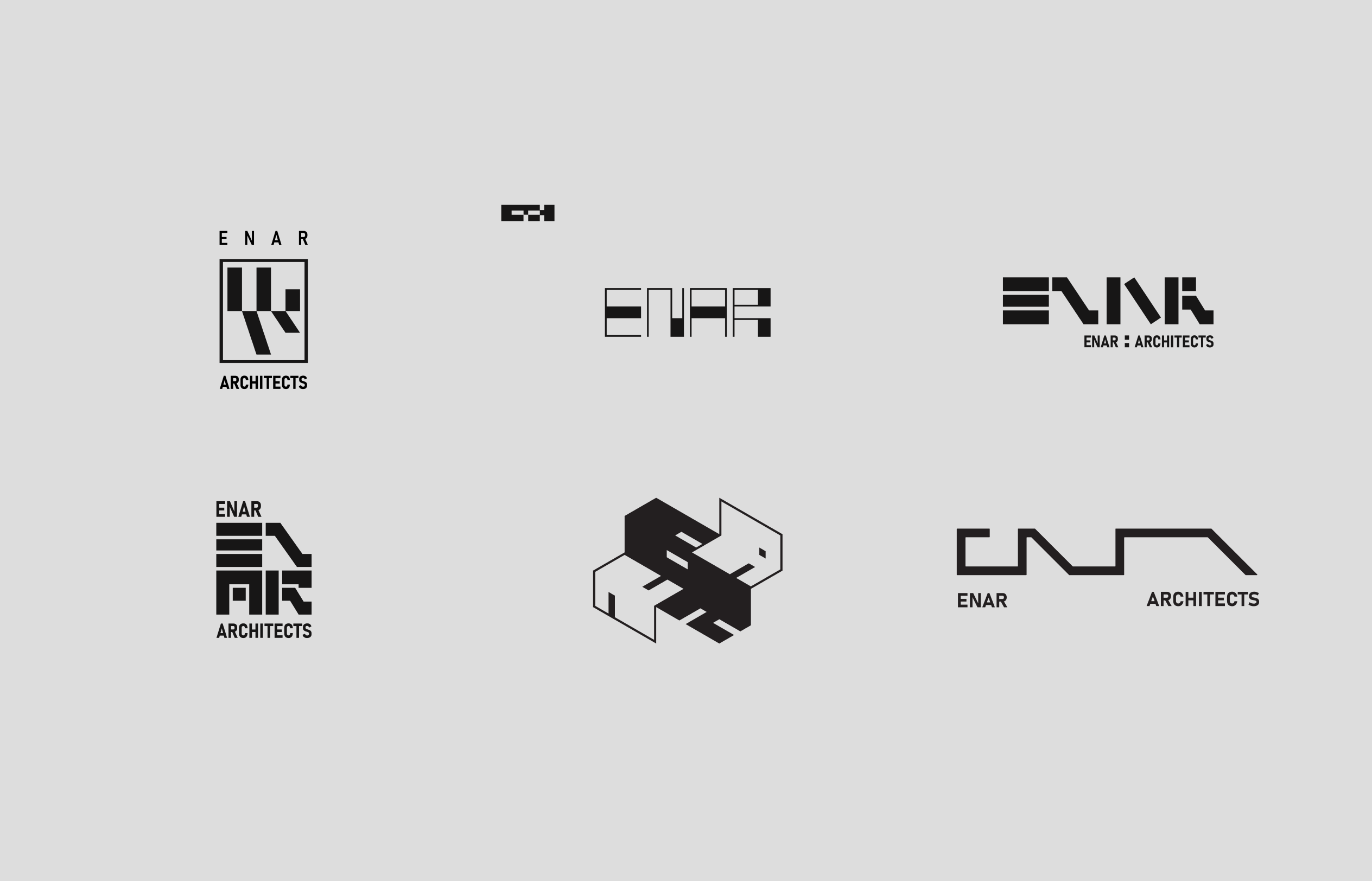
Since Enar is an invented word, the logotype comprises letters derived and developed from our studies of architectural drawings. We iterated with planes and varying line thicknesses before settling on the current language.
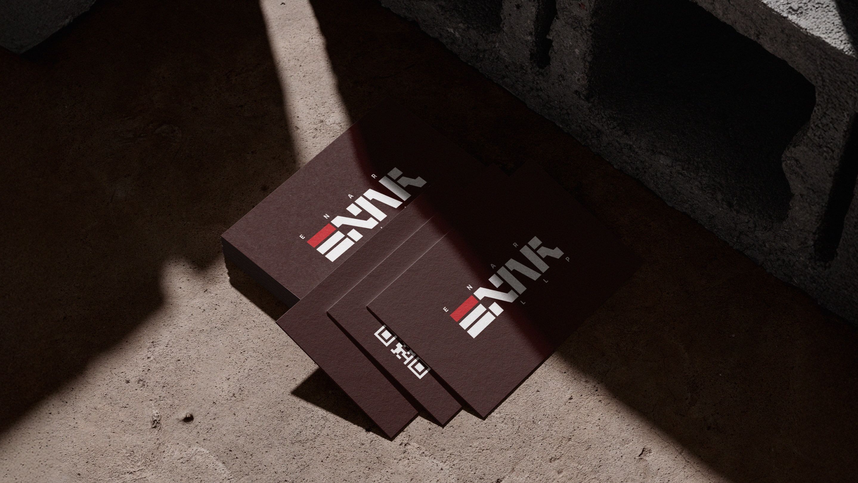
Thick squares and solid rectangles form repeating modules to construct the letters, allowing the forms to resemble architectural elements such as stairs, windows, and sectional fragments.
The process involved revisiting each letter several times, adjusting proportions so that readability and structural logic could coexist. The rest of the deliverables extend this language of the logotype as repeating patterns, layered with images of existing projects.
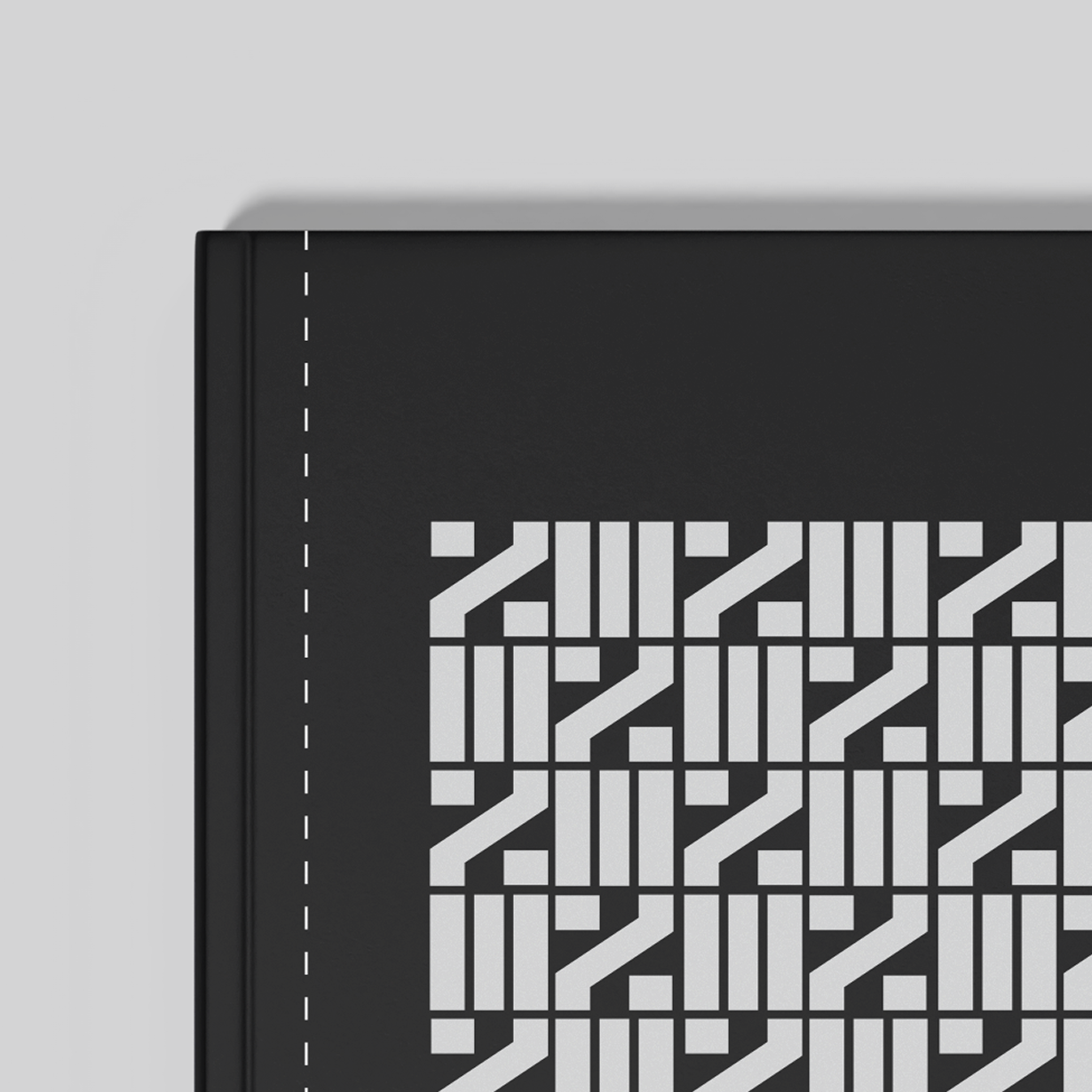
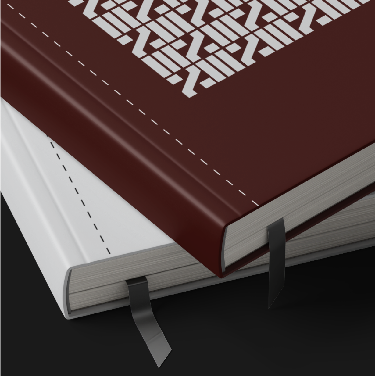
Developing Enar’s identity taught us to extract the typographical capacity of every visual element. The outcome reads as type, while reflecting the language it comes from.
Midcai
2025