Book Design, Illustrations, Type setting, Cover and Back Design, Posters
“An eclectic collection of studies with chapters on oral narratives of Goa, Balaji Telefilms, textile mills in Ahmedabad, the sari, and Mulk Raj Anand, Khanwalkar’s is the best book on the semiotics of design to come out of India in this Century.”
- Paul Cobley, Professor in Language and Media at the Middlesex University, UK
Applied Semiotic Tools For the Indian Cultural Context is a Semiotic research account of various cultural complicities across the Indian context through Seema Khanwalkar's unique lens.
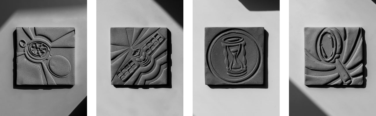
The chapters across the book are published articles and essays throughout Khanwalkar’s elaborate career as a researcher and professor. We imagined these profound cultural observations through the semiotic method as ‘relics’ or ‘seals’ that can become metaphors for the various themes across the book. As a visual concept, these themes are imagined as actual ceramic relics created by Snehal Kashikar in pigmented terracotta.
Applied Semiotic Tools is a compilation of essays and published writings by Seema Khanwalkar—semiotician, academic, and researcher—exploring the cultural fabric of India through a semiotic lens. With decades of experience across disciplines, Khanwalkar brings together rigorous academic inquiry and on-ground cultural observations to examine how meaning is constructed in Indian contexts.The book speaks to an audience of designers, researchers, and cultural theorists who engage deeply with semiotics, visual language, and Indian social systems. Positioned within design and research academia, this publication doesn’t claim to simplify; instead, it invites readers into layered, often overlooked aspects of cultural meaning-making, with thoughtful reflections on everything from visual metaphors to material practices.
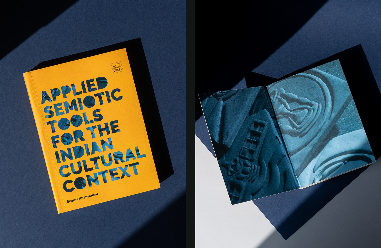
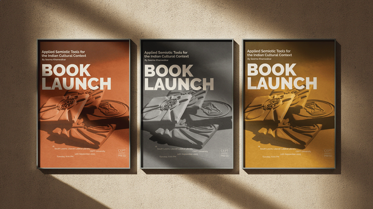
Our approach to designing the book focused on balancing academic seriousness with accessible entry points. The structure is built around four central themes, each understood as a cultural artefact. To represent these ideas visually, we created 5x5 terracotta tiles, each one standing in for a chapter or motif. These tiles were photographed and integrated into the cover design, creating a tactile, grounded graphic atmosphere that complemented the book’s intellectual depth. The cover has bold, restrained typography that interacts with the tile forms, relics half-hidden like embedded signs waiting to be uncovered. The colour palette of warm yellows and deep blues was selected to reflect both vibrancy and introspection, an echo of the complex cultural narratives housed within.
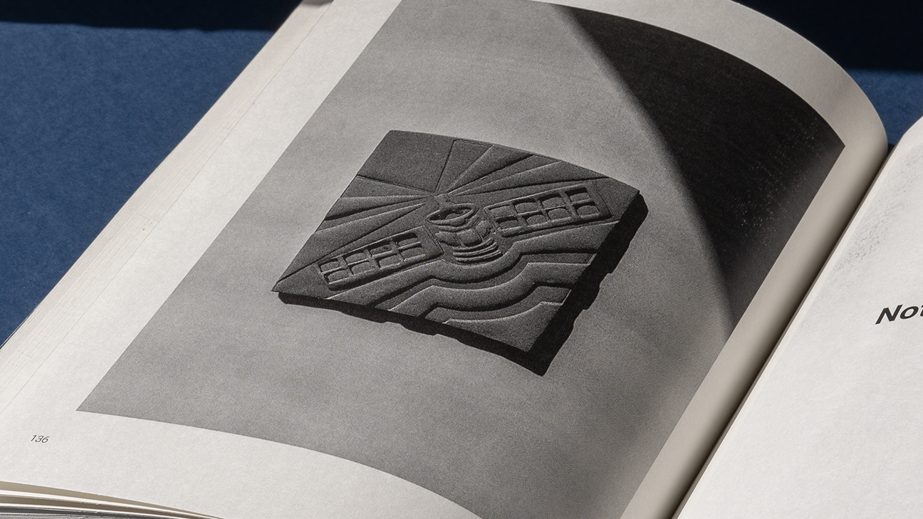

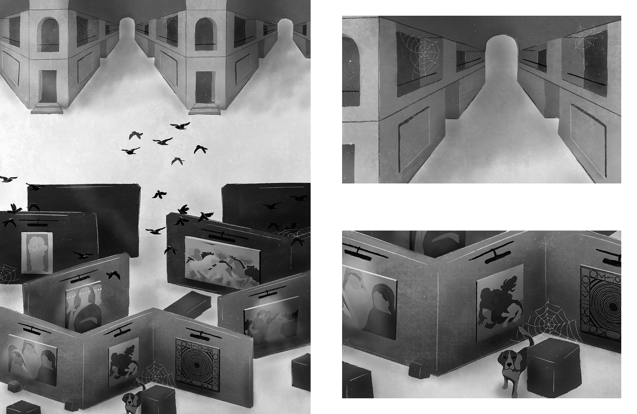
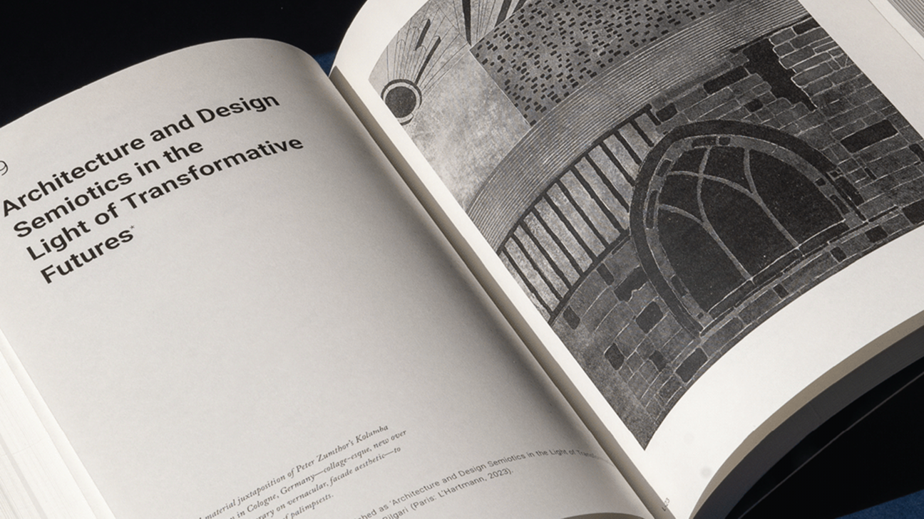
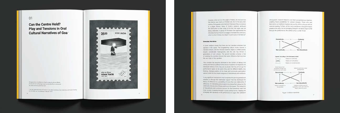
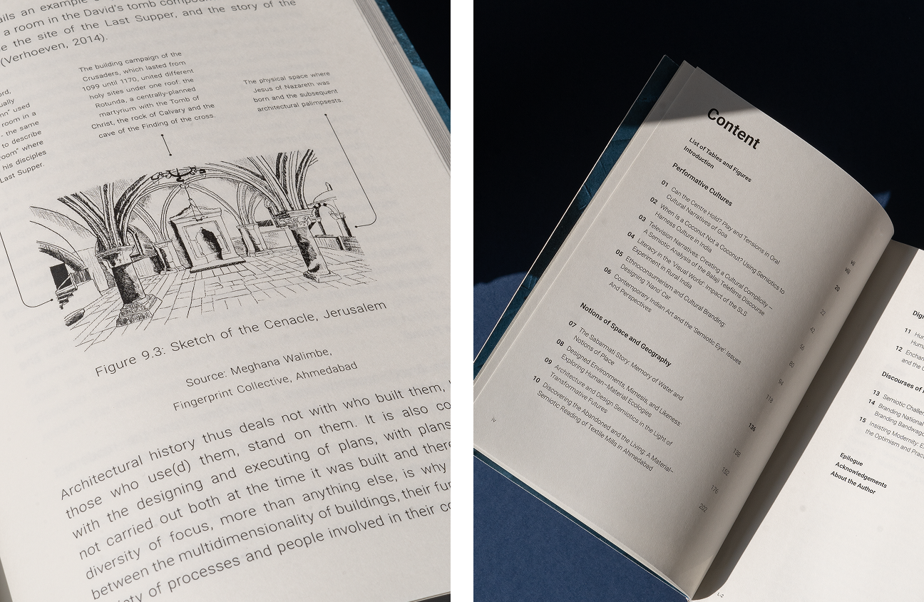
Inside, the layout was intentionally made spacious to accommodate the density of academic language while remaining readable. Illustrations were placed as interpretive summaries at the start of each essay, offering visual cues into the subject matter without overpowering the text.

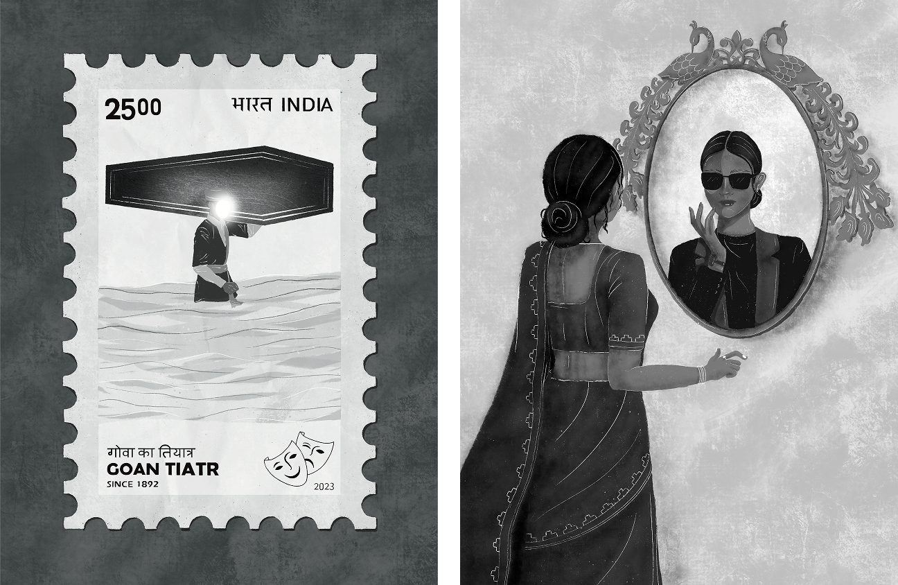

These illustrated snapshots were conceptualised as parallel readings: not mere decoration, but a second mode of understanding. The typography choices were made to support a rhythm of pause and flow, allowing for careful reading.


While the content remained largely academic, the design opened it up to new readers, those outside institutions but curious about the intersections of culture, language, and meaning. The result was a book that respected the complexity of its content while encouraging an open and inviting reading experience.